Beyond the clichés
Gone are the days of dull green clichés and soft eco-friendly imagery. As consumer expectations evolve, a new sustainable design language emerges.
In this piece, we delve into the shift from superficial ‘stock sustainability’ to a refreshing approach that emphasises experience, shining the spotlight on four themes that are defining the new landscape.
If you are a forward looking brand, and are considering your strategy for design language, read on.
Short on time? Use these links

Moving towards authenticity
Today, modern consumers seek more than just token symbols – they crave genuine, action-oriented sustainability. The expectation for transparency and honesty from brands has ignited a transformation in sustainable identity.
From premium product experiences that encourage re-use to beautiful biomaterials, we explore the new face of sustainable design and the strategies employed by forward-looking brands to deliver a positive impact.

Earth-tific: Know what’s in it
From cosmetics to household cleaners, certain brands are embracing a contemporary and minimalist visual language that celebrates the technical prowess of sustainability.
Enter “Earth-tific,” – a sustainable design language that seamlessly blends scientific precision with aesthetics, proudly showcasing brands’ unwavering commitment to eco-conscious practices while captivating savvy consumers who demand both elegance and efficacy.

Aesthetic meets ethics
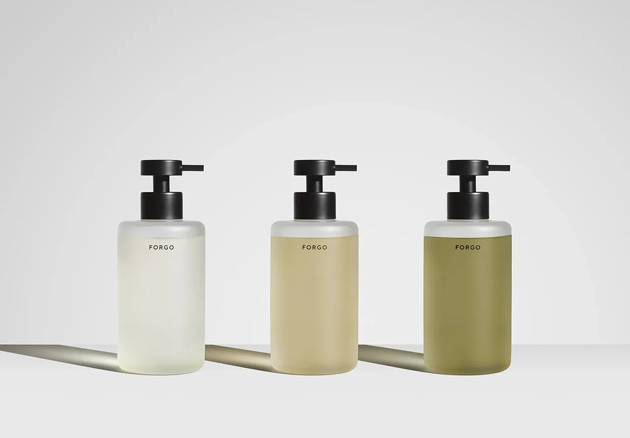
Typology, a Paris-based brand, embodies chic French minimalism with its apothecary-inspired packaging and natural tones.
Their semi-opaque brown bottles and typewriter font labels exude transparency, allowing consumers to trust and understand the ingredients they are using.
Aesthetic meets ethics in Kinfill’s approach to packaging. Encased in sleek glass tubes, their biodegradable cleaning products speak fluently to the values of conscious consumers.
Simply pour into the glass spray bottle and top up with water. The understated yet refined typeface on the label further reinforces the Kinfill’s commitment to openness—there are no hidden agendas, just a commitment to creating effective, safe cleaning alternatives.
Beyond function, Kinfill’s glass spray bottle becomes an elegant household element, with muted tones adding a touch of quiet luxury to interiors.

Informed choices
Breaking grounds in the beauty industry, textile startup AIZOME has joined forces with Serviceplan Innovation to unveil WASTECARE™ – a premium skincare product crafted from wastewater sourced from AIZOME’s own textile dyeing factory.
Drawing inspiration from apothecary practices, each product is packaged in glass and meticulously labelled, detailing key ingredients and their effects.
This approach establishes a genuine connection, empowering consumers to make well informed choices.

Mainstream+
Sustainability 2.0 is here, bringing forth a new design identity that is ‘wonderfully mainstream’ – a positive shift away from the niche approach that was failing to instigate widespread change.
Now, a growing number of brands are tapping into this mainstream approach, putting sustainability at the core while delivering a delightful consumer experience.
Blueland, an eco-friendly cleaning company, illustrates this by putting equal bias on product performance, desirability and sustainability. The packaging is honest and straightforward, delivering on promises without overwhelming consumers.
The brand’s stunning, minimalist design features blue type with small pops of colour, celebrating the innovative cleaning solution in tablet form.


Disrupting tradition
Meanwhile, Who Gives A Crap, known for donating 50% of its profits to improve access to toilets and clean water, flaunts a playful and seasonal design identity. With a colourful and memorable brand persona, Who Gives A Crap are visually disrupting the traditions of their industry, ditching the soft and cuddly design tropes while proving that looking good and doing good can go hand in hand.
In the same vein, coffee brand Heaped breaks away from clichéd green symbolism and embraces playfulness to create a memorable design identity. Delivering instant coffee in a teabag format with compostable materials and recyclable packaging, Heaped put sustainability at the heart of their design process. Equally, the brand’s vivid colours and fun typography create a unique and engaging brand experience that transcends conventional coffee tropes.


Beautiful Imperfection
In this new era of sustainable design, brands have a unique opportunity to break free from trite tropes and embrace a more tasteful and authentic approach. We call it ‘beautiful imperfection’ – a design language rooted in the genuine beauty of natural ingredients.
Gone are the forced designs that leaned towards greenwashing; instead, this sustainable design language celebrates the inherent non-uniformity of materials, welcoming natural speckles and imperfections as a symbol of true sustainability.
Calvin Klein x Natural Design Studio offers a great example. Their neutral-toned pouches are crafted from handmade sheets of Procel, a biotextile made from protein bioplastic, a natural softener, and natural pigments. Each pouch features a subtle, swirly pattern and is held together by four steel pins, adding an artistic and eco-conscious touch.
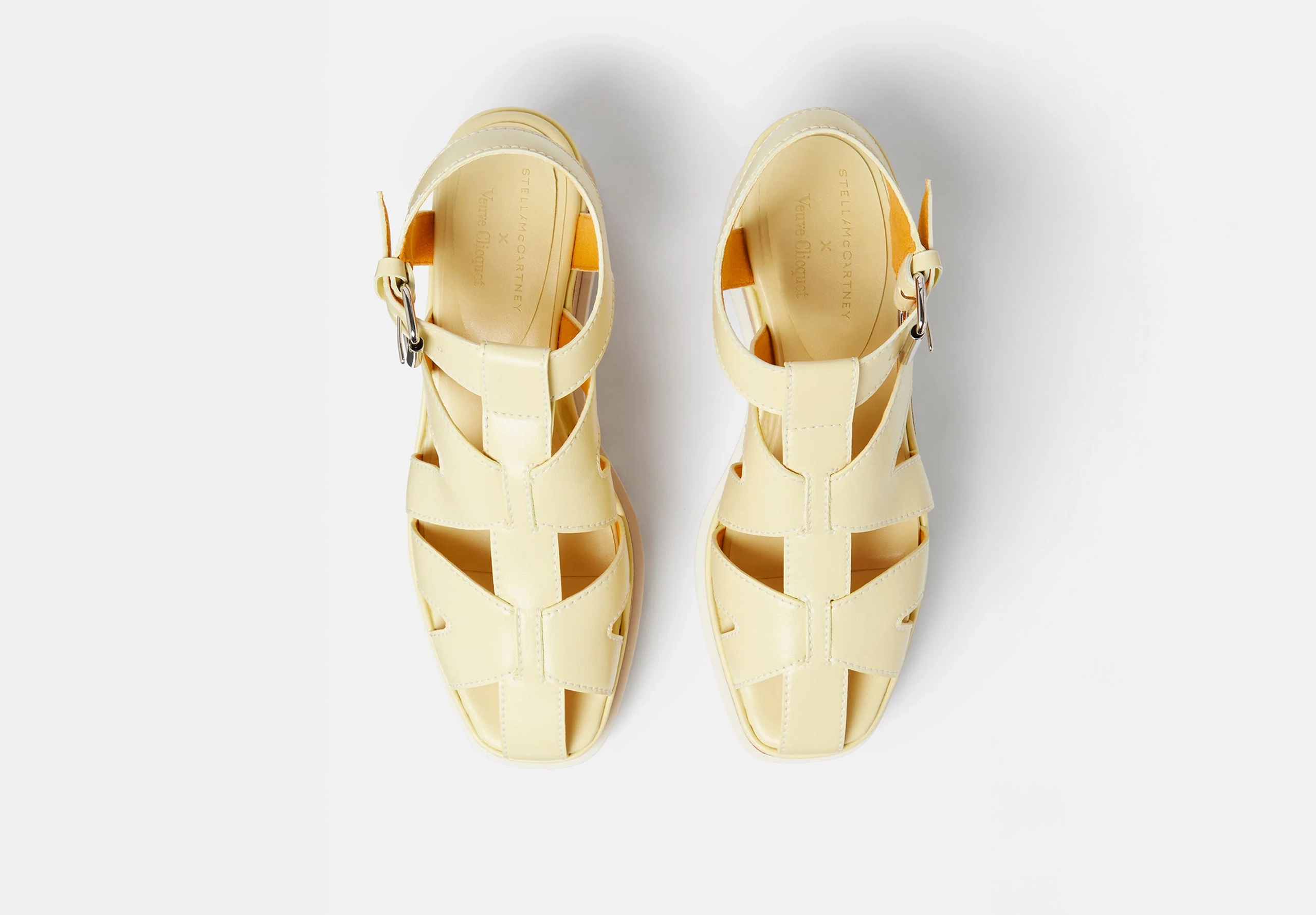
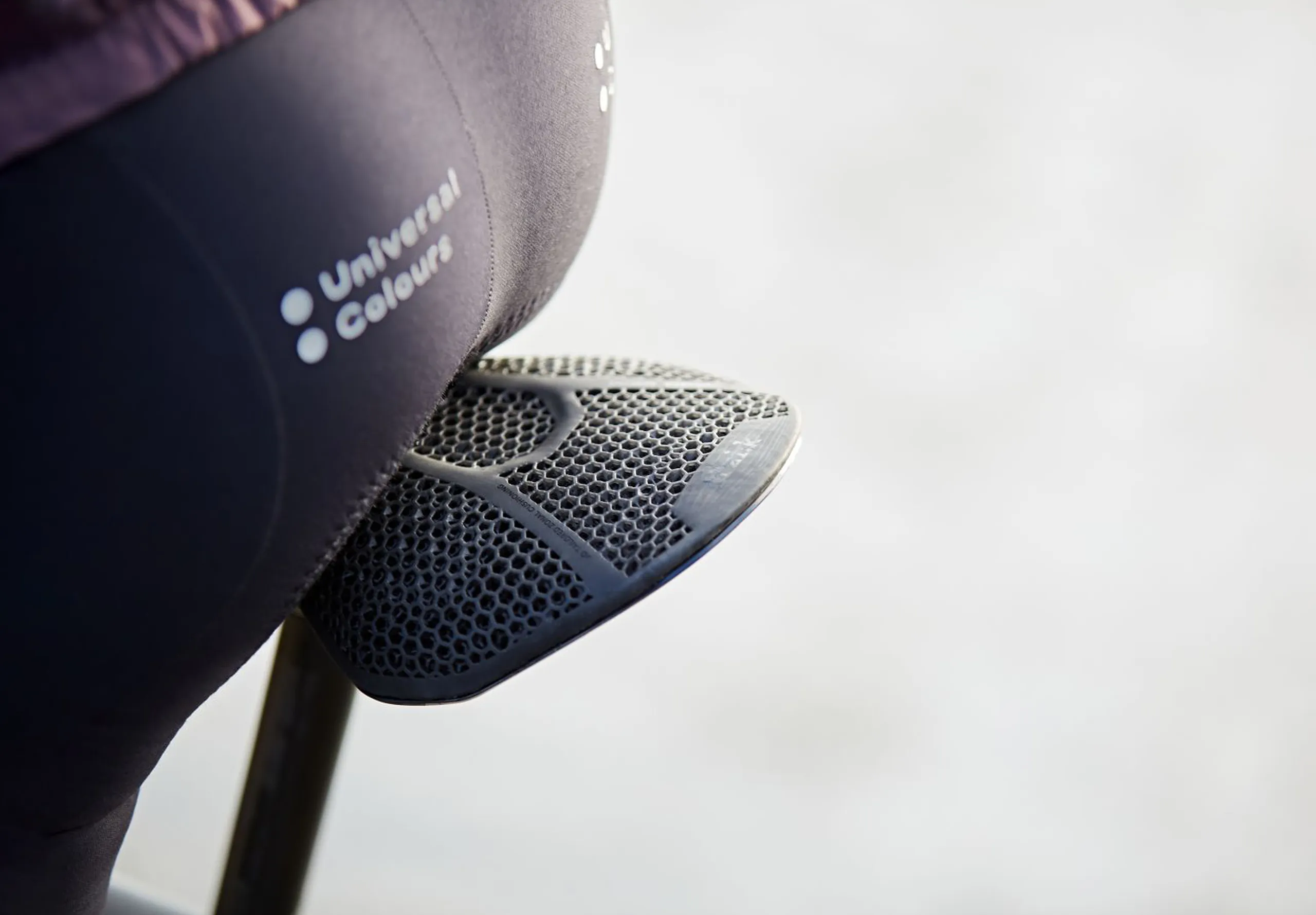
Rewriting the rulebook in sustainable footwear design, Balena produces soft compostable sandals ‘BioCir Slides’ made from flexible biodegradable thermoplastic and mixed with the recycled waste of the fashion industry. The sandals’ open-hole design provides airflow for comfort on rough terrains, reflecting Balena’s thoughtful consideration for both the wearer’s experience and the planet’s well-being.
As they are coloured and scented using natural cinnamon, the sandals achieve an organic aesthetic that appeals to the tastes of modern consumers. Critically, this design feature comes naturally as opposed to being a superficial addition for the sake of a “sustainable look.

Crafting authenticity and meaning
In a world where sustainability is no longer a choice but a necessity, the design language of eco-friendly products has evolved to become a powerful tool for brands.
No longer do the traditional notions of “stock sustainability” suffice. Visual communications filled with sad polar bears on melting ice have failed to make sustainability feel real or relatable.
Instead of tired clichés and empty claims, this new sustainable design language focuses on crafting authentic and captivating experiences that deeply resonate with conscious consumers.
Whether it’s embracing mainstreamism or adopting a scientific language that instils trust, each brand can discover its unique voice in this dynamic landscape.
Rodd bring a deep expertise in crafting design language that tell your brand’s story as it should be told, so talk to us about how we can help you continue your story.