Zyliss approached us with a vision for a new kitchen tool to meet the growing needs of consumers worldwide.
However, competing in a crowded space requires innovation underpinned by unique consumer insights.
Bringing proven expertise in the field of user-centred design, we helped Zyliss differentiate their next generation box grater, allowing them to go beyond the boundaries of their category.
Behind every Zyliss tool is the “design to delight” principle that supports the look, feel and functionality of their products. In turn, their kitchen tools are known for simplicity, efficiency and small but significant touches that make the user smile. However, when Zyliss approached the box grater category, they saw that most competing brands had the obvious bases covered.
Still, we knew there was an opportunity for innovation: we just needed to look more closely at the problems in hand. So, we immediately began holding user observation sessions to get to the heart of their customer’s challenges.
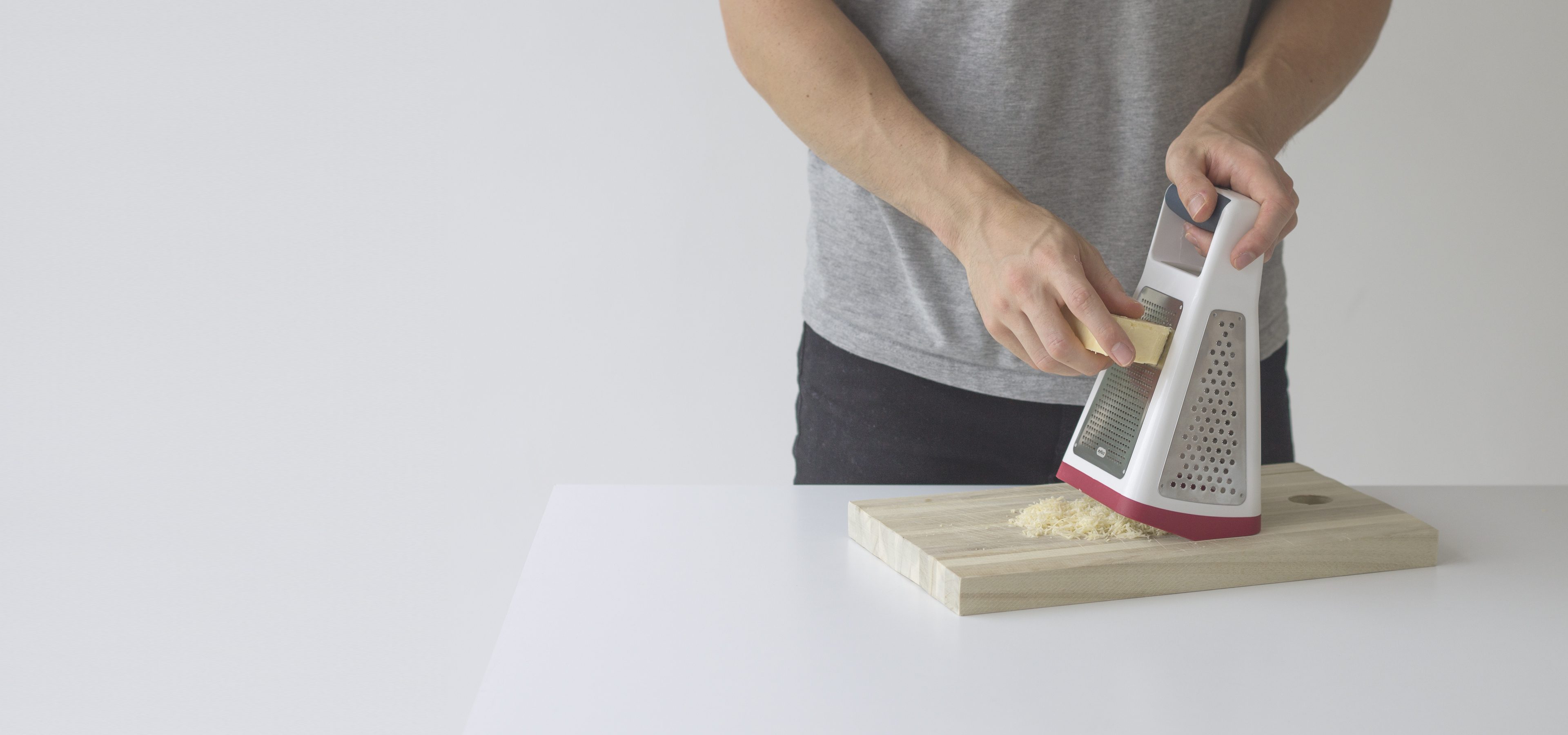
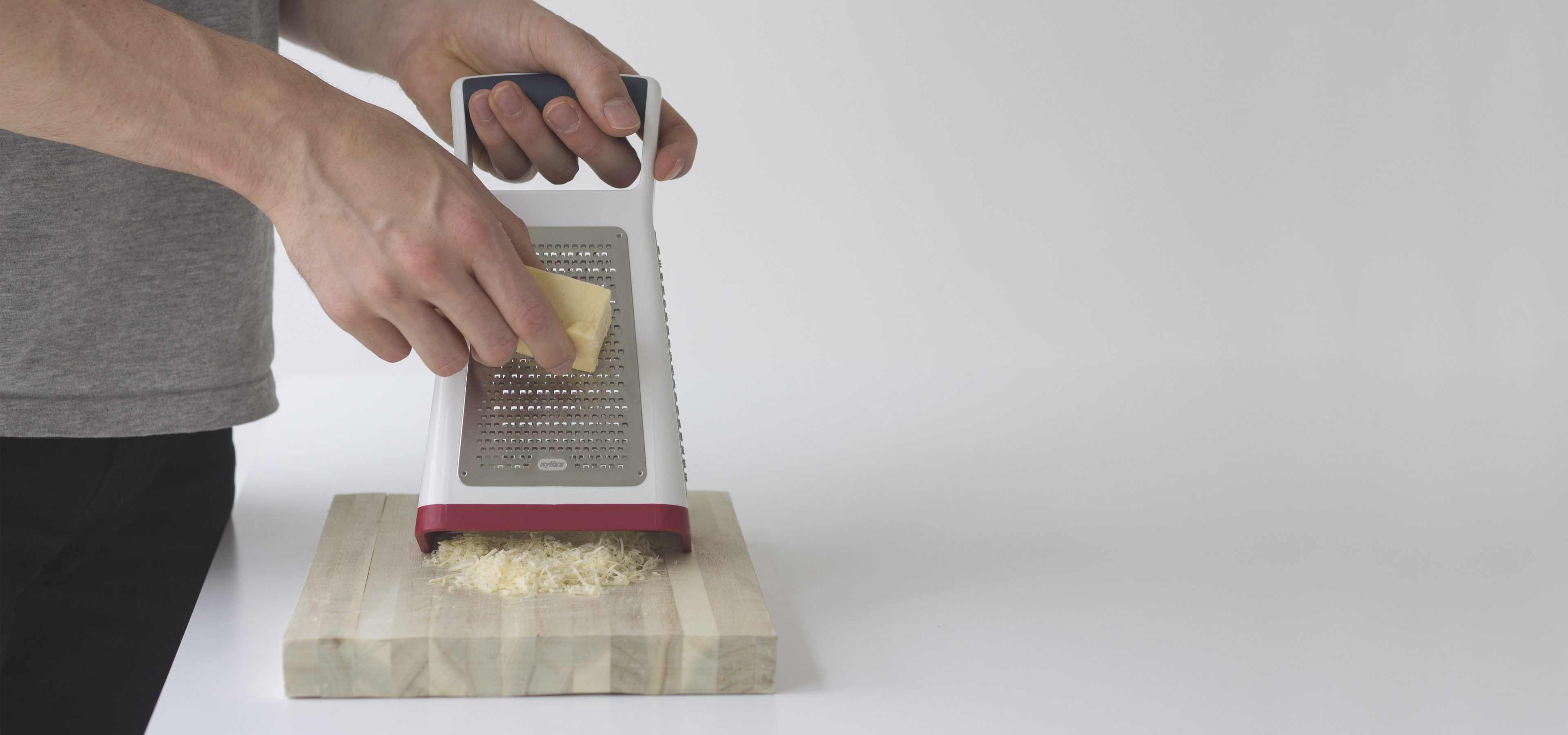
From these sessions, we found that users would often rock the grater onto its rear edge to give them a more natural grating angle. Although more comfortable and convenient, this method risks injury to the user should the grater slip from its unstable position. As we observed users, we realised another pain point: with the gratings collecting inside the grater, you won’t know how much cheese, fruit or veg you’ve grated until you lift the grater to check.
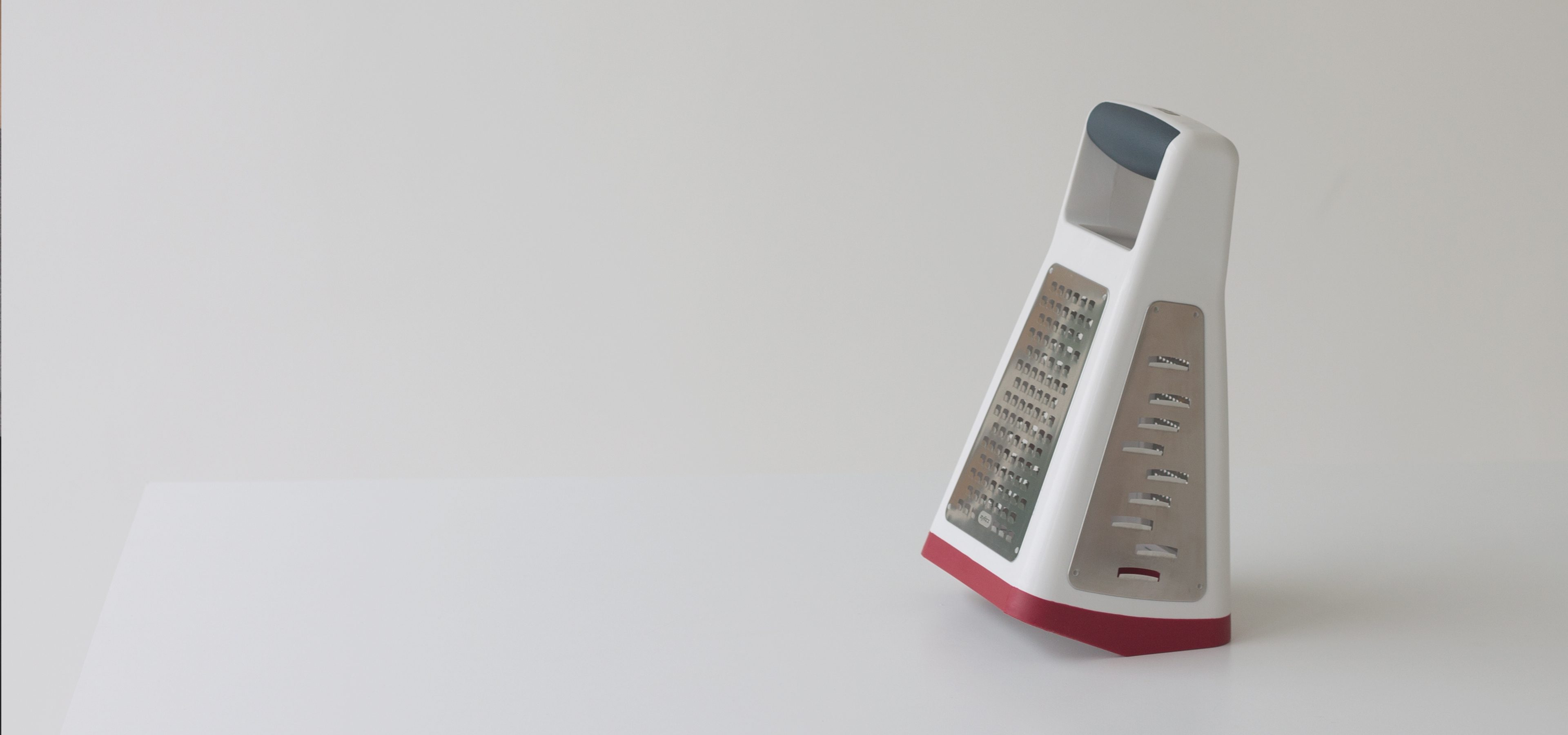
Inspired by our findings, we combined these simple observations to create a solution that exuded ease, efficiency and simplicity for the user. The ‘Tilt and Grate’ features an angled base that allows for users to grate in a position that feels natural, while a non-slip foot removes the risk of accidents. Further, we deliberately added an elevated front edge, so users can keep on top of how much they are grating without having to constantly stop and look.
