Inclusive Innovations in Tech
Author Béatrice Lorans
Design exclusion happens when we solve problems using our own biases.
Now, as we move through an era of rapid technological advancement, it’s our collective responsibility to rethink these biases, to consciously challenge the status quo and to innovate in ways that honour the true spectrum of human experience.
Remember, every decision we make in design can raise or lower barriers to participation in society. As part of my monthly design inspo series, I’m exploring how inclusive innovations are paving the way by dismantling these barriers.
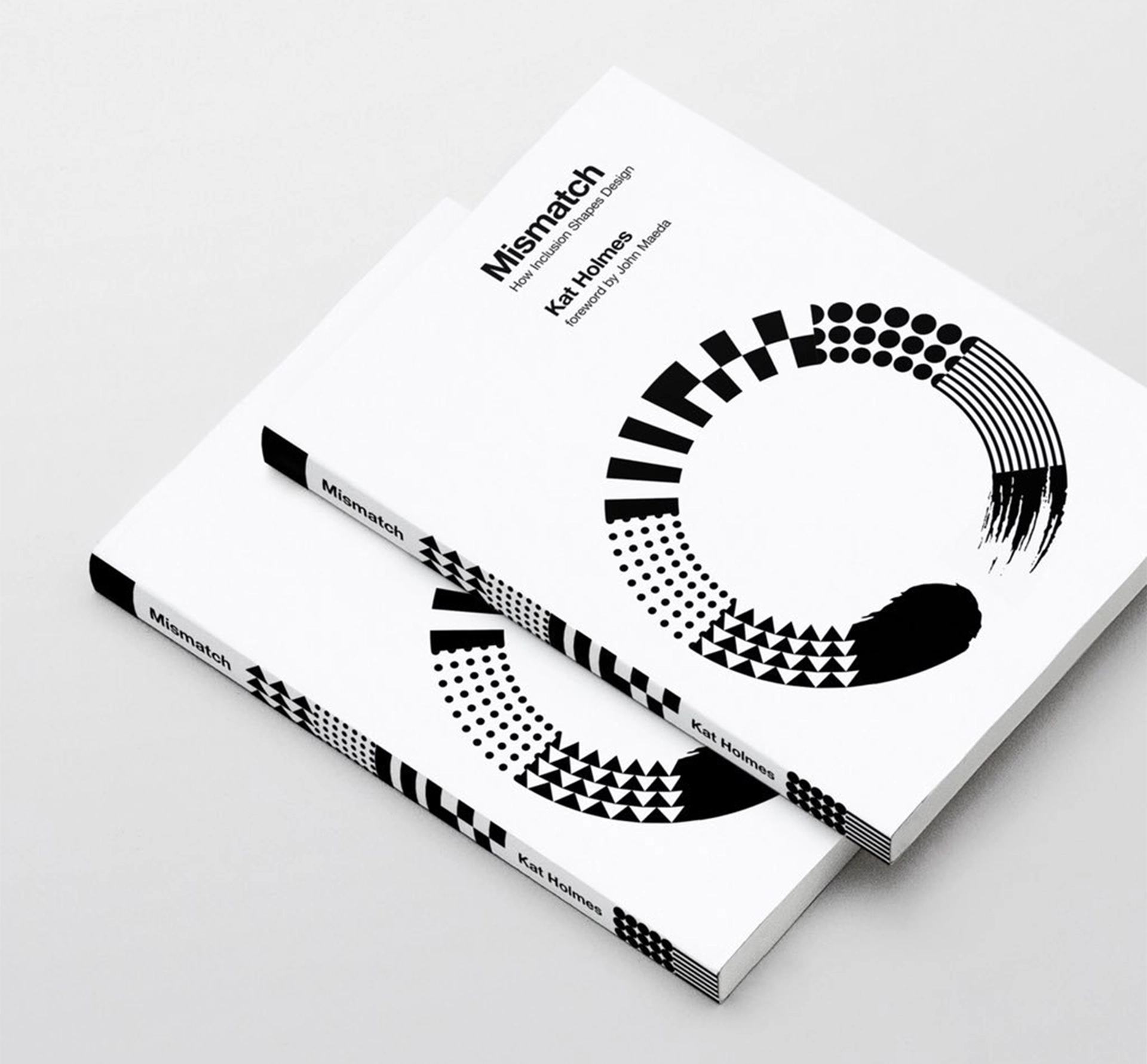
Mismatch - Kat Holmes
In this book, founder of Mismatch Design Kat Holmes exposes designers to the impact of what we create, prompting us to ask who we are excluding by not making our products accessible. Through real world examples and powerful storytelling, Holmes argues against designing for the ‘lowest common denominator’ and instead champions design that works better for everyone. Essential reading for all designers!
Innovating Quick Replies - Intercom Messenger
After readability issues with certain colour contrasts came to light, Intercom revamped its “quick reply” buttons in their Messenger platform to better meet WCAG 2.0 accessibility guidelines. This seemingly minor tweak significantly improved usability for everyone. It really drives home how even the smallest adjustments, made with inclusivity in mind, can make a big difference for everyone.
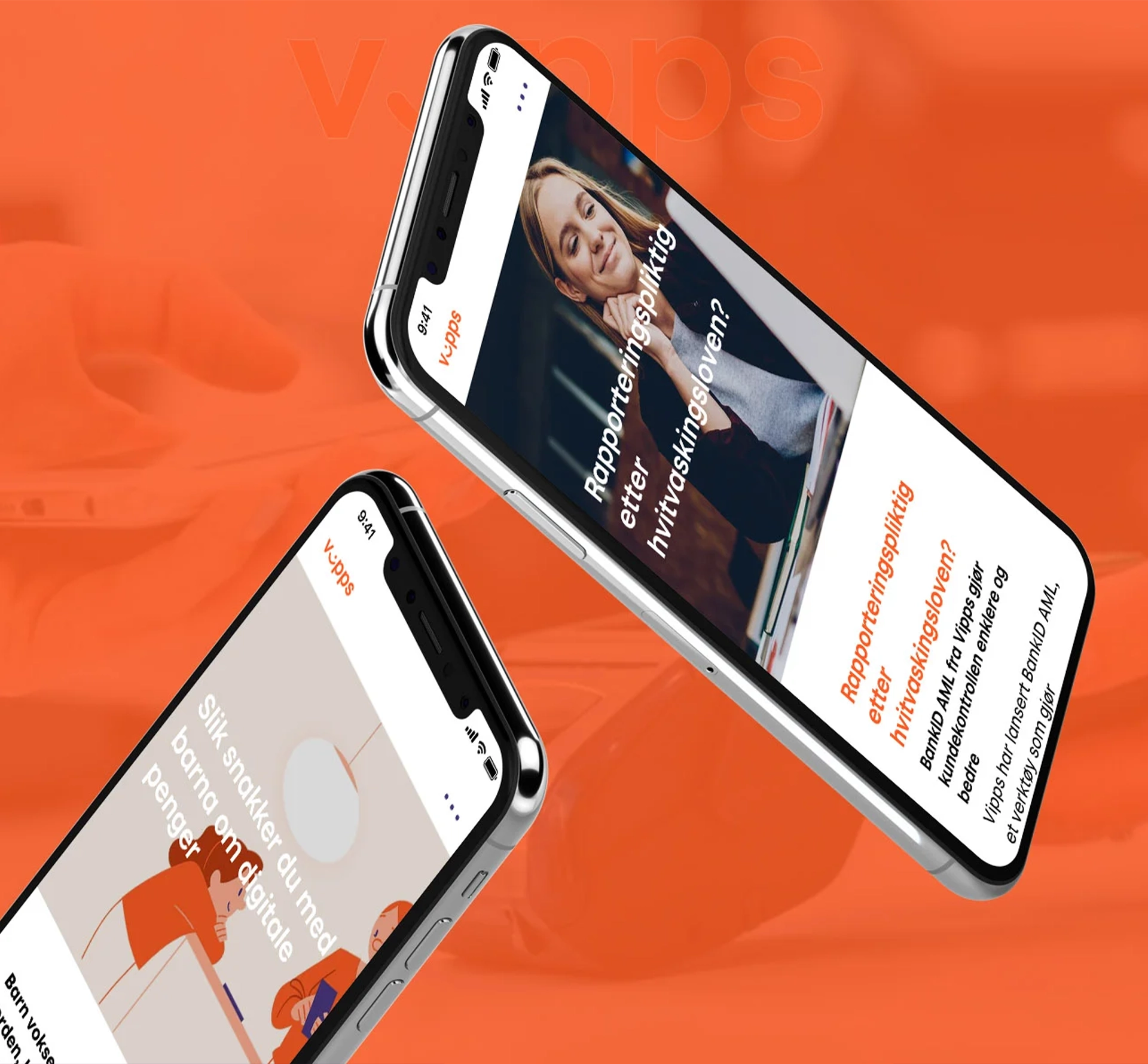
Inclusive Mobile Payments - Vipps
Launched in 2015, Vipps quickly became Norway’s favourite mobile payment app, simplifying transactions to just a phone number. However, they hit a bump in 2017 with a complaint about accessibility, sparking them to up their game in universal design. Collaboration with the Norwegian Association of the Blind and Partially Sighted and the user who submitted the complaint were crucial, and they’ve since ramped up user testing and engagement, tapping into feedback and customer service insights to elevate their accessibility.
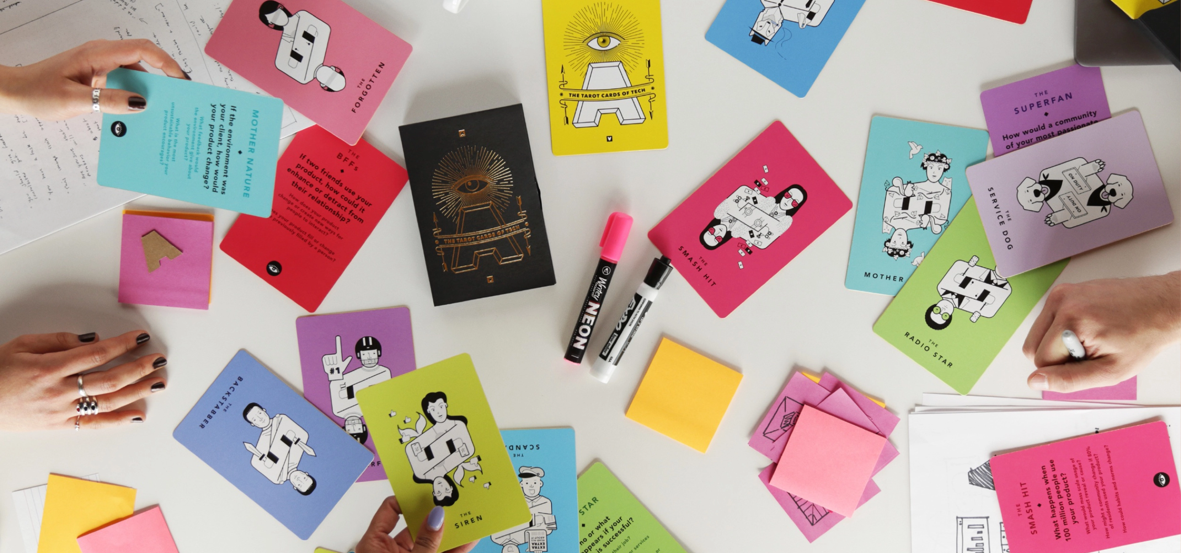
The Tarot Cards of Tech - Artefact
I love this idea of using a tarot card set for “humanity-centred design.” This tool from Artefact is a hands-on way to make empathy and understanding a natural part of how we work, prompting conversations around the true impact of technology and the products we design. It’s super relevant today as we’re recognising how good intentions can sometimes backfire, stressing the importance of weaving inclusivity into the fabric of our design process right from the start.
Inclusive design isn’t just a feel-good afterthought. By considering user needs from the get-go, everyone benefits. Done right, it’s a win-win: it broadens your reach, fuels innovation, and positions your company as a leader in social responsibility.
Looking for more design inspiration?


