CMF
Author Dan Harfield
CMF is where products come alive.
This month, I’ve been inspired by the way brands are using colour, material and finish to tell their unique stories. From playful palettes to retro refinements, each project shows how carefully crafted choices can build cohesive identities.
Take a look.
Wasted 001 by Potato Head x Max Lamb
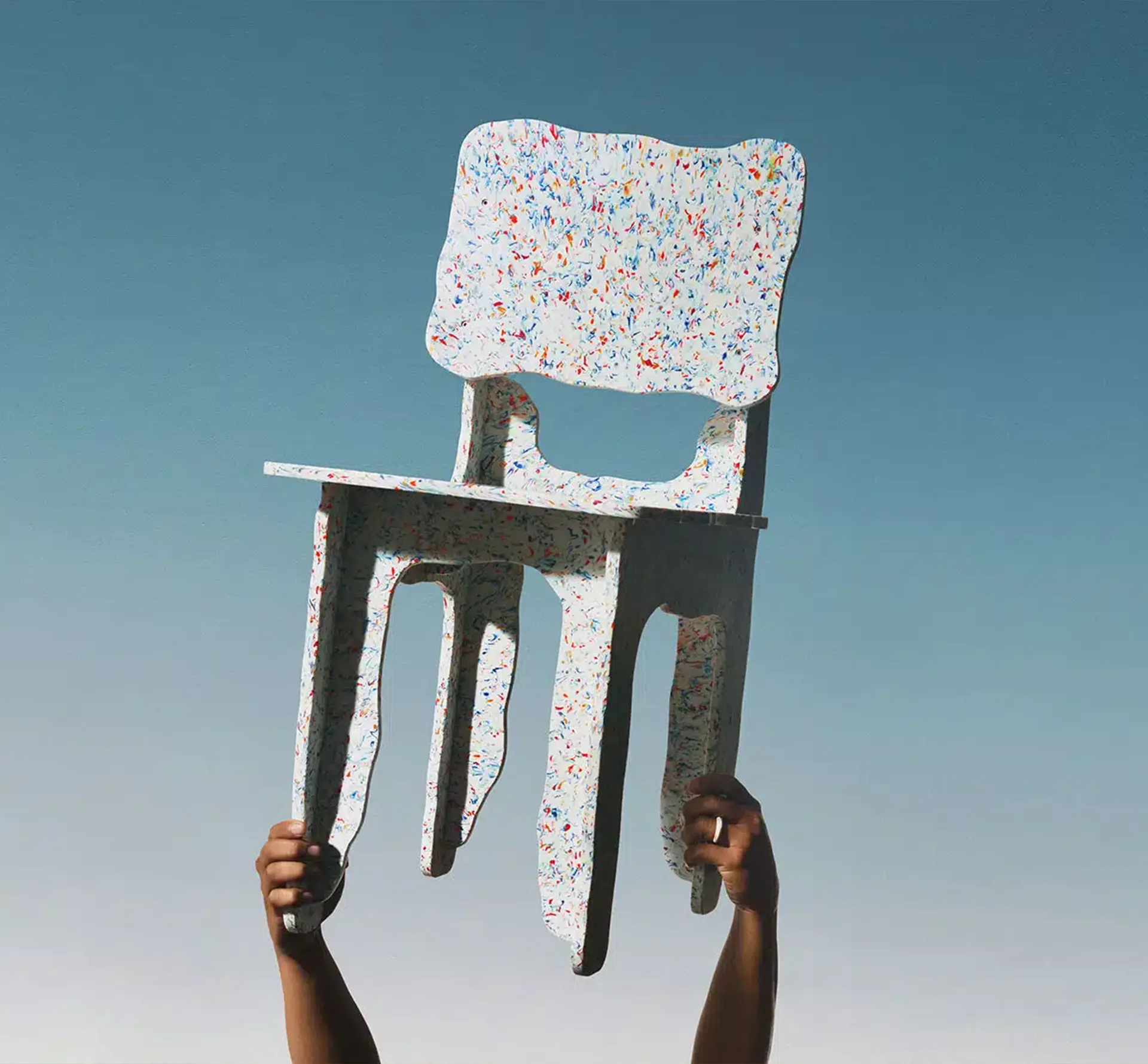
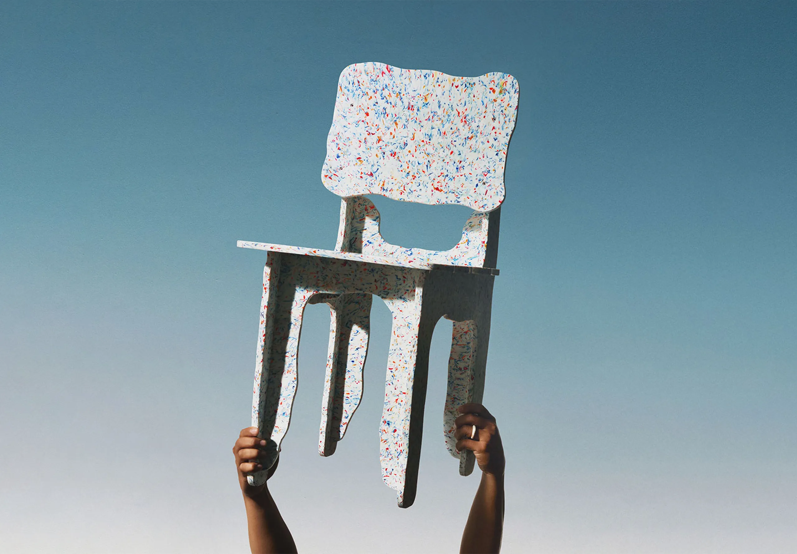
I love the energy and honesty of this collaboration between furniture designer Max Lamb and Balinese eco retreat Desa Potato Head. Speckled surfaces, layered tones and raw textures transform hotel waste into functional objects that carry both story and substance. Under Lamb’s guidance, the pieces have been brought to life through the skills of local craftspeople.
It feels like a celebration of knowledge and tradition, where sustainability and heritage come together to create something beautiful.
Beosystem 3000C
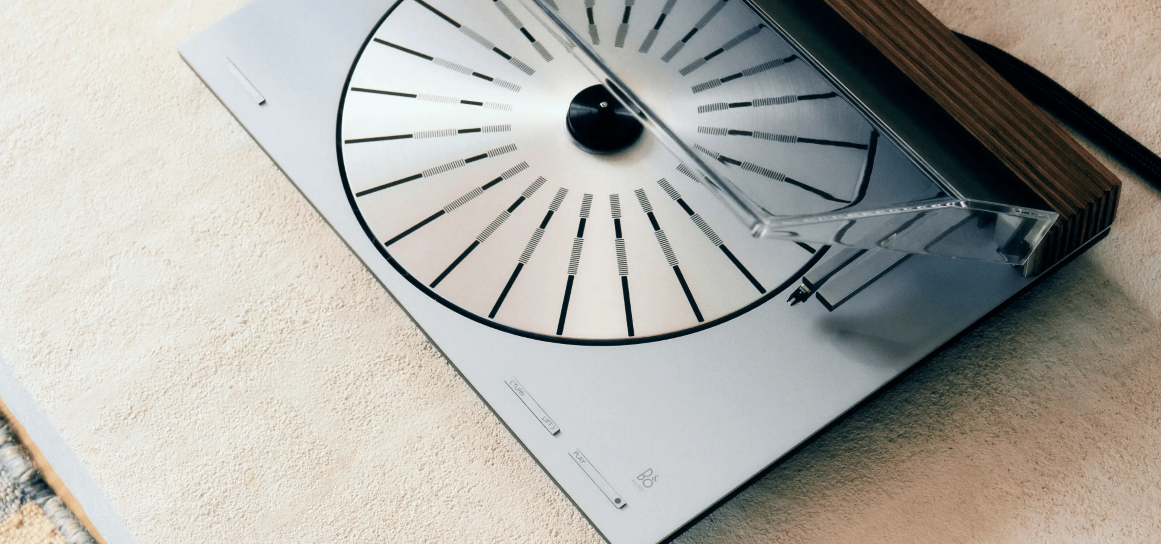
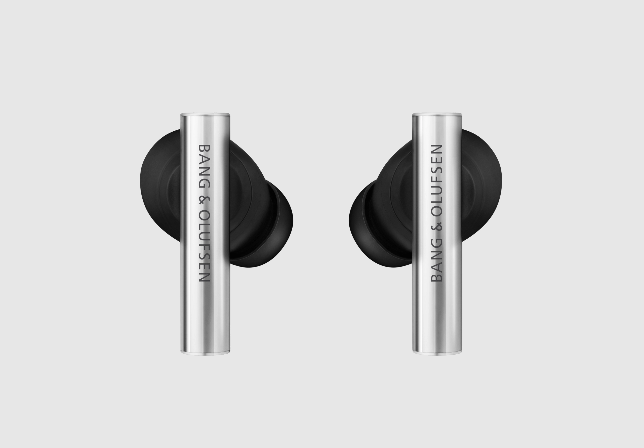
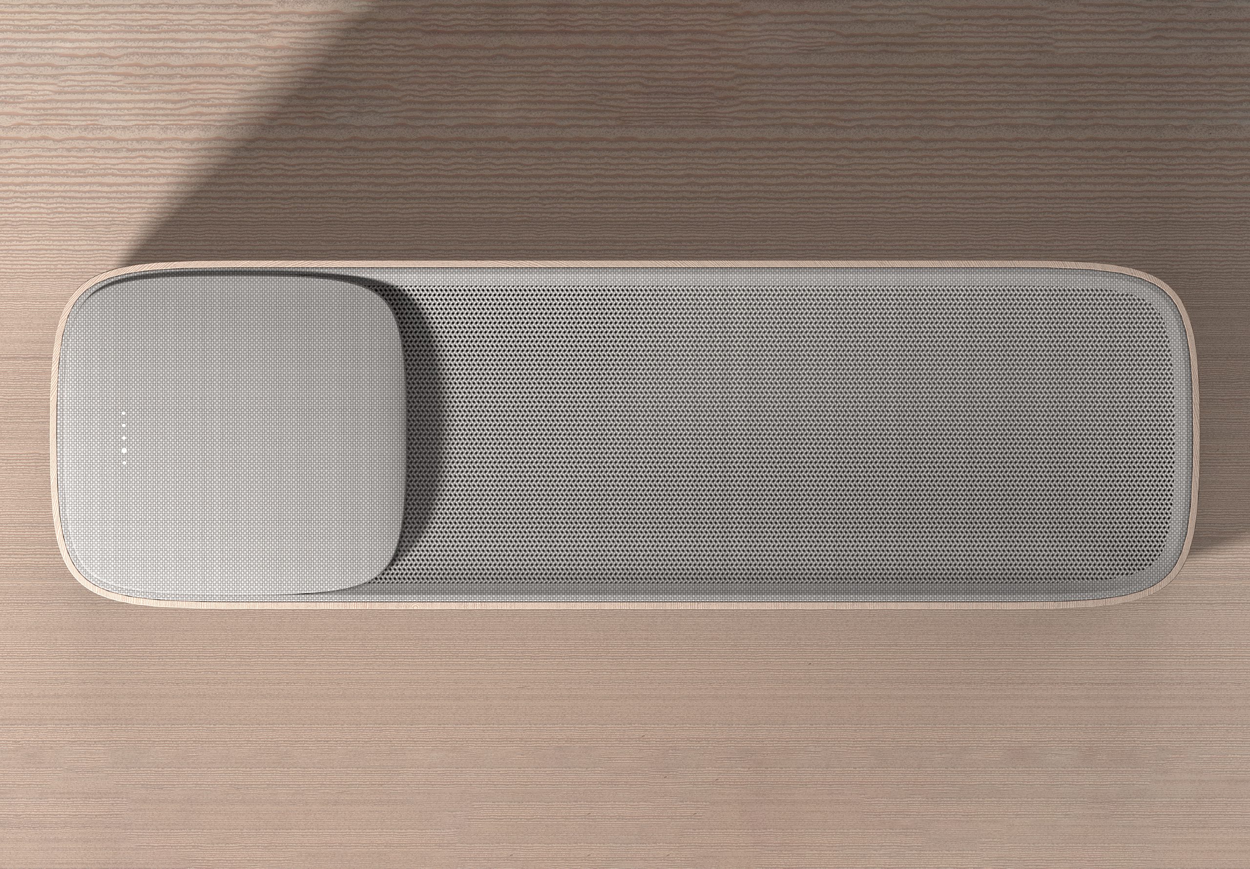
Bang & Olufsen always use CMF to tell beautiful stories, and the Beosystem 3000c is no different. Cool brushed aluminium meets the warmth of rich wood, a dialogue that feels both retro and refreshingly modern.
Layered metallic tones bring depth and precision, while every surface speaks to craft and care. The result is a system that looks as considered as it sounds.
Google Pixel 10
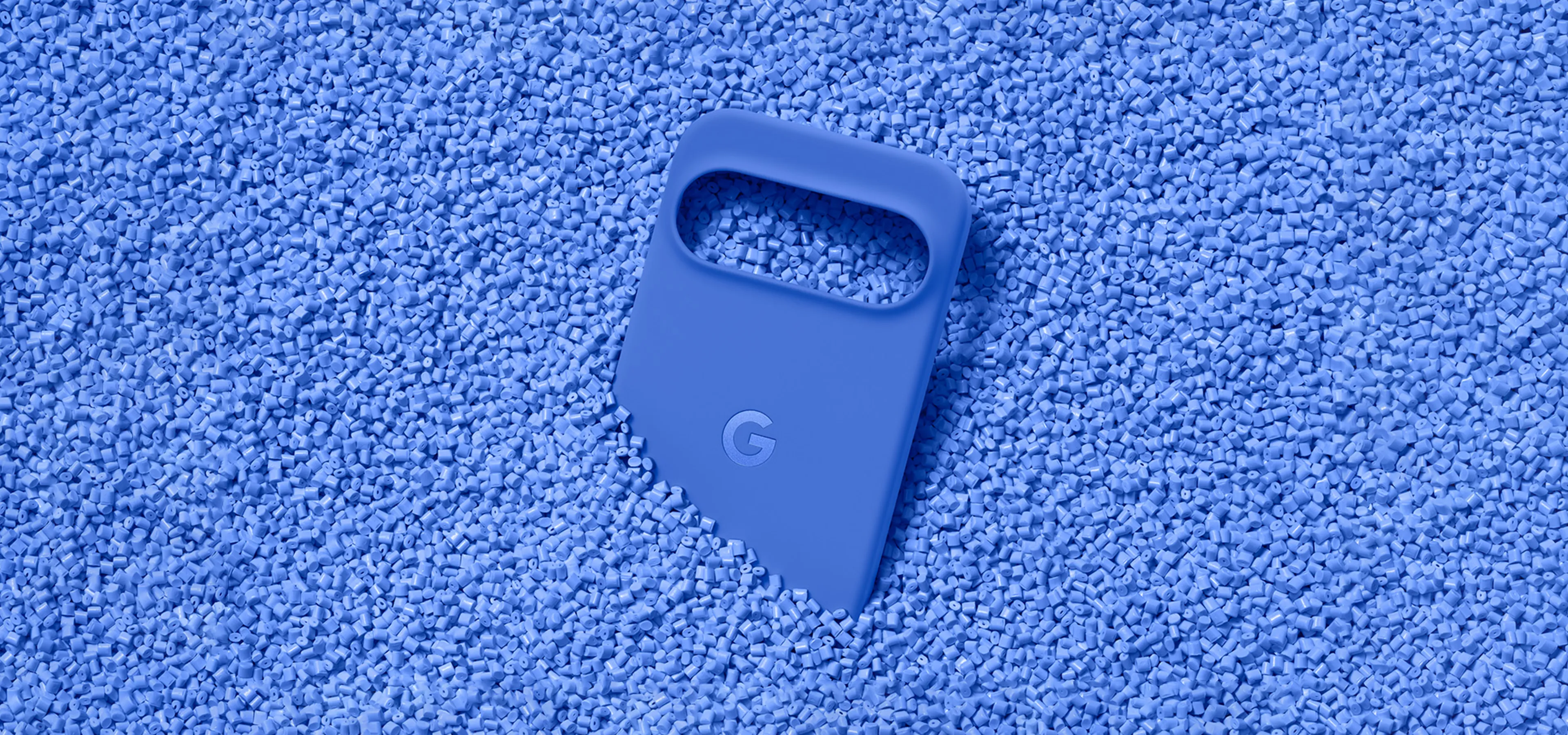
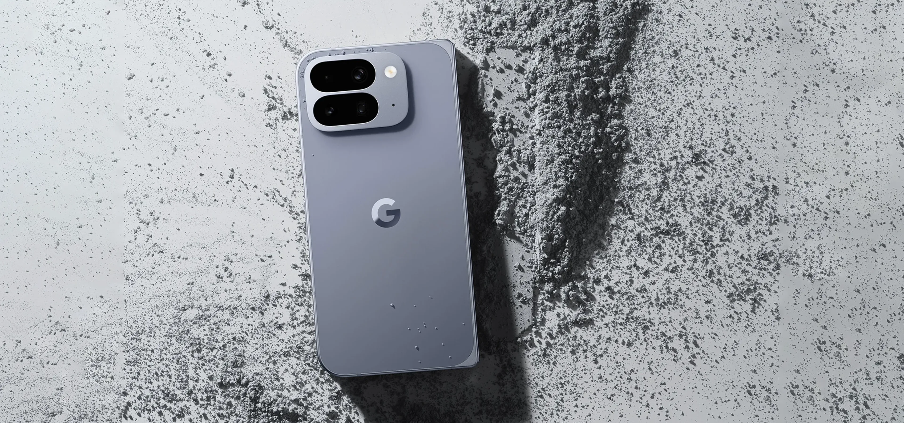
Google’s Pixel 10 line shows how thoughtful CMF can elevate everyday tech. Soft, matte finishes sit alongside subtle metallic accents, but the colour palette is where things open up. Colours like Jade, Moonstone, Lemongrass, Indigo and Porcelain move the range far beyond the predictable tech greys, each one designed to complement the new Material 3 Expressive interface.
Together, the palette feels cohesive yet individual, offering devices that sit comfortably in both lifestyle and technology spaces.
Hydro R100
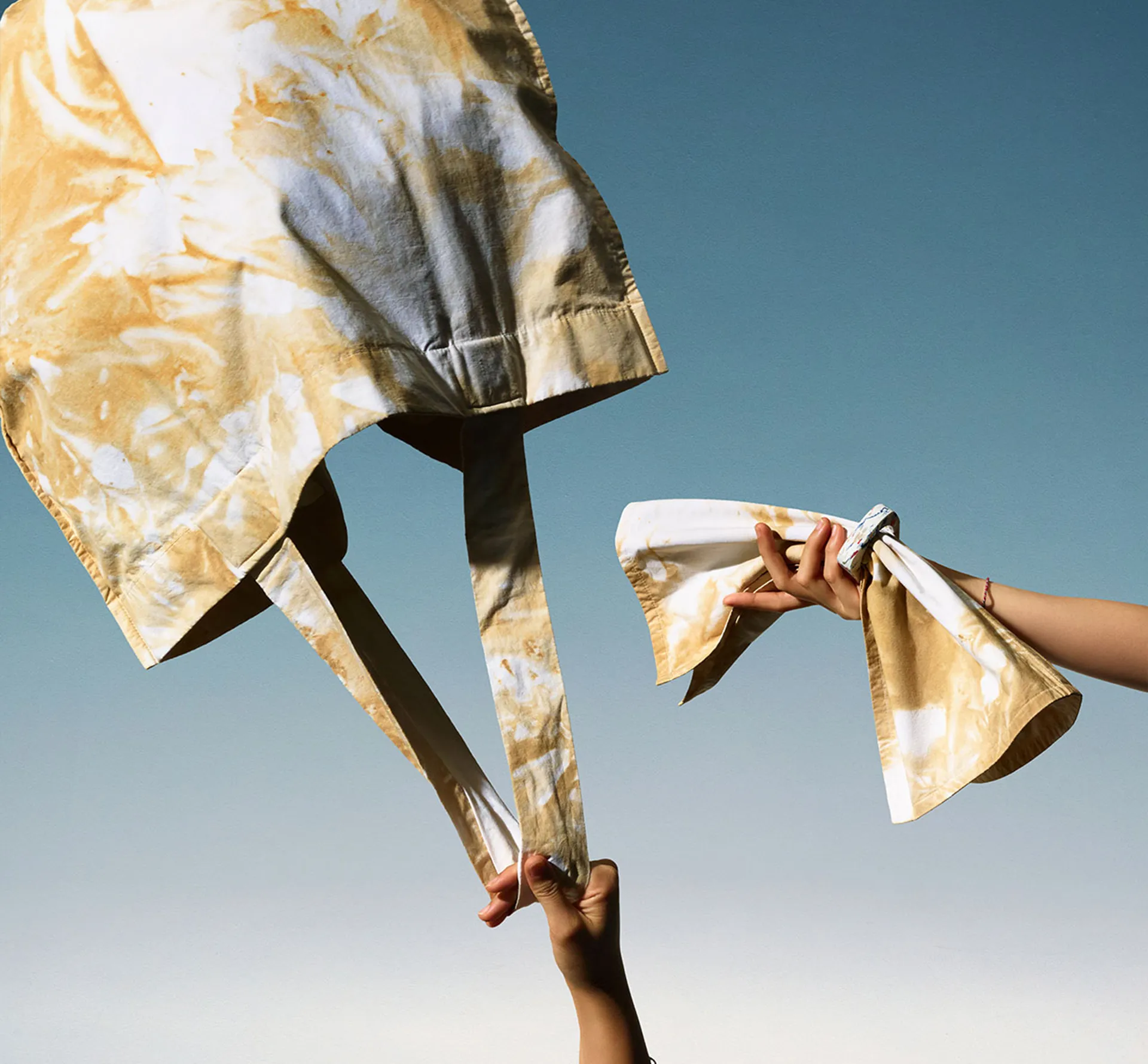
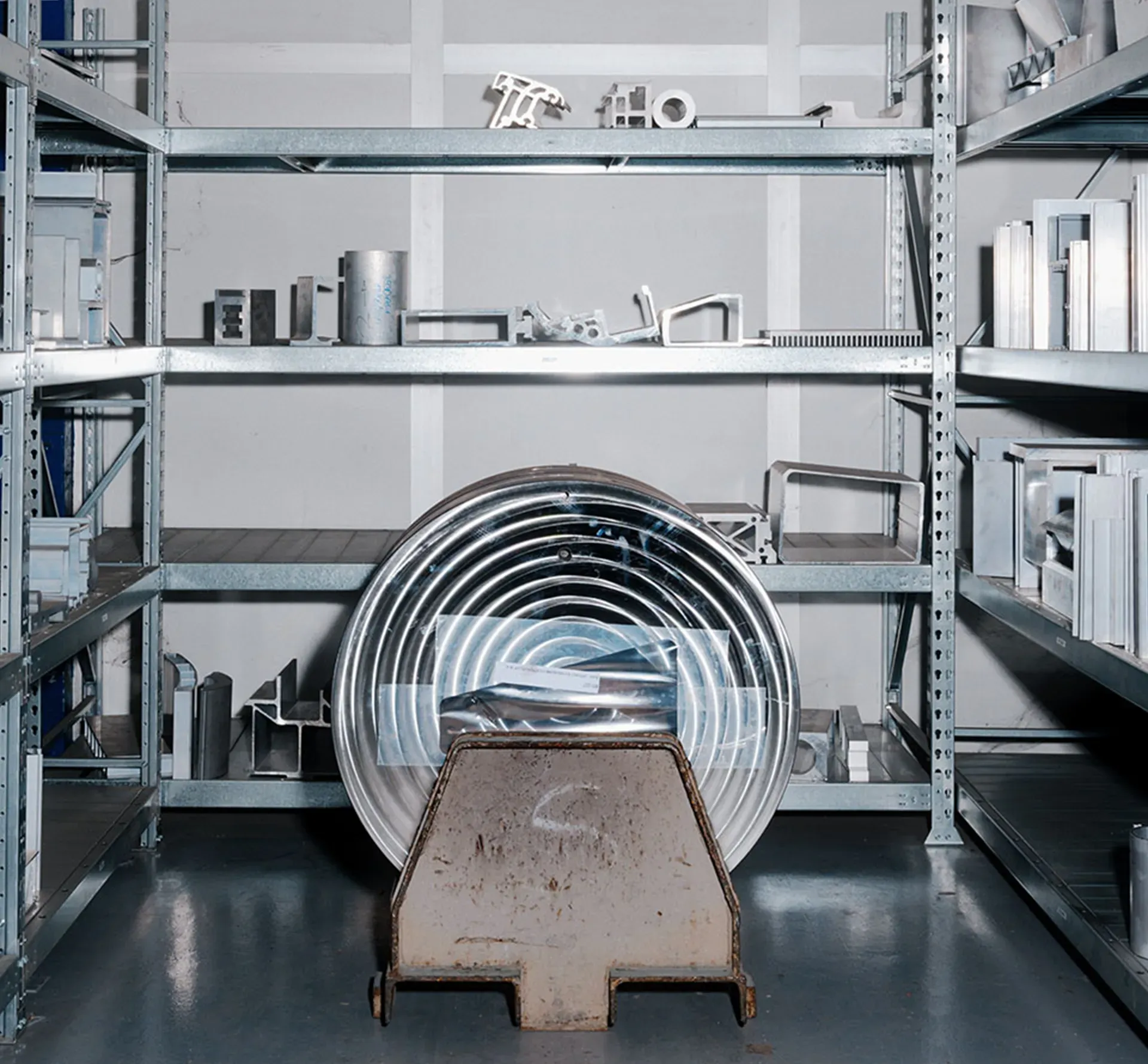
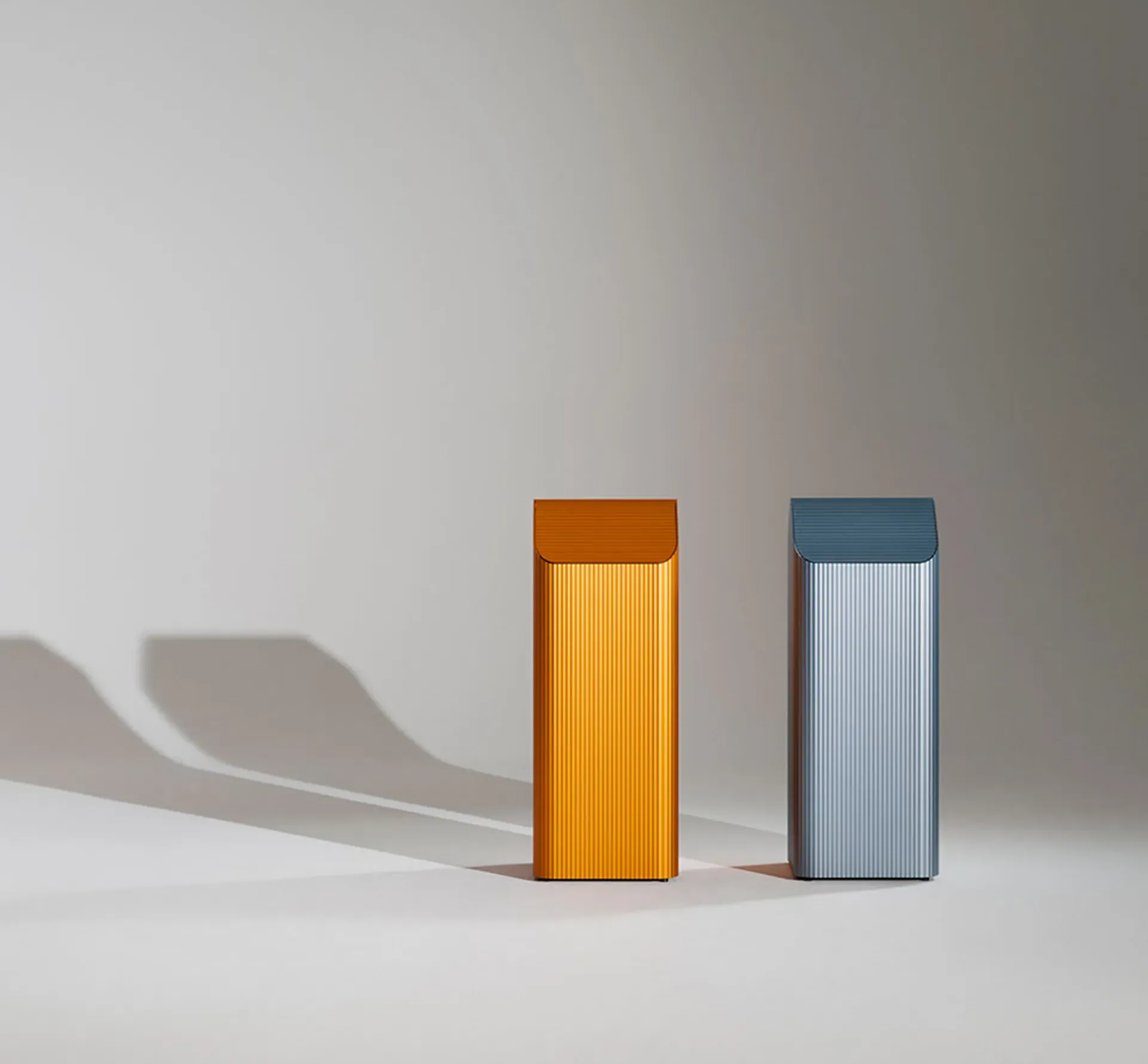
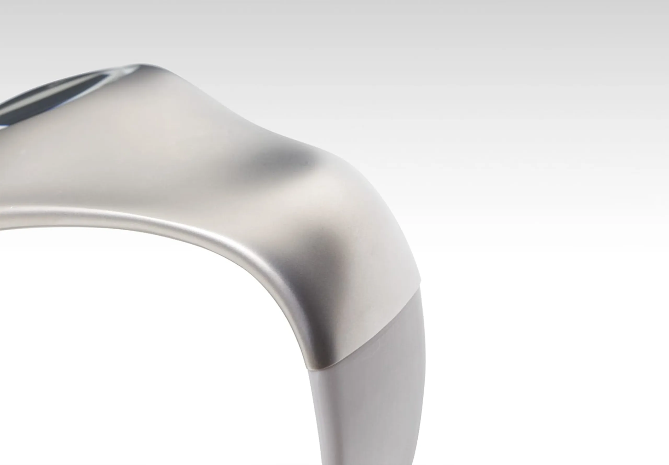
Aluminium isn’t usually the star of the show, but Hydro’s R100 project is leaning into it, taking 52 tons of locally sourced aluminum scrap to craft a unique collection of products. Some pieces glow with rich, almost jewel-like colour, while others keep things pared back with softer, matte tones.
The mix makes each object feel distinct but still part of a bigger story. It’s clever, and really makes you see the material in a whole new light.
