Icons and identities
Author Dan Harfield
Strong branding shapes how we experience organisations, products and places. It creates distinction, builds trust and gives stories a visual and emotional anchor.
This month, I’ve been inspired by projects that achieve this with clarity. From retail and hospitality to heritage and sport, each demonstrates how design gives identity lasting resonance.
Dive in.
Vinted x Studio Kiln
Vinted’s new identity with Studio Kiln reflects the scale of its rise to become the top clothing retailer in France. The system is bold and structured, with messaging that feels both confident and immediate.
What I find most compelling is the harmony between the efficiency of a clean grid framework and the warmth of language that feels personal and alive. The result positions Vinted with authority, clarity and the energy of a true category leader.
NOWNOW x Saint Urbain
The wordmark for Now Now packs real character and range. It holds together across lockups and sizes, with portal-like curves giving each configuration a clear anchor. The impressive part is the consistency: signage, wayfinding, web and in-room touchpoints all carry the same tone, making the identity feel coherent, purposeful and unforced.
The New Forest x Studio Glass
The identity for The New Forest balances heritage with sensitivity. I love how the creative direction reflects the spirit of the place rather than defaulting to generic tourism tropes.
The illustrations in particular bring folklore and landscape into focus, giving the brand a distinctive texture that feels authentic to locals and inviting to visitors. It’s a well-considered system that captures the idea of being “old, yet ever new” with clarity and care.
Wilson x Codea
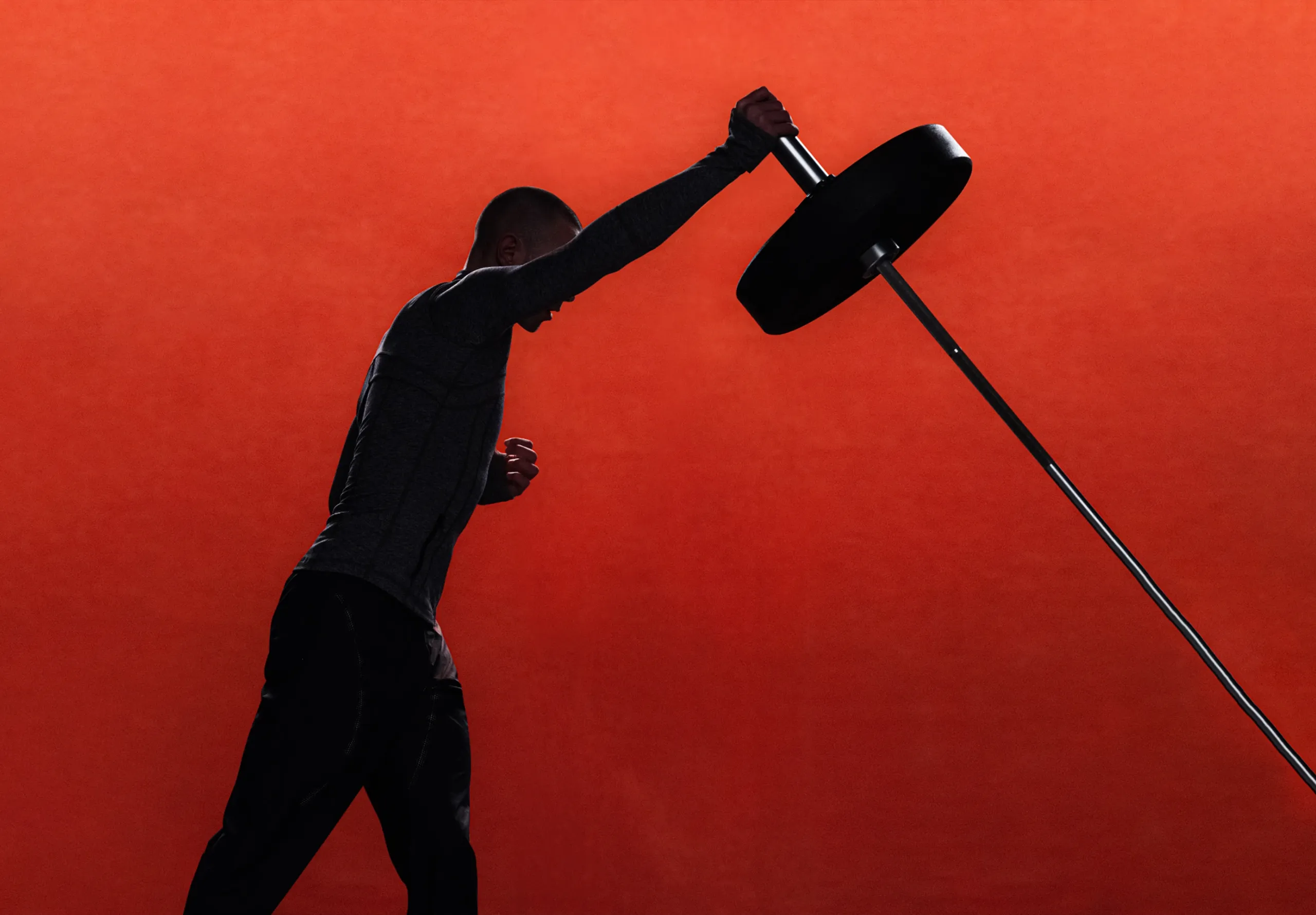
When padel’s most decorated player, Fernando Belasteguín, retired, Wilson faced the challenge of honouring a career at its peak while launching the Bela V3 racket that carries his name. The campaign framed this moment as cultural as much as sporting, with a stripped-back stage of glass walls, shadow and red carpet.
I really appreciate how the high concept aesthetic blends with retro cues, using timeless black and white with sharp red accents to iconise Bela and create a look that feels perfectly aligned with the brand.


