Inclusive, Clean digital UI
Author Dan Harfield
Lots of UI chatter through my network this month – mostly in response to a certain fruity interface update. It’s got me thinking about the kinds of inclusive UI design that quietly supports users without pulling focus. Some are recent, others have been setting the standard for years.
Here’s what stood out.
Material Design 3
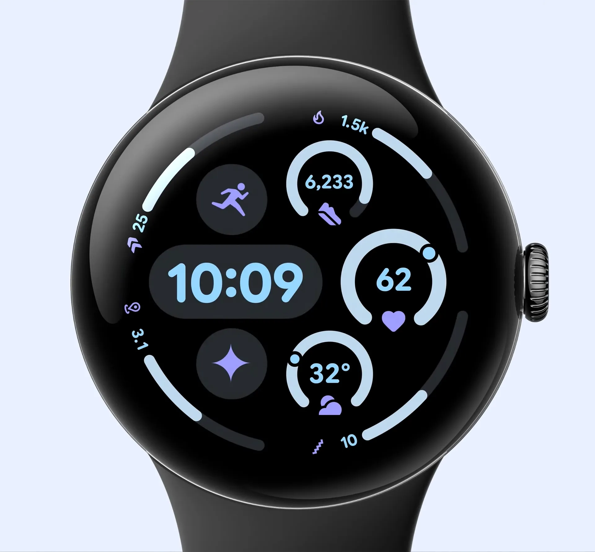
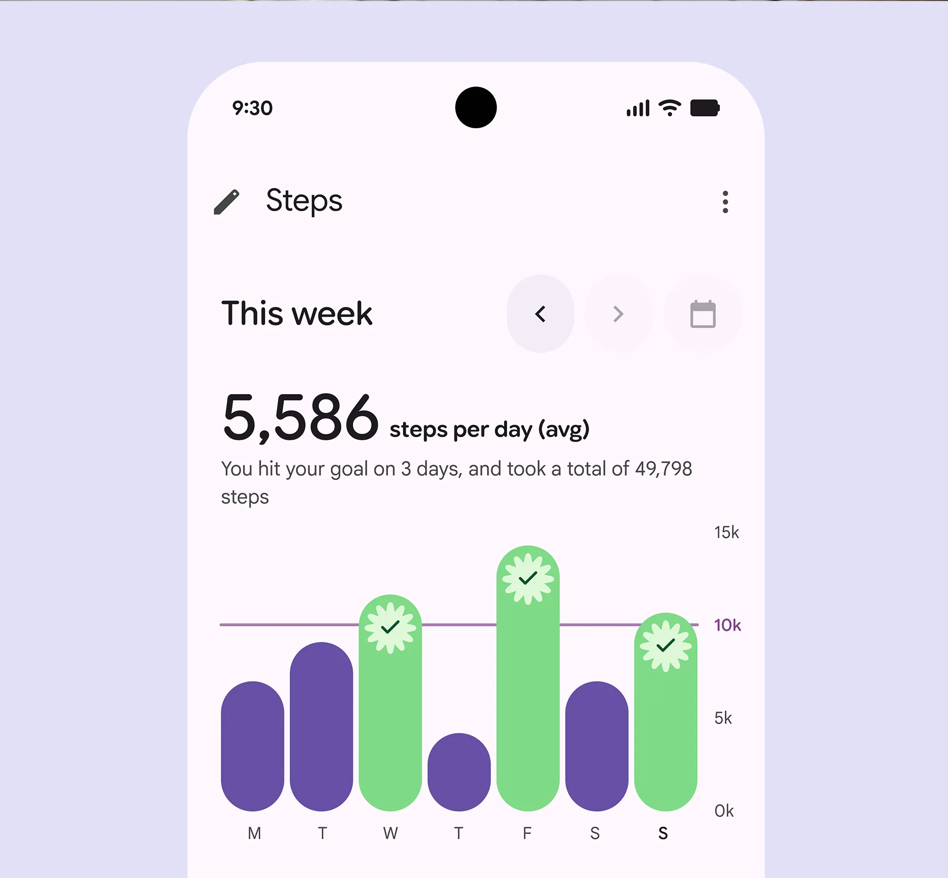
Material 3 continues to evolve as one of the most robust and adaptable design systems in use today. Its latest update, M3 Expressive, introduces a more emotional layer to the experience, bringing new colour strategies, shape libraries and motion patterns into the core framework.
Built on three years of research, it reflects a broader shift in how we relate to digital products. Interfaces now aim to resonate as well as function, with vibrant palettes, shape-morphing components and motion physics adding tone and intention, while maintaining clarity. It’s a confident counterpoint to Apple’s glass-heavy UI: less decorative, more adaptable, with enough structure to scale and enough character to stand out.
GOV.UK
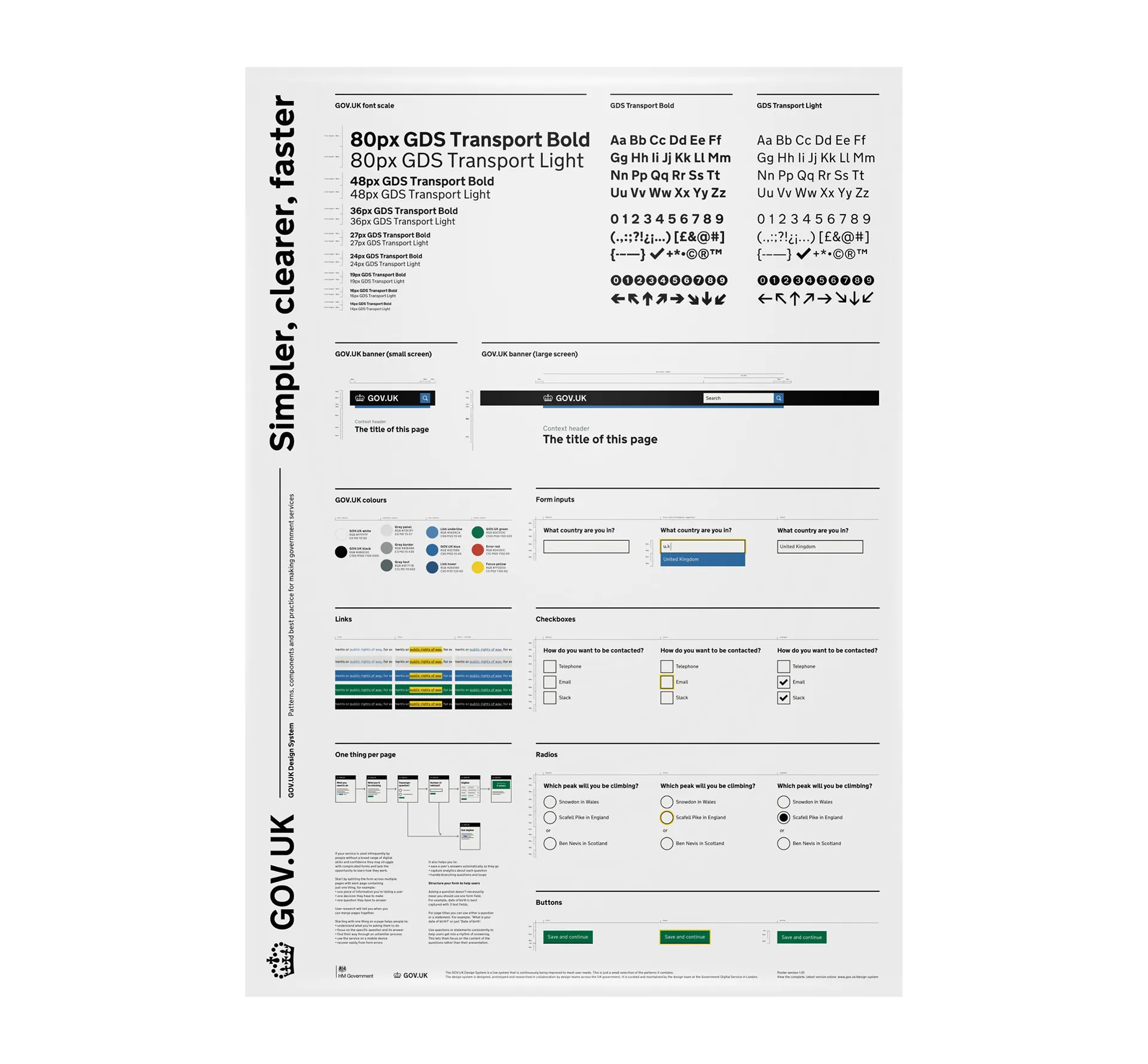
The recent outcry over the government’s logo redesign reminded me of something that felt far from superficial: the GOV.UK design system. This project was grounded in usability. It brought hundreds of fragmented digital services into a single, coherent platform designed to support as many people as possible. Every detail, from typography to load time, was considered with inclusivity at its core.
The system works with assistive technologies, functions on older devices, and stays readable in low-connectivity environments. It prioritises edge cases and, in doing so, raises the standard for everyone. It may not be the most exciting, but it remains one of the most quietly impactful pieces of digital design in recent memory.
Pio X Bakken & Bæck
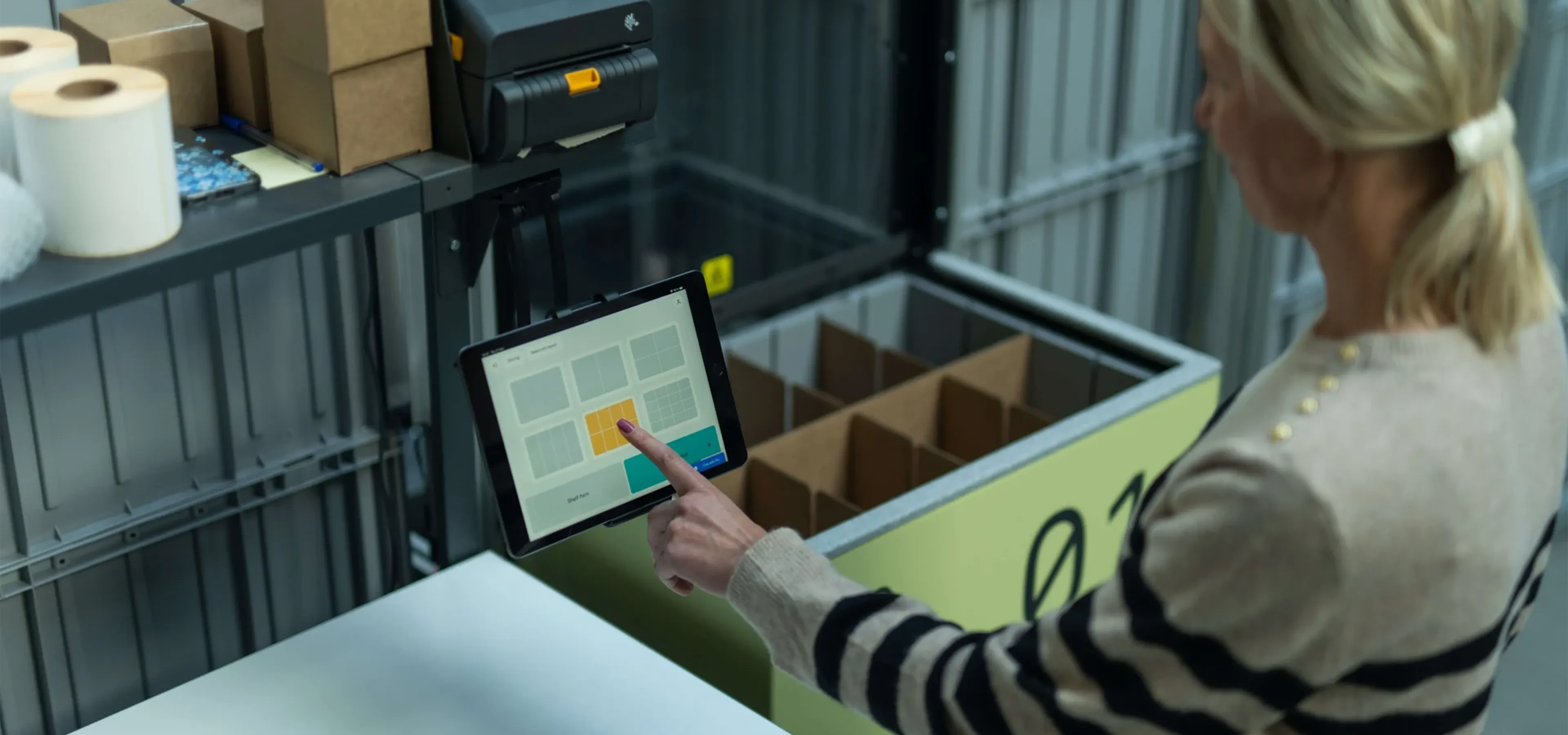
Over all, I really like the visual identity and clarity of the Pio brand – in particular, its application into the UI design. It feels designed for purpose, in a fulfilment setting, you need large ‘hittable’ targets, with visual clarity to minimise read-time and errors.
The interface delivers on that with smart spacing, strong contrast and a confident sense of hierarchy. There’s no unnecessary detail, just a well-judged system that helps people move quickly and accurately. It’s a great example of functionality supported by design, not just aesthetics.
AirBnb Summer Release 2025
I really rate Airbnb’s move into experiences and services, all delivered through a world-class UX. The latest Summer Release is a great example of how to balance utility with atmosphere. It needs to do a lot: surface information, guide choices, streamline booking. But it still manages to hold on to the emotional part of the journey.
There’s clarity in the layout, consistency in the details, and just enough visual charm to keep it feeling personal. The platform gets a fair amount of criticism, but from a design perspective, there’s a lot they continue to get right.
