Brand
Author Sakshi Seth
Brand becomes most interesting when it moves beyond a logo and starts to live across everything a company creates – in tone, behaviour, systems and presence. This month, I was drawn to brands that carry a clear identity across categories, building something recognisable through consistency and intent.
Here are four that really stayed with me.


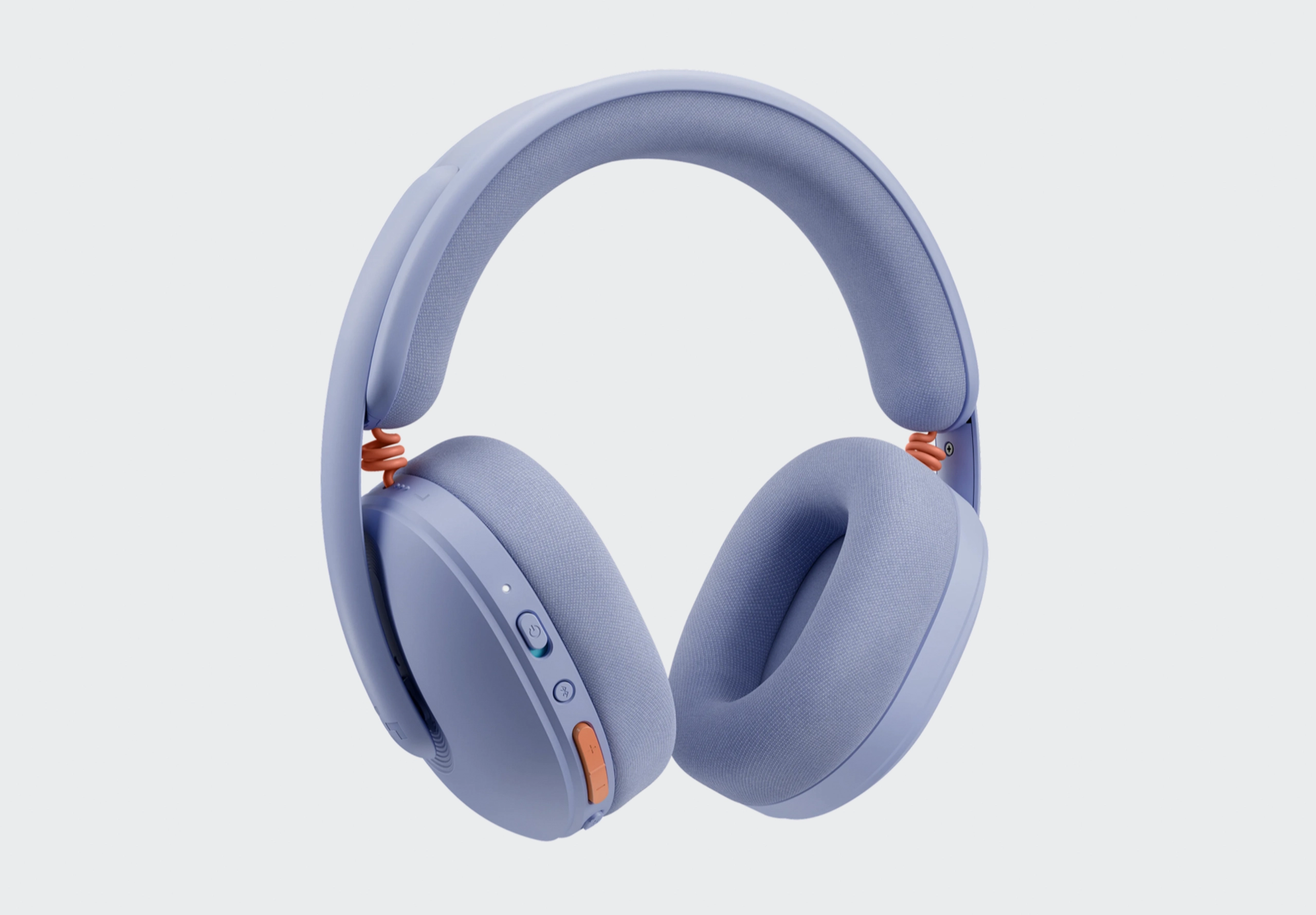
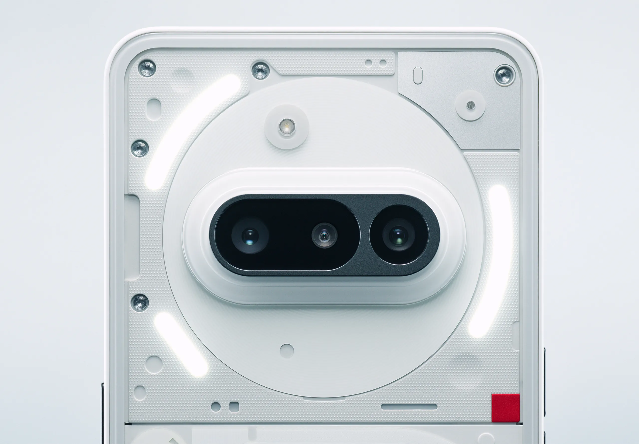
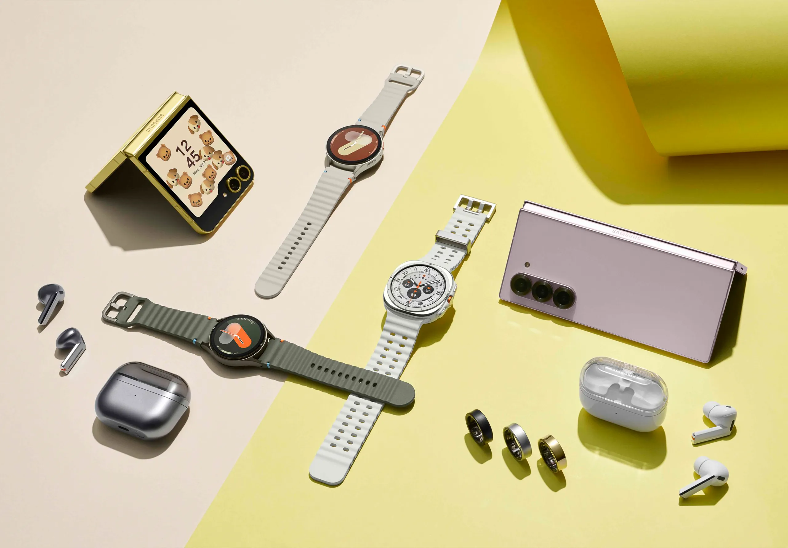
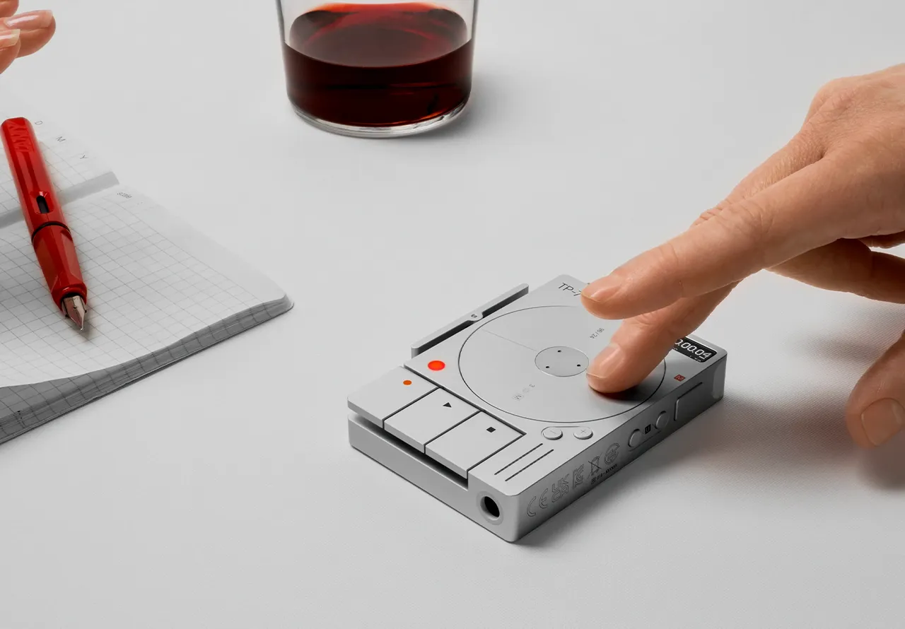
What always strikes me with Google is how seamlessly everything connects. The colour system does so much of the work; those primary tones carrying across interfaces, icons and hardware in a way that feels instantly familiar.
Geometry, spacing and motion all follow the same logic, so whether you’re using an app or holding a device, it feels part of the same system. Even transitions reinforce that identity, they’re smooth and responsive in a way that adds clarity.


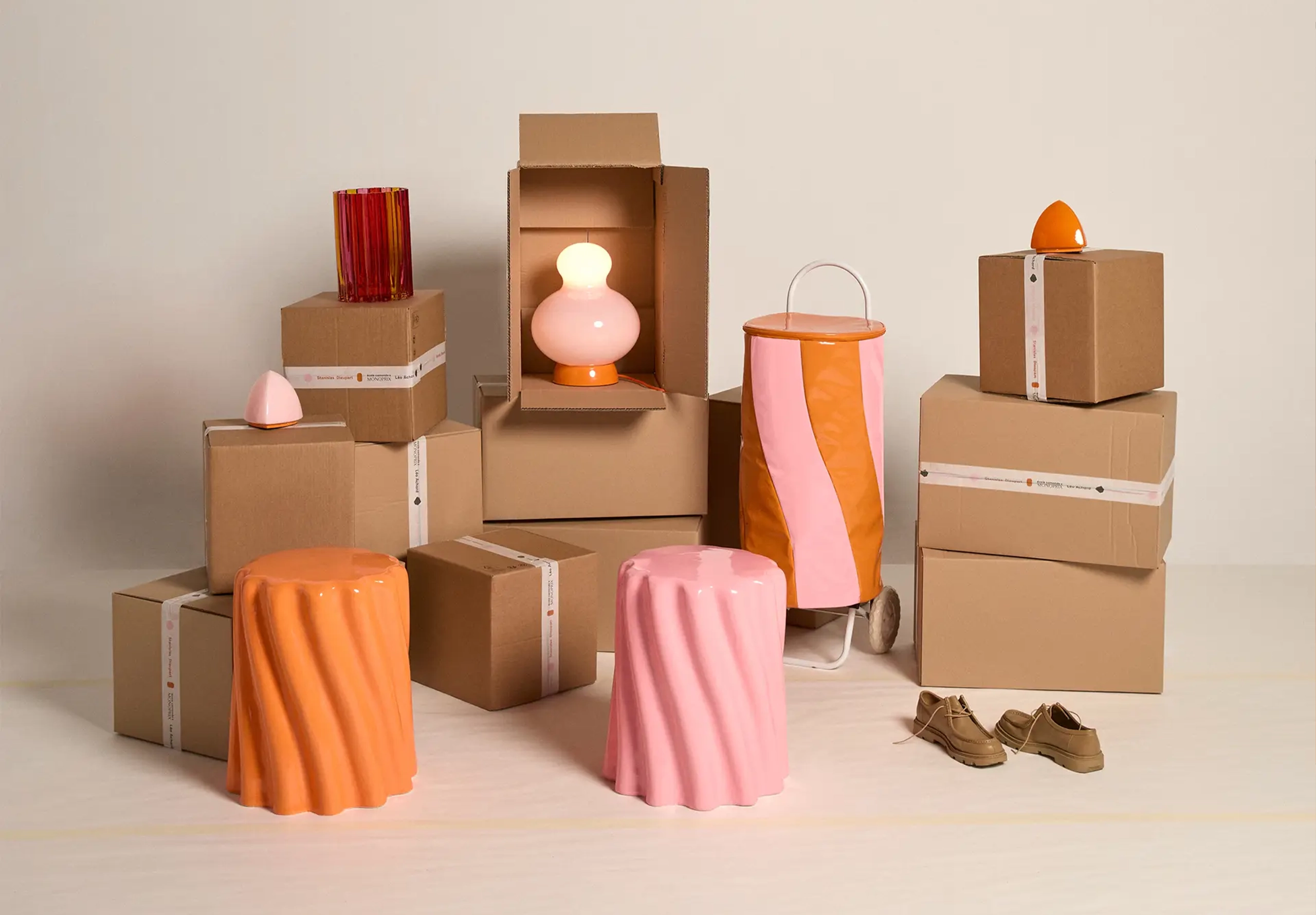
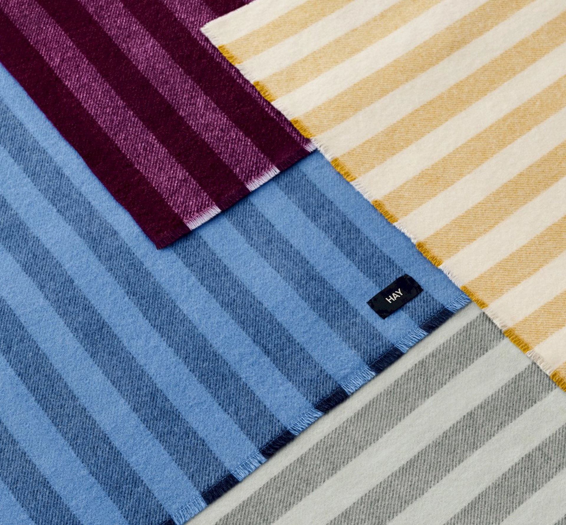
Hay
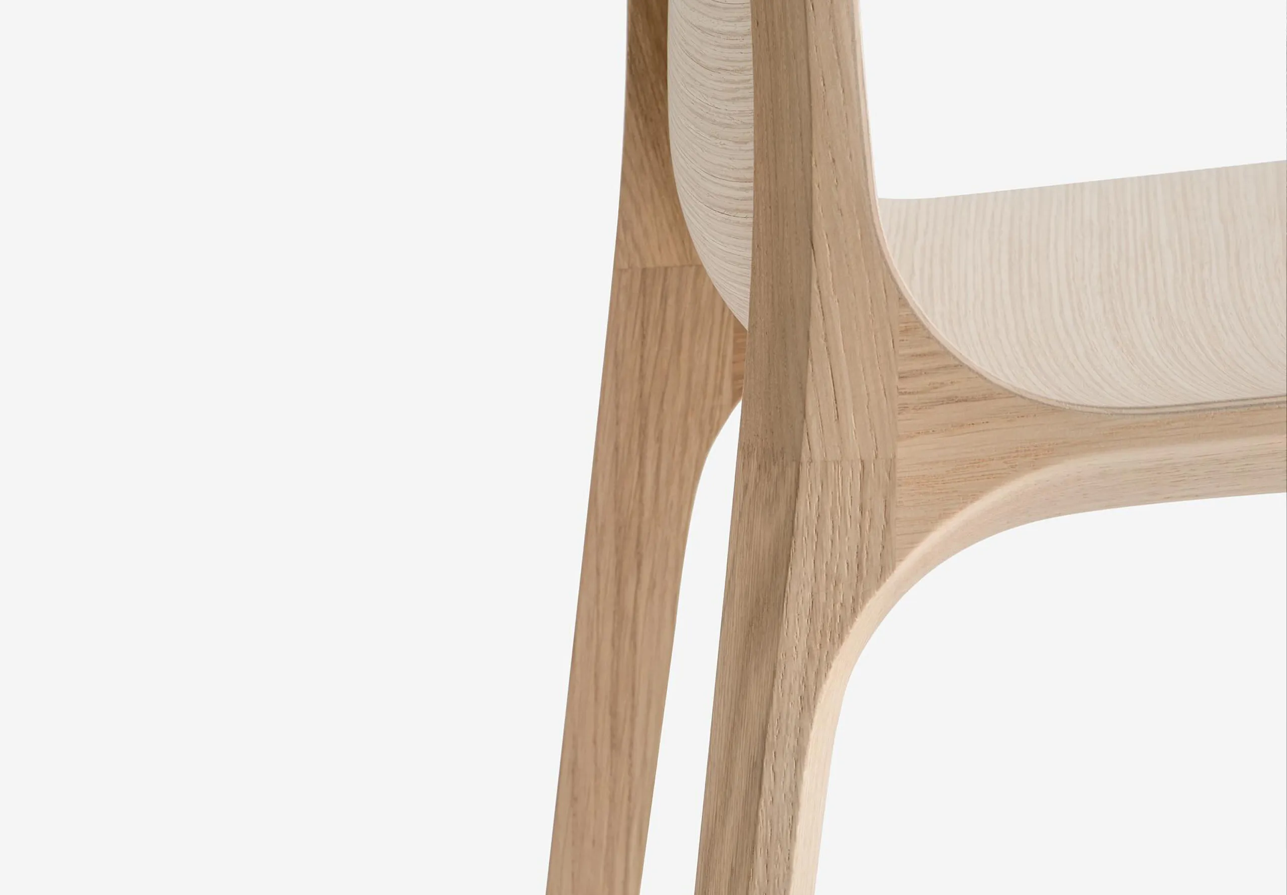
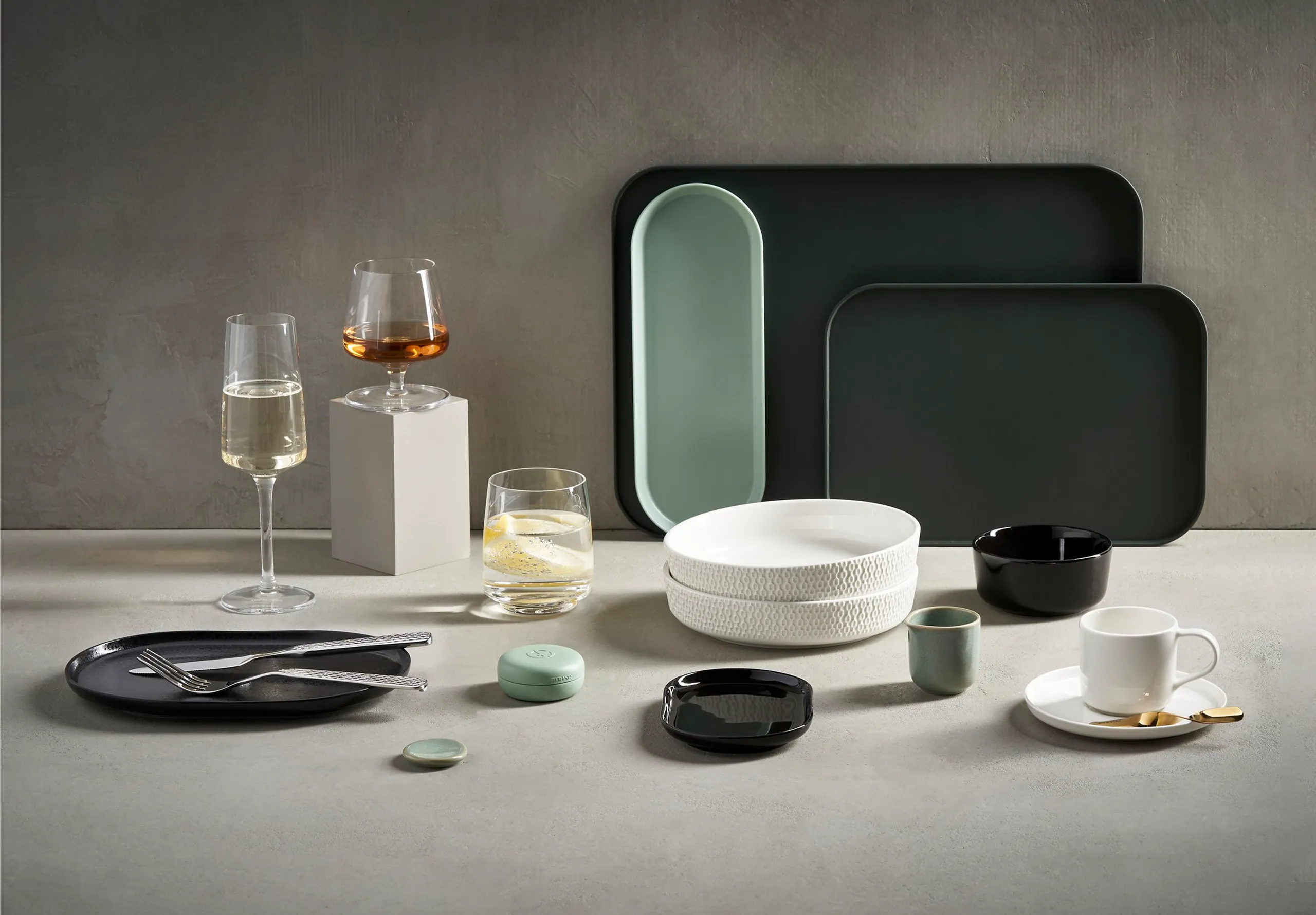
HAY caught my eye for how confidently it lets colour take the lead. The forms stay simple, which gives the palette space to define the object. Across furniture and homeware, everything feels connected through proportion and repetition.
I love how controlled it feels. The contrasts stay bold yet measured, finishes remain soft and matte, and edges feel light and precise. It turns everyday objects into something more intentional through clarity rather than complexity.


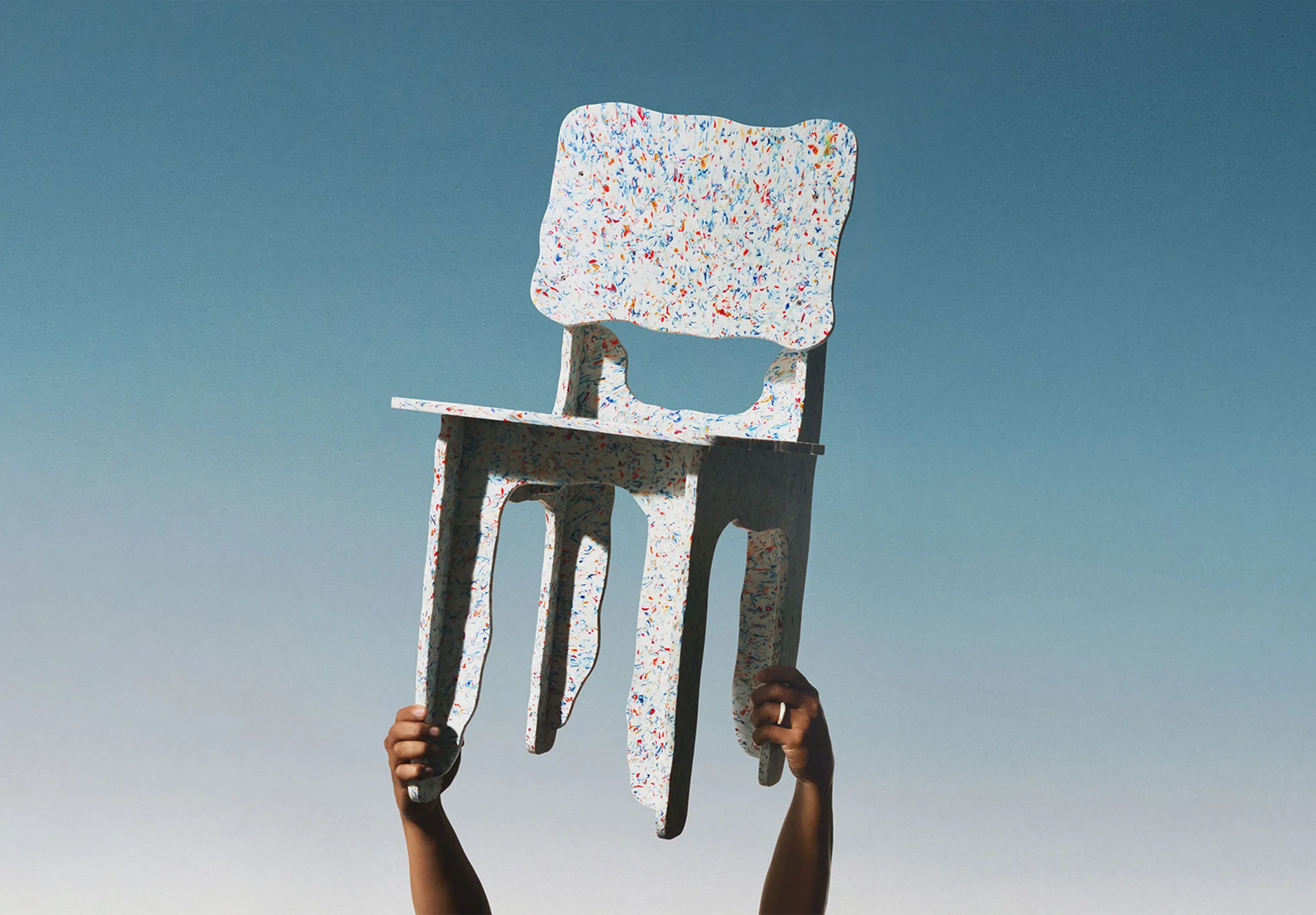
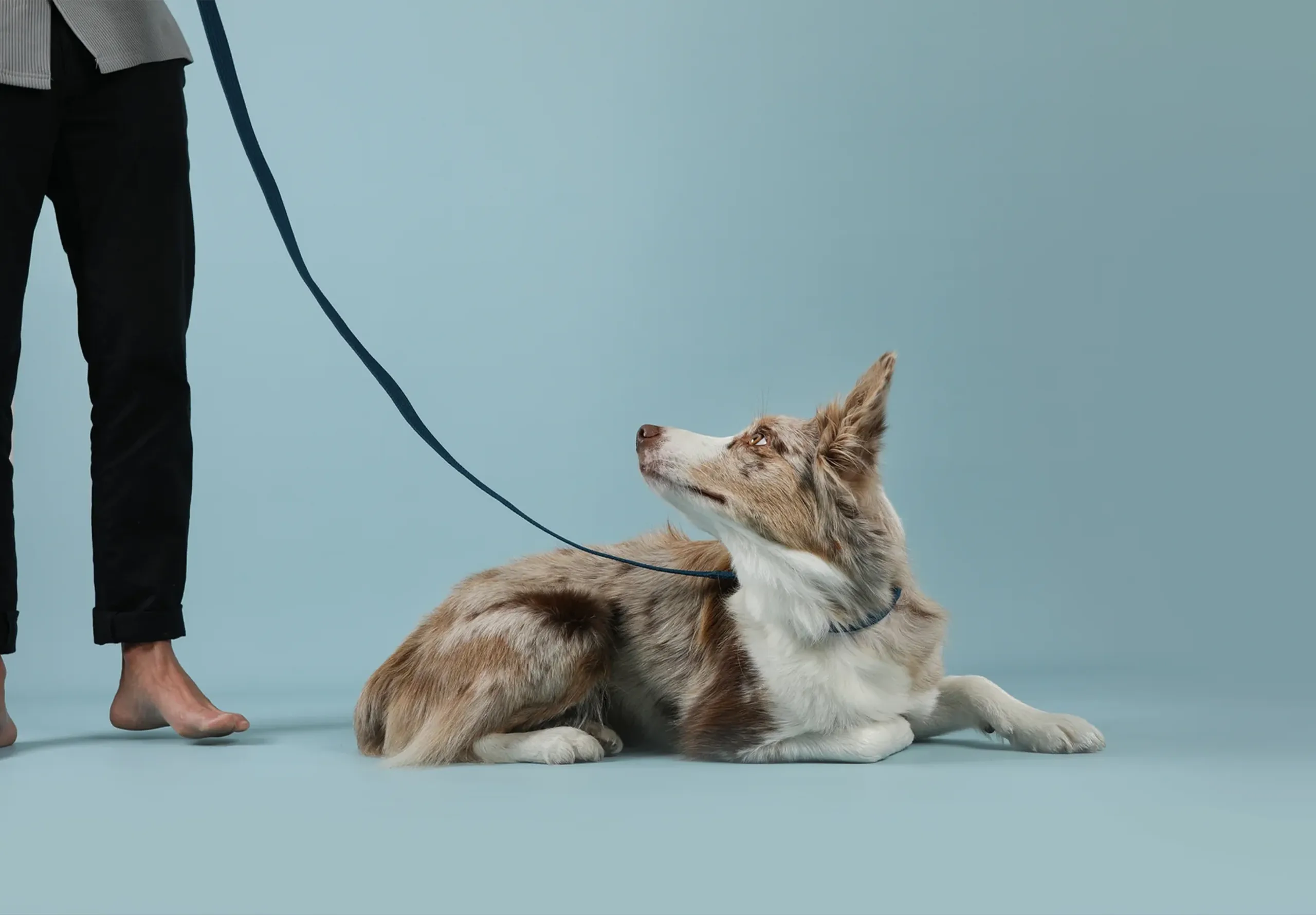
Lucy & Yak
Fans of the brand can spot Lucy & Yak prints a mile off. The prints have a hand-drawn quality, the styling feels relaxed, the colour combinations feel instinctive – and yet there’s real intent holding it all together.
That balance is hard to strike. Too loose and it reads as chaotic; too controlled and you lose the warmth. Lucy & Yak sits right in the sweet spot, and the community that’s formed around it reflects exactly that openness.


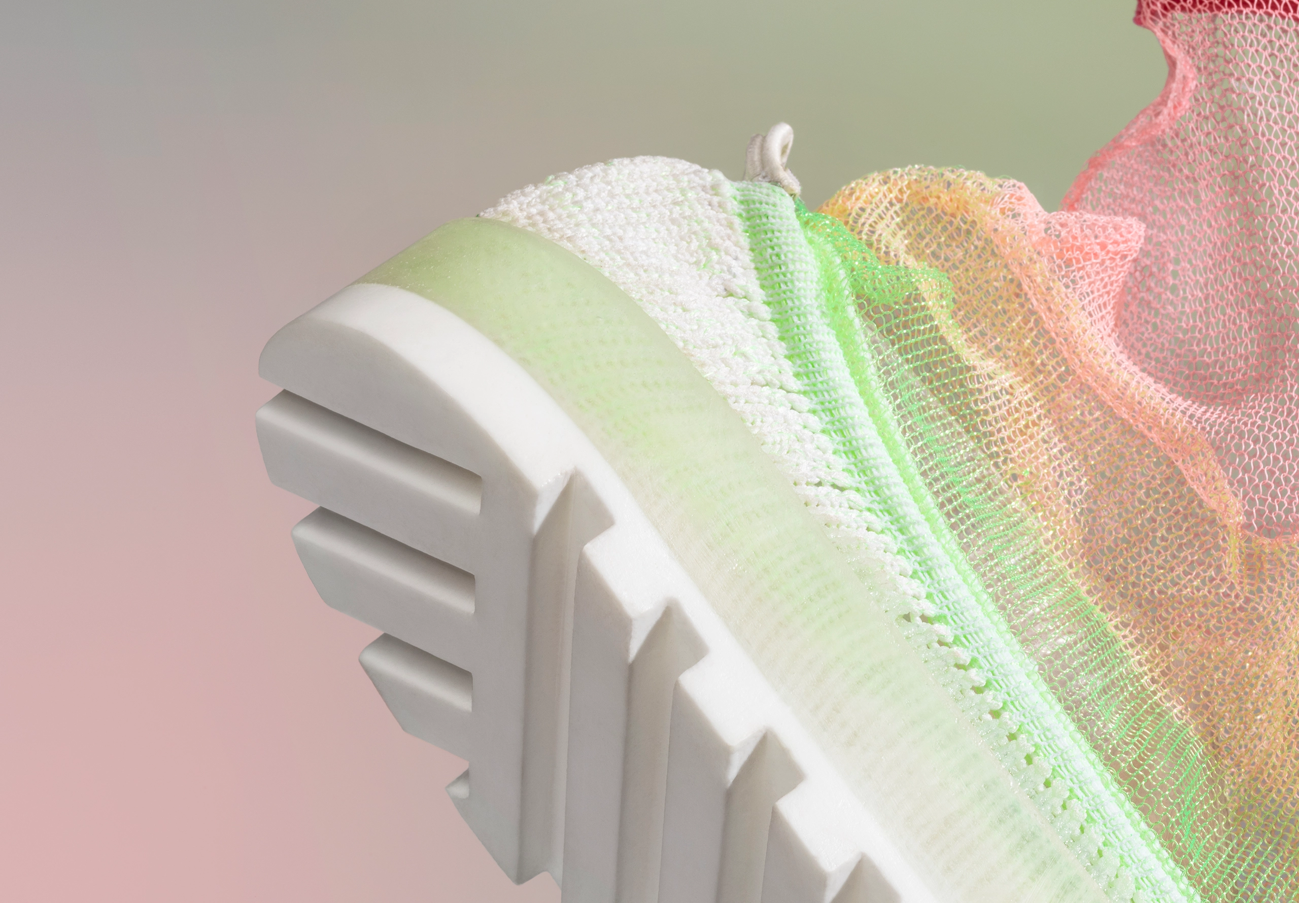
New Balance
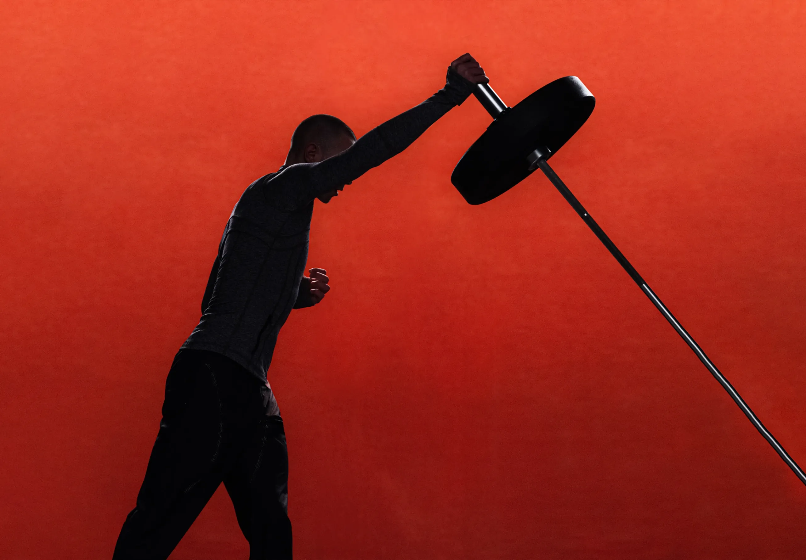
New Balance sits in an interesting place, sport softened into everyday life, performance present but never pushed in your face. You see it on runners, on dads, on fashion week streets, and it all feels connected rather than repositioned.
There’s a consistency across footwear, apparel and collaborations that reads less like brand management and more like a point of view held over time. The same attitude carries through wherever it lands, building familiarity through repetition rather than reinvention.