How brands adapt
Identity used to mean consistency. Now it means controlled adaptation. In this piece, we explore how elasticity has become a core component of brand expression and examine the brands doing it best.
Short on time? Use these links

The new rules of brand recognition
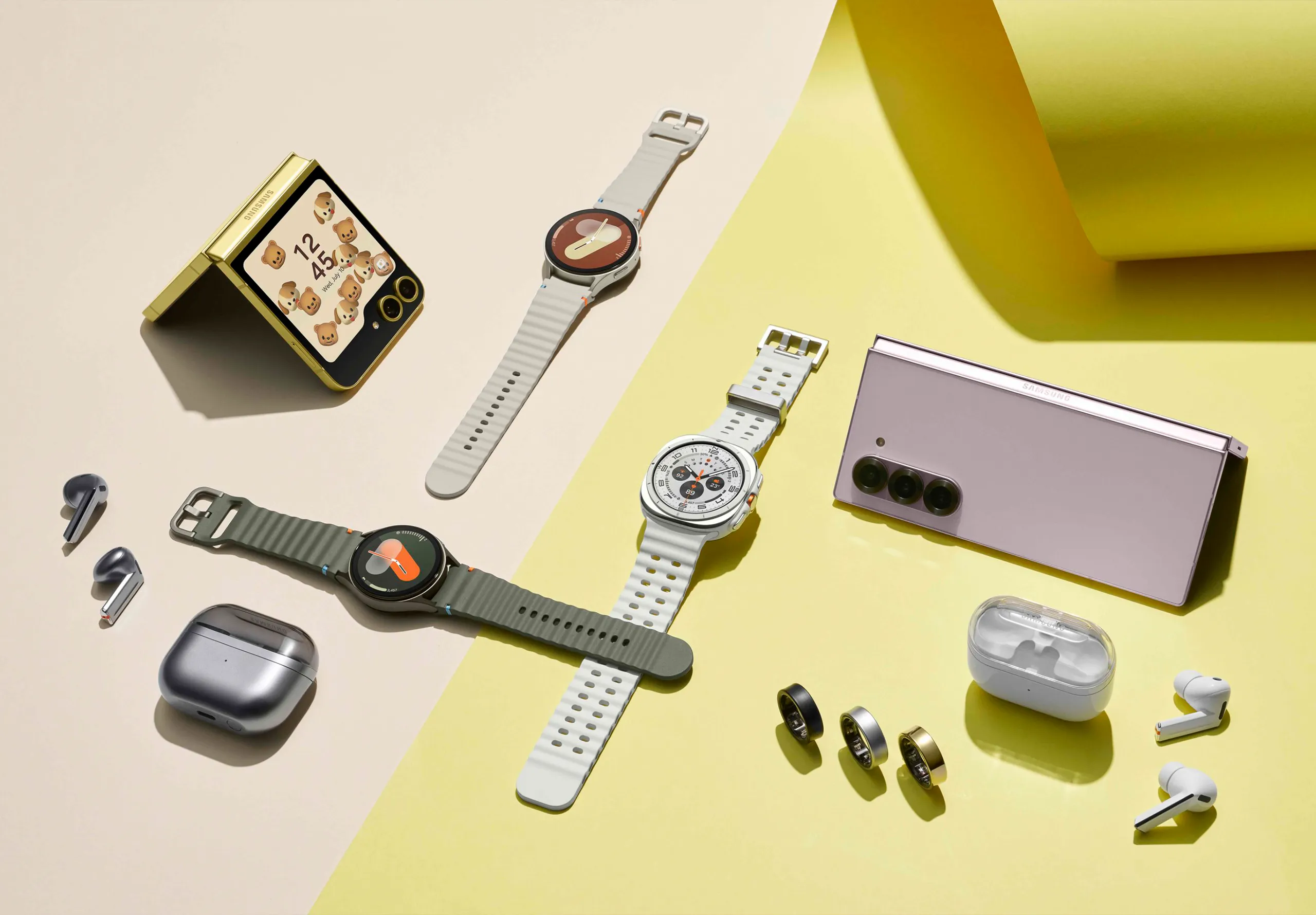
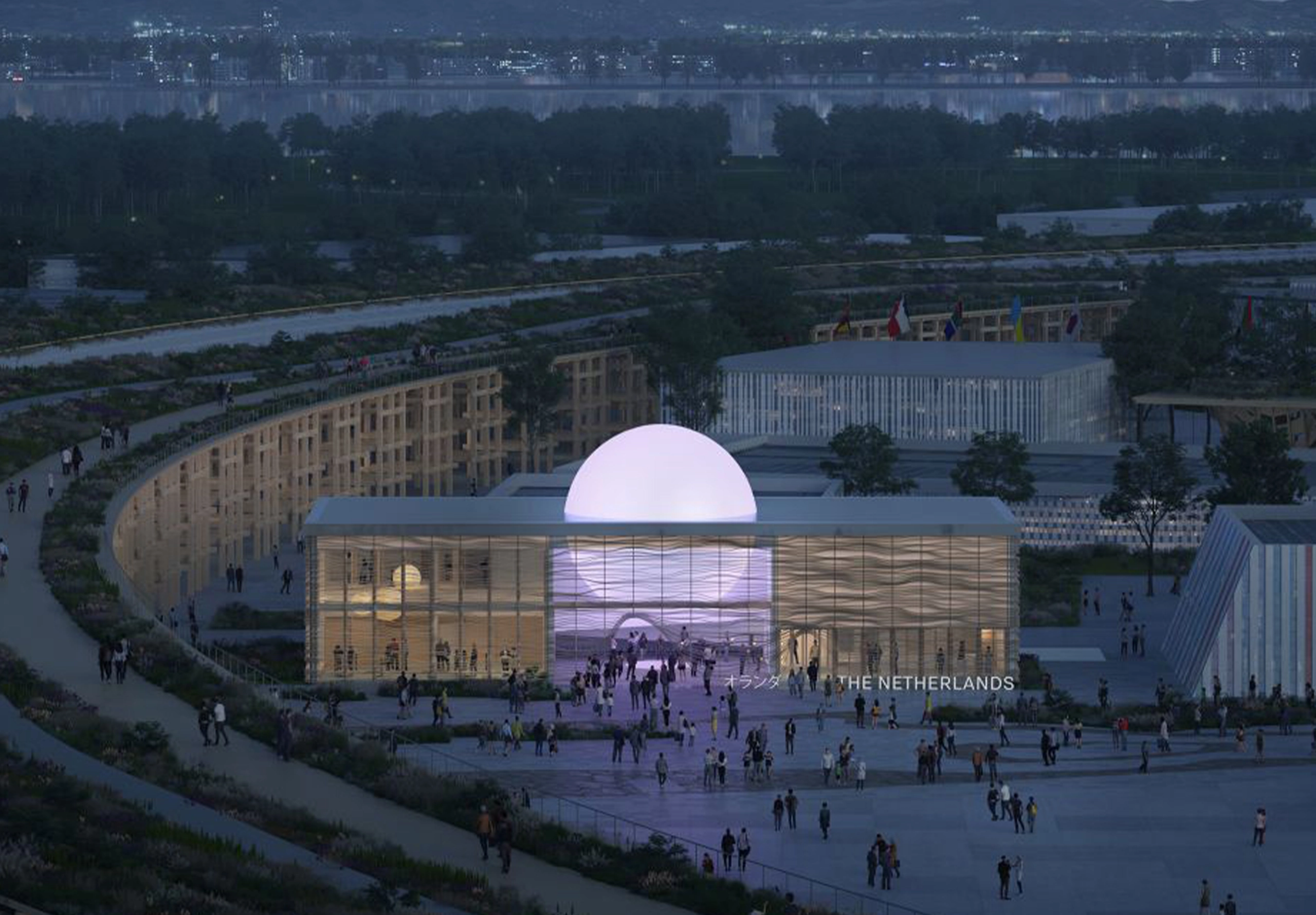
The rules have changed. Where brands once relied on stable touchpoints – packaging, print, retail – they now exist across a fast-moving ecosystem of platforms, products and experiences. Instagram demands immediacy, TikTok demands motion, retail demands materiality, products demand coherent form language. Reputation demands sensitive adaptation to all.
The old model of rigidity has given way to freedom of expression. What has emerged is elastic branding.


Why elasticity matters
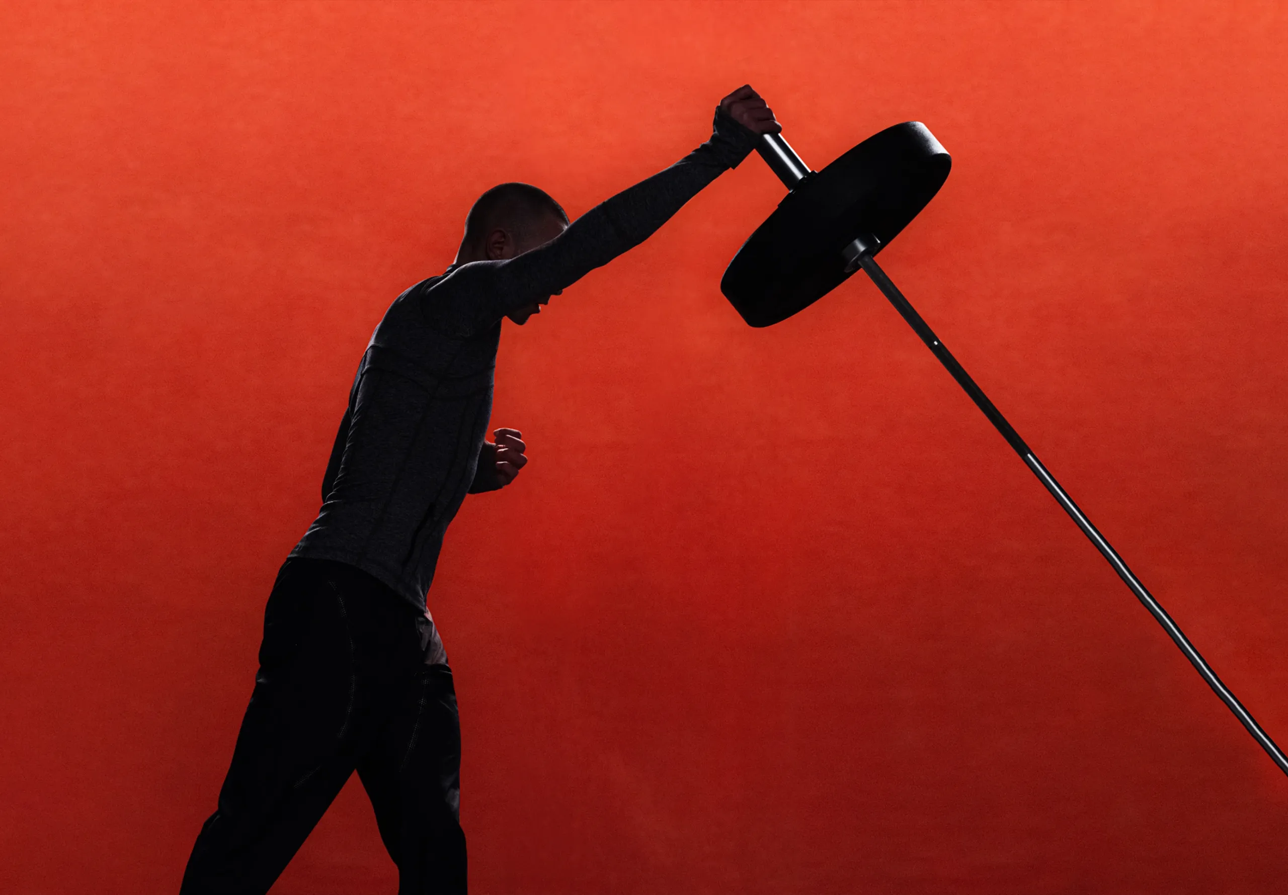
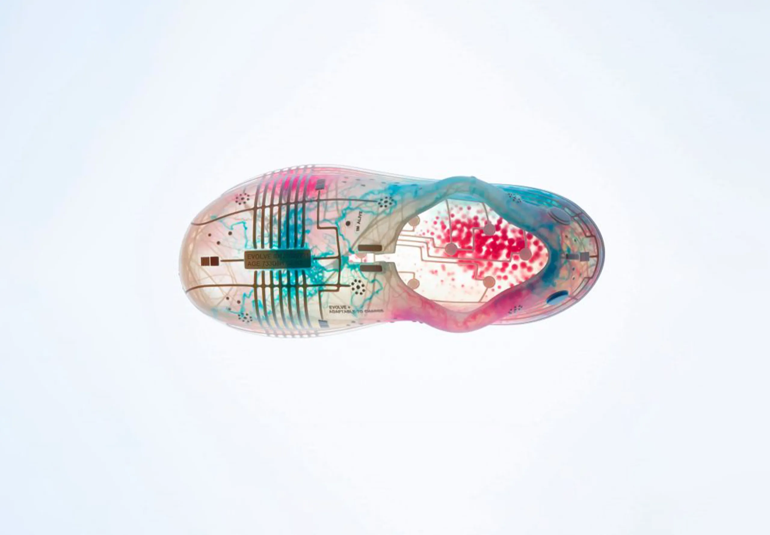
Brand identity now lives in how products behave over time. Recognition is increasingly built through product behaviour: performance signatures, interaction feel, material honesty, ageing patterns, repair logic. Brands become familiar through how they work and feel, not what they look like in a single moment.


How elasticity works
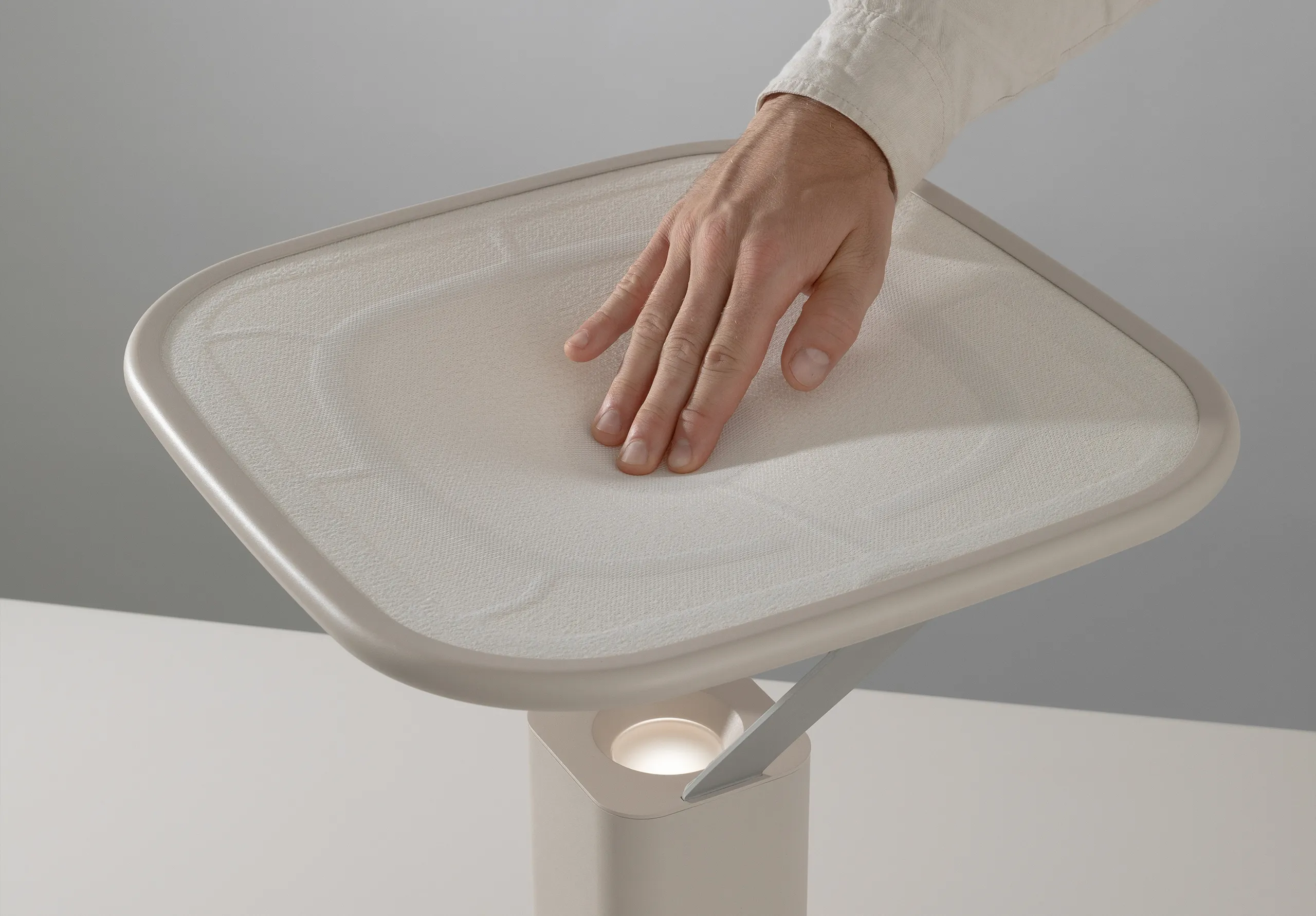
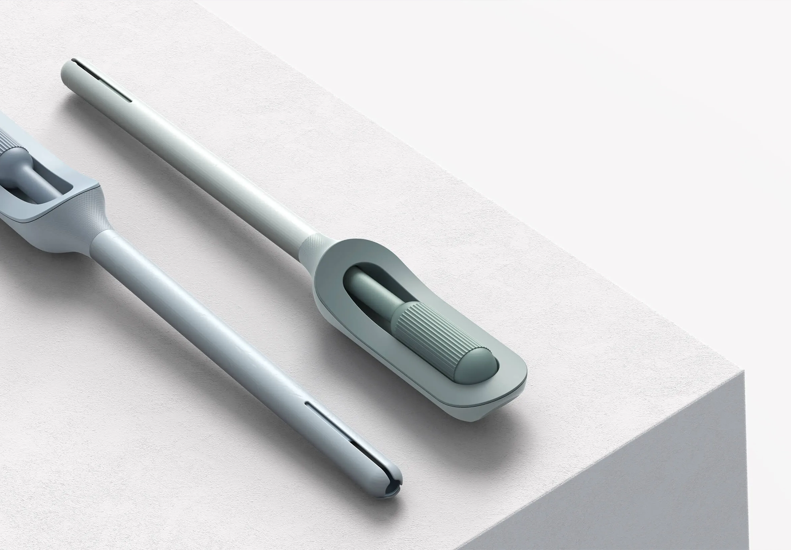
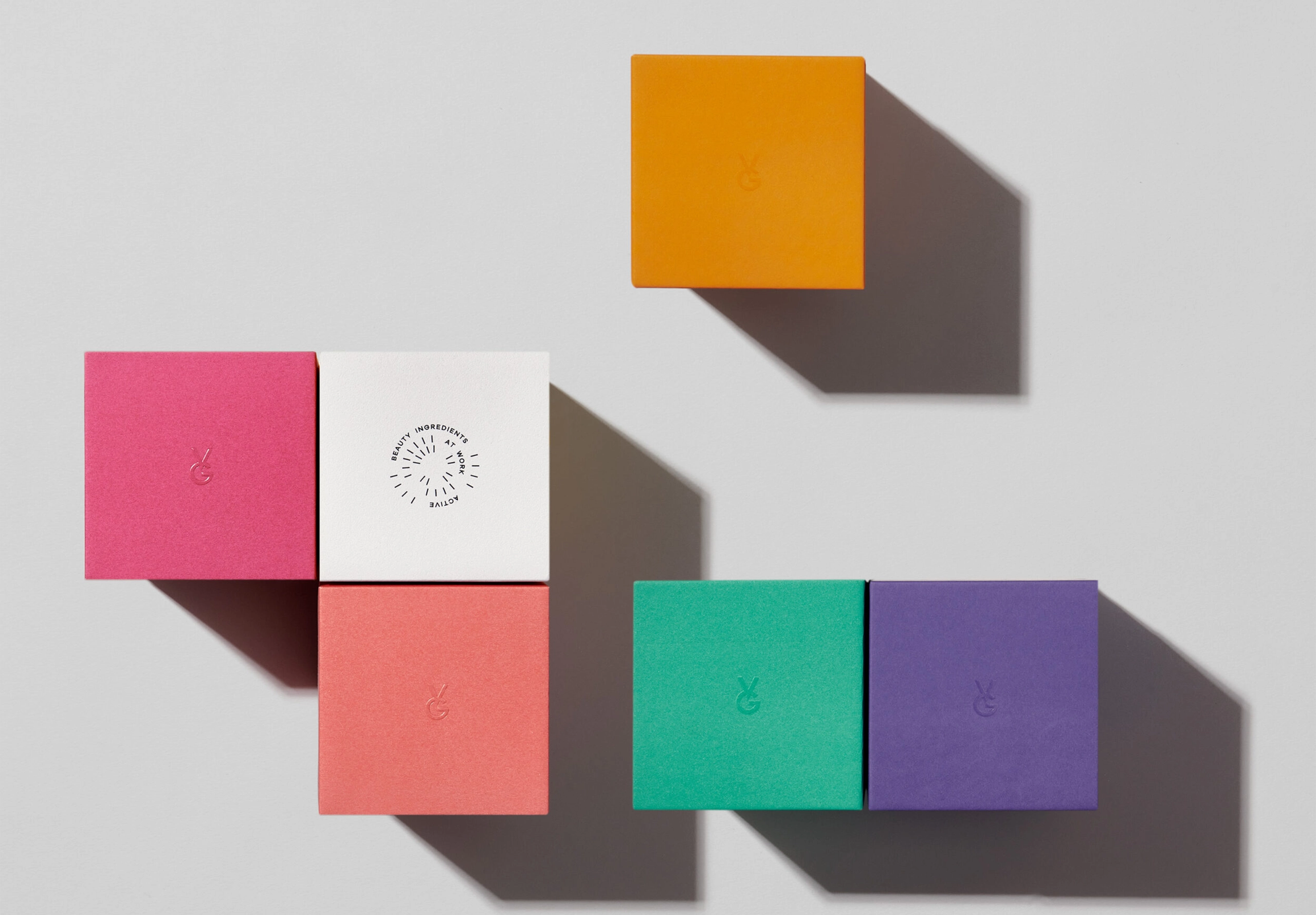
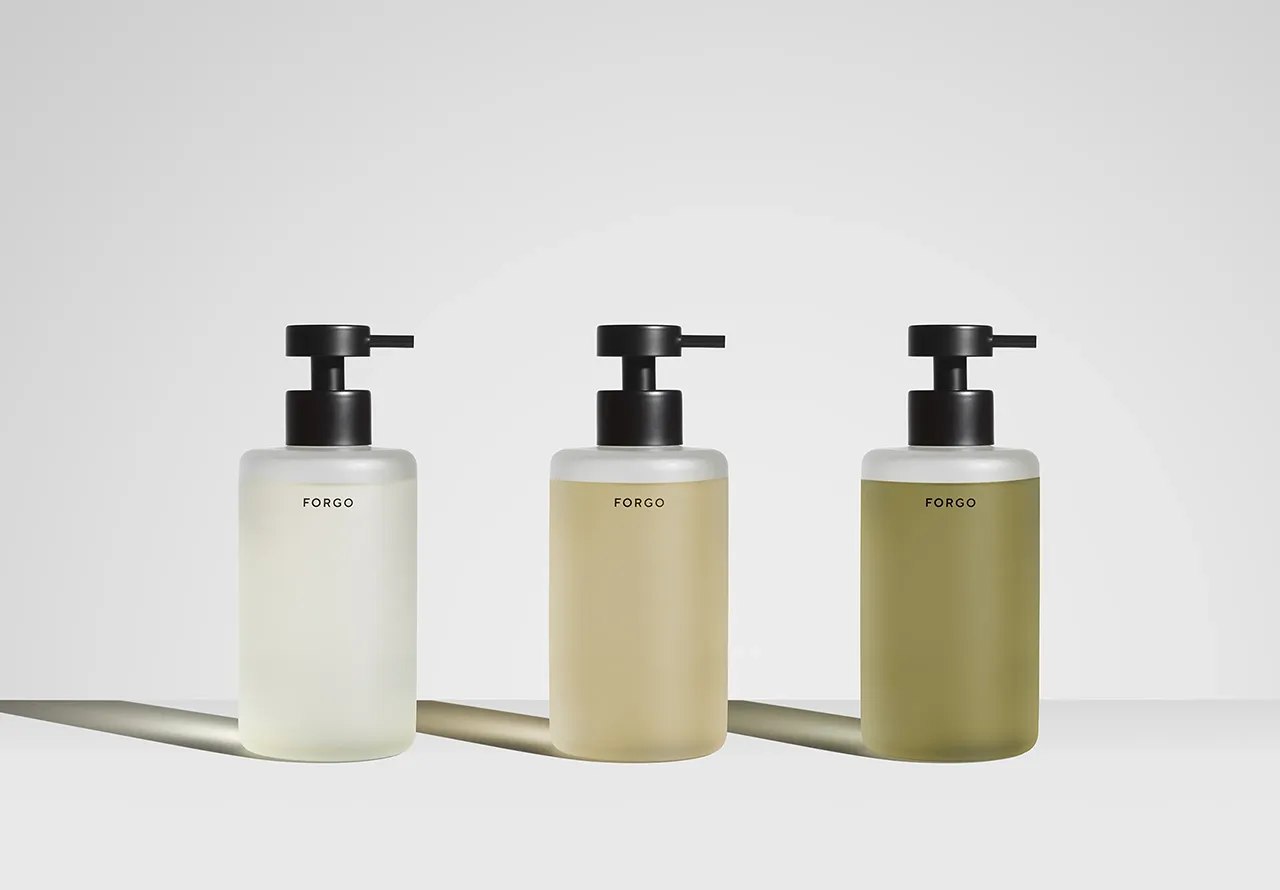
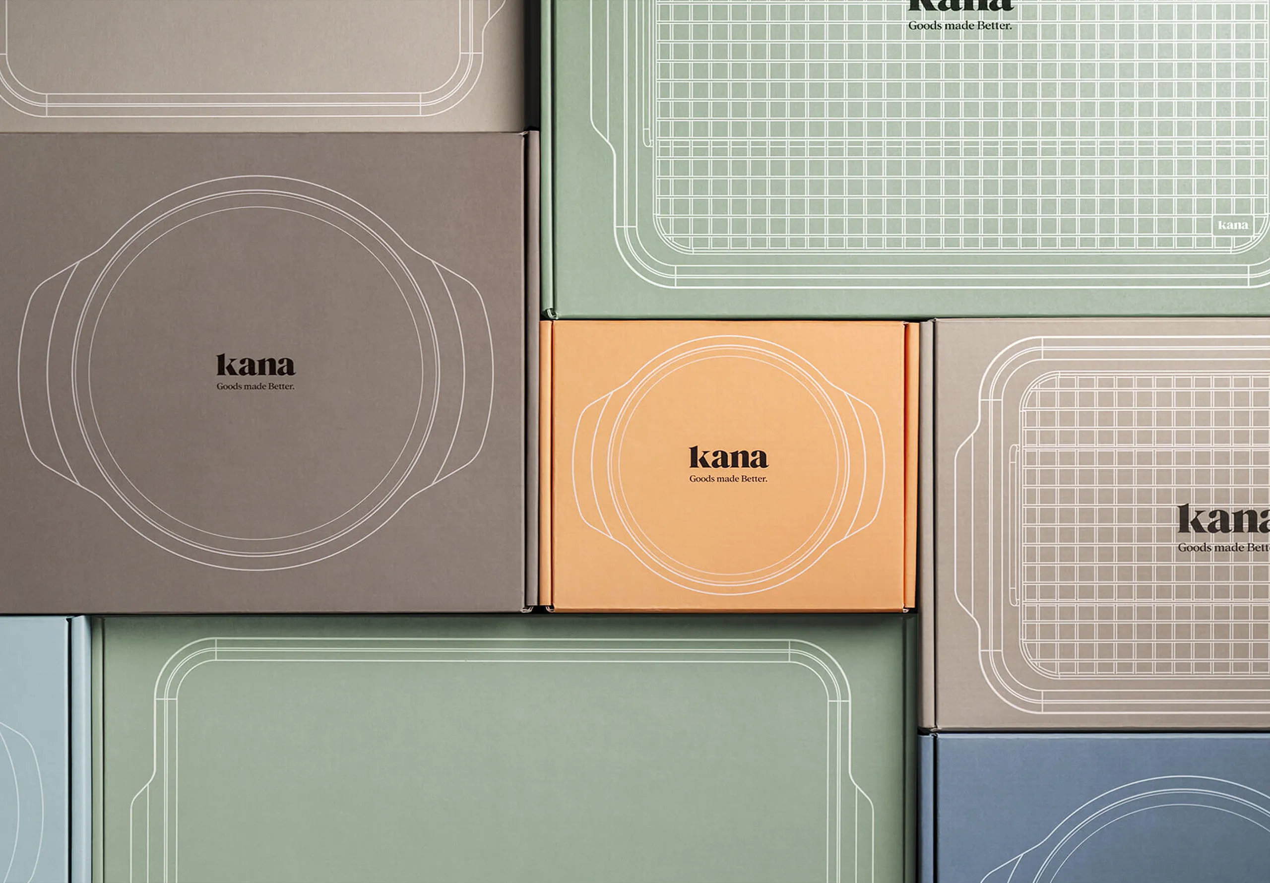
Elastic brands separate into two layers. The core code contains the brand’s emotional truth: its founding philosophy, behavioural tone, sensory anchors. This stays fixed. The flexible expression includes CMF, packaging, campaigns, product categories. This layer stretches constantly in response to cultural shifts.
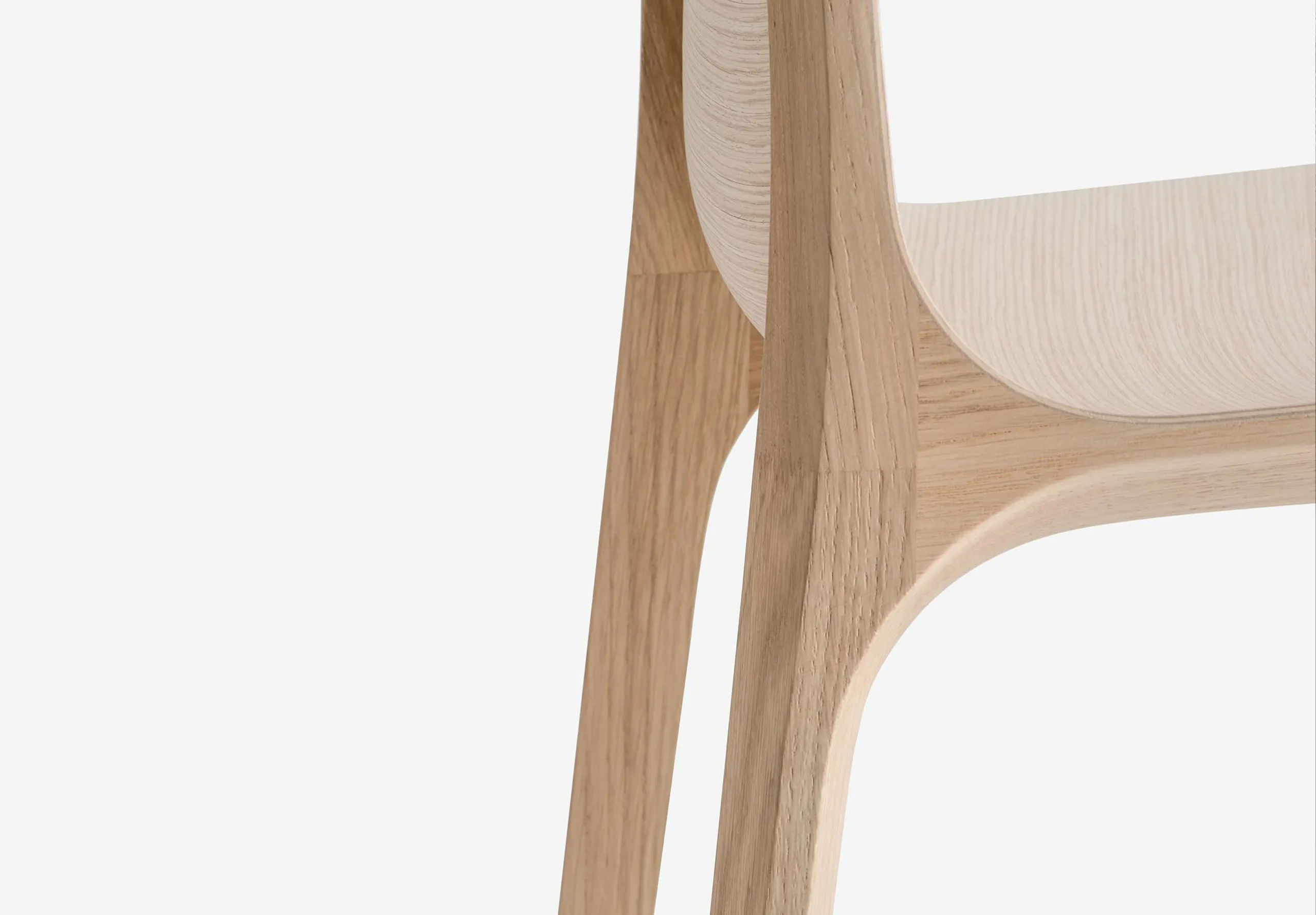
Braun’s core code centres on functional honesty: visual clarity and performance. Forms, proportions and materials have varied across decades, yet Braun remains instantly recognisable because the design intent stays constant. Modern Series 9 shavers coexist with Dieter Rams’ legacy without copying it. The belief is stable, while the language evolves.


Context and architecture
If you’ve ever been to an Aesop store, you’ll recognise the feeling instantly – even though no two look alike. Each store responds to its local architecture and materials – reclaimed timber in Melbourne, volcanic stone in Seoul, library shelving in London. Yet all feel like Aesop through pace, light quality and botanical cues. Aesop achieves coherence through sensory consistency rather than visual repetition. The brand becomes a feeling you recognise before you see the name.


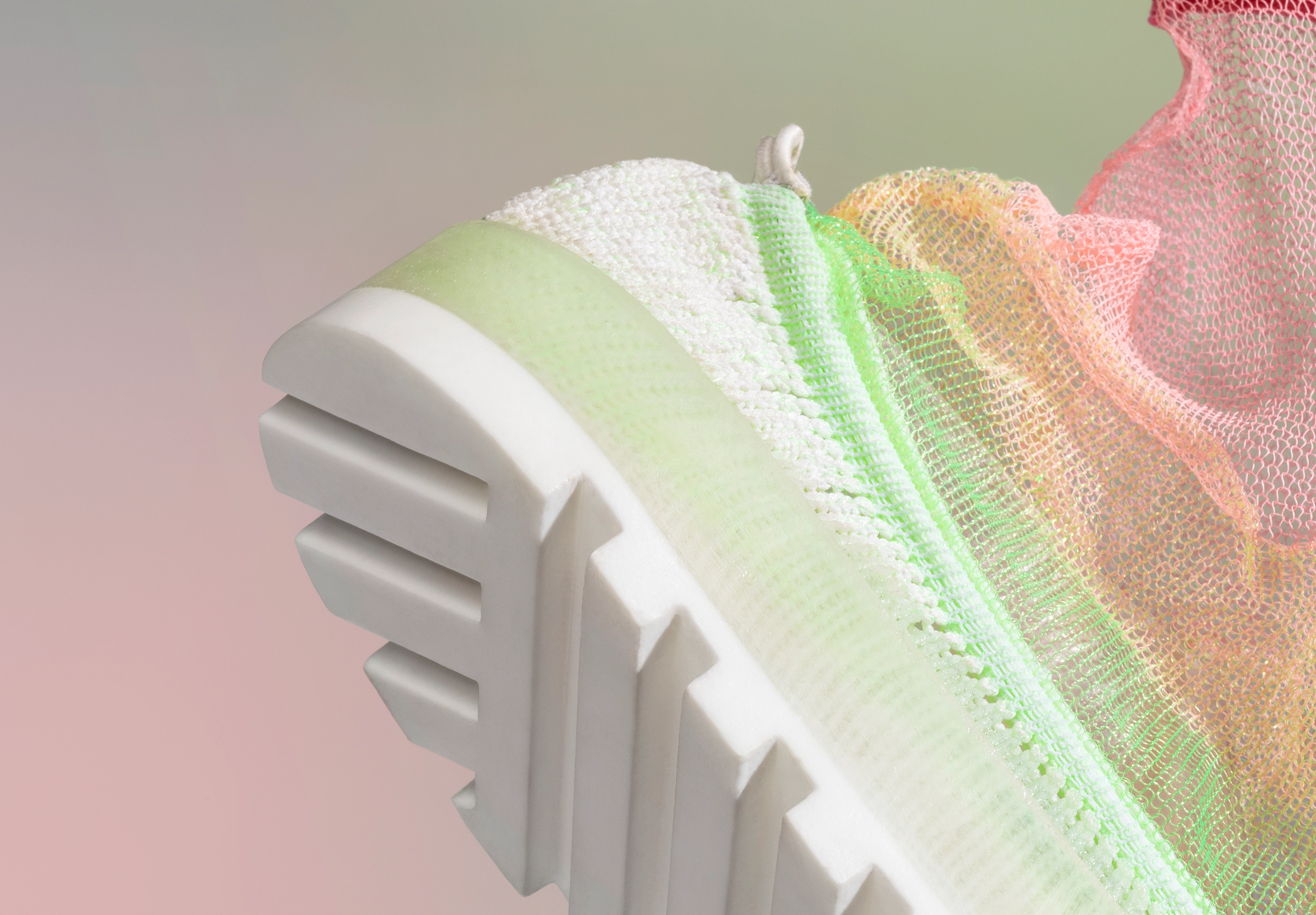
Material science as an identity driver
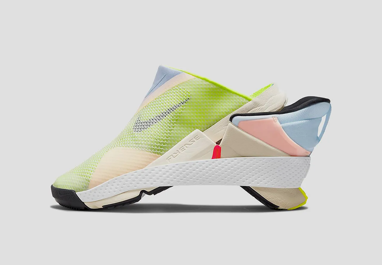
Some brands anchor identity in how products perform rather than how they look, and Nike is a perfect example. Flyknit, Air, React, Grind – each material system introduces new structural possibilities that reshape product appearance completely.
An Air Max from 1987 and one from 2024 share almost no common geometry, yet they feel like the same lineage through exaggerated cushioning, sweeping midsole lines, and performance-forward silhouettes. Identity sits in movement, propulsion, energy, not in fixed forms.


Elasticity across categories
The true test of elasticity comes when brands expand beyond their original territory, stretching across fundamentally different use cases while maintaining coherence.
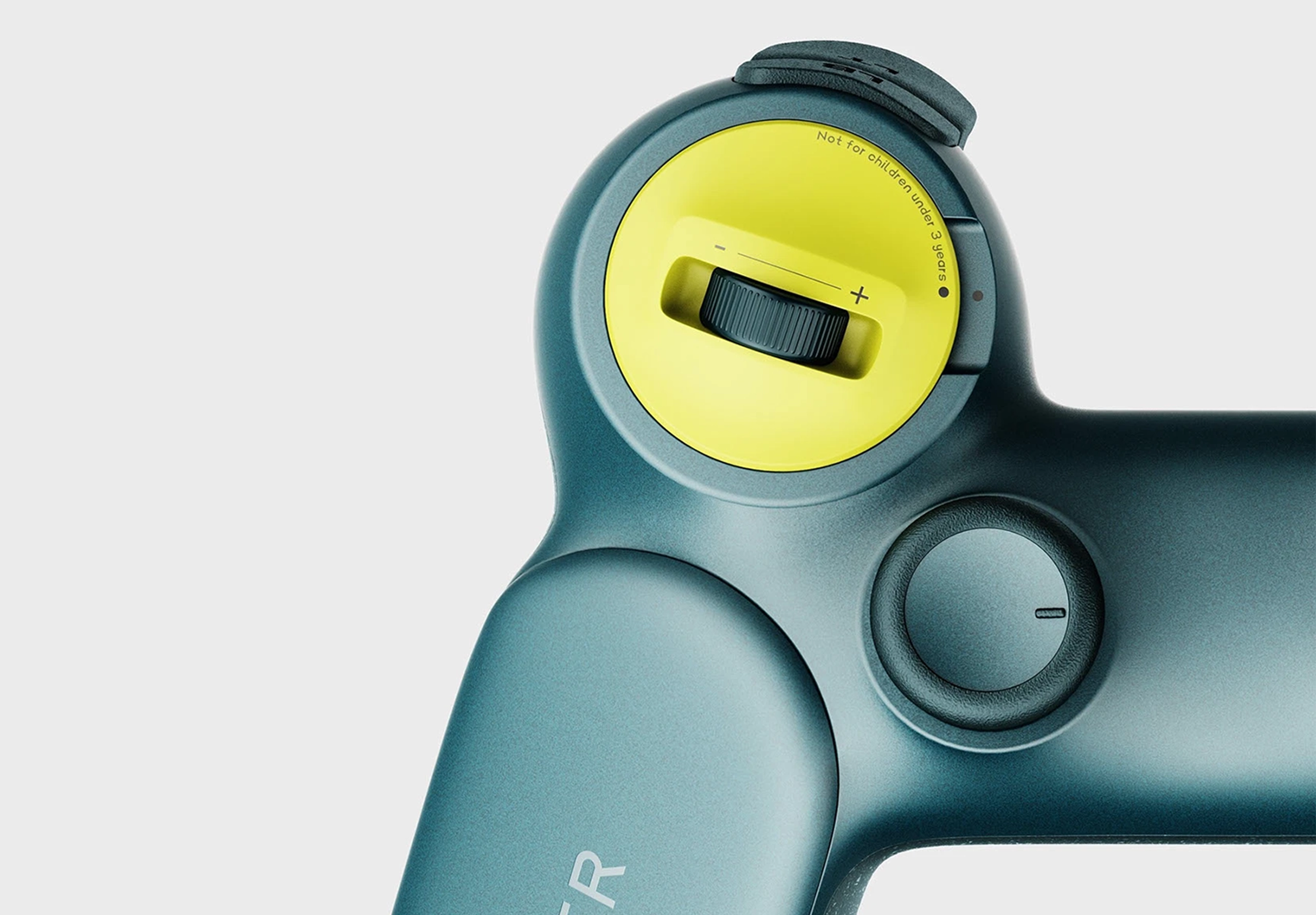
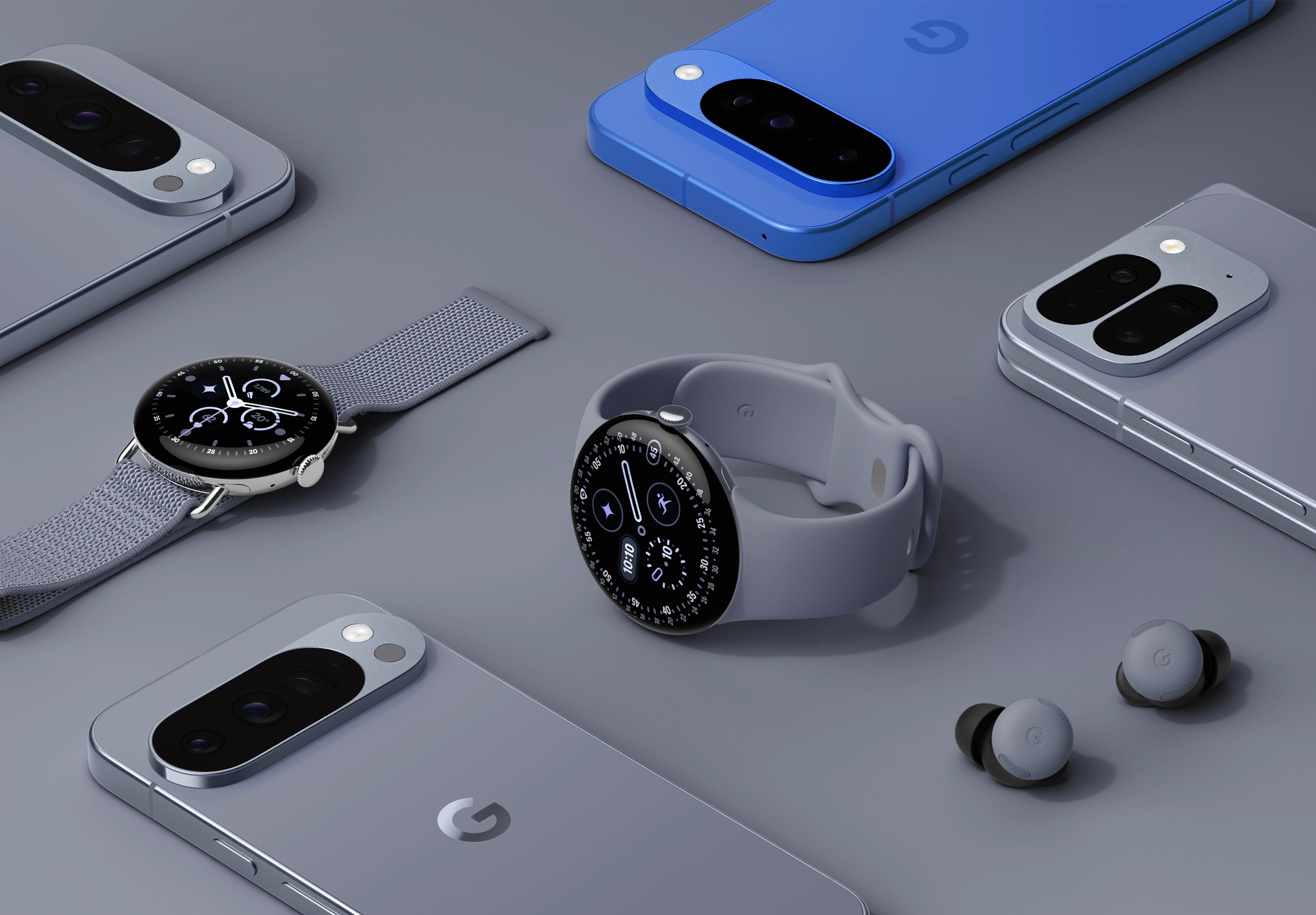
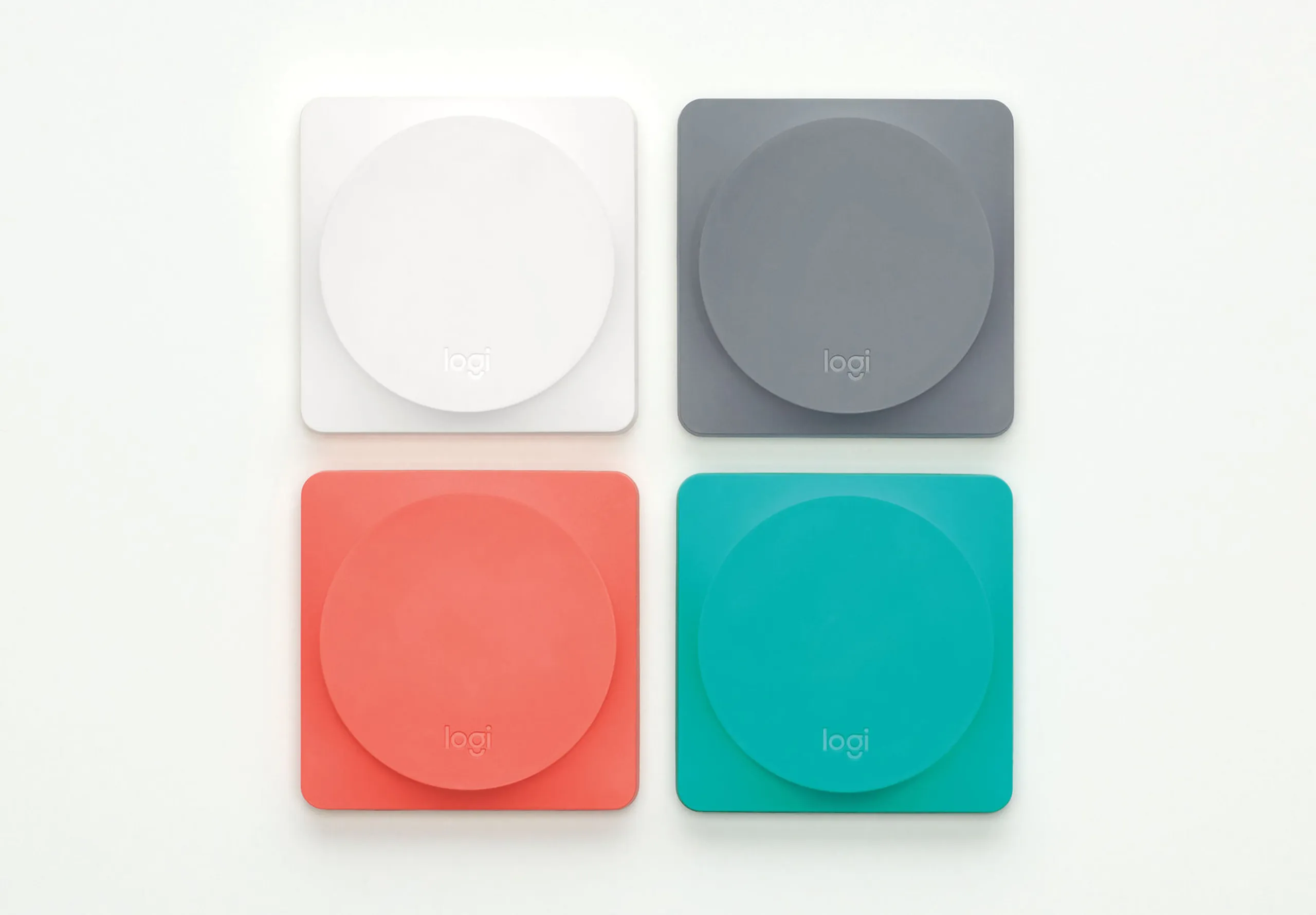
Logitech spans gaming peripherals, productivity tools and enterprise conferencing with striking range. Gaming mice are aggressive with RGB plastics, MX products are sculpted and premium with soft-touch finishes while conference systems are neutral and understated. Each category demands different ergonomics, materials and emotional tone.
What holds it together is consistent ergonomic intelligence: deep understanding of the hand, long-duration comfort, interaction precision. The brand adapts to who the user is, what they’re doing and how long they’re doing it for. Elasticity rooted in use-case empathy.


Elasticity vs. Rigidity
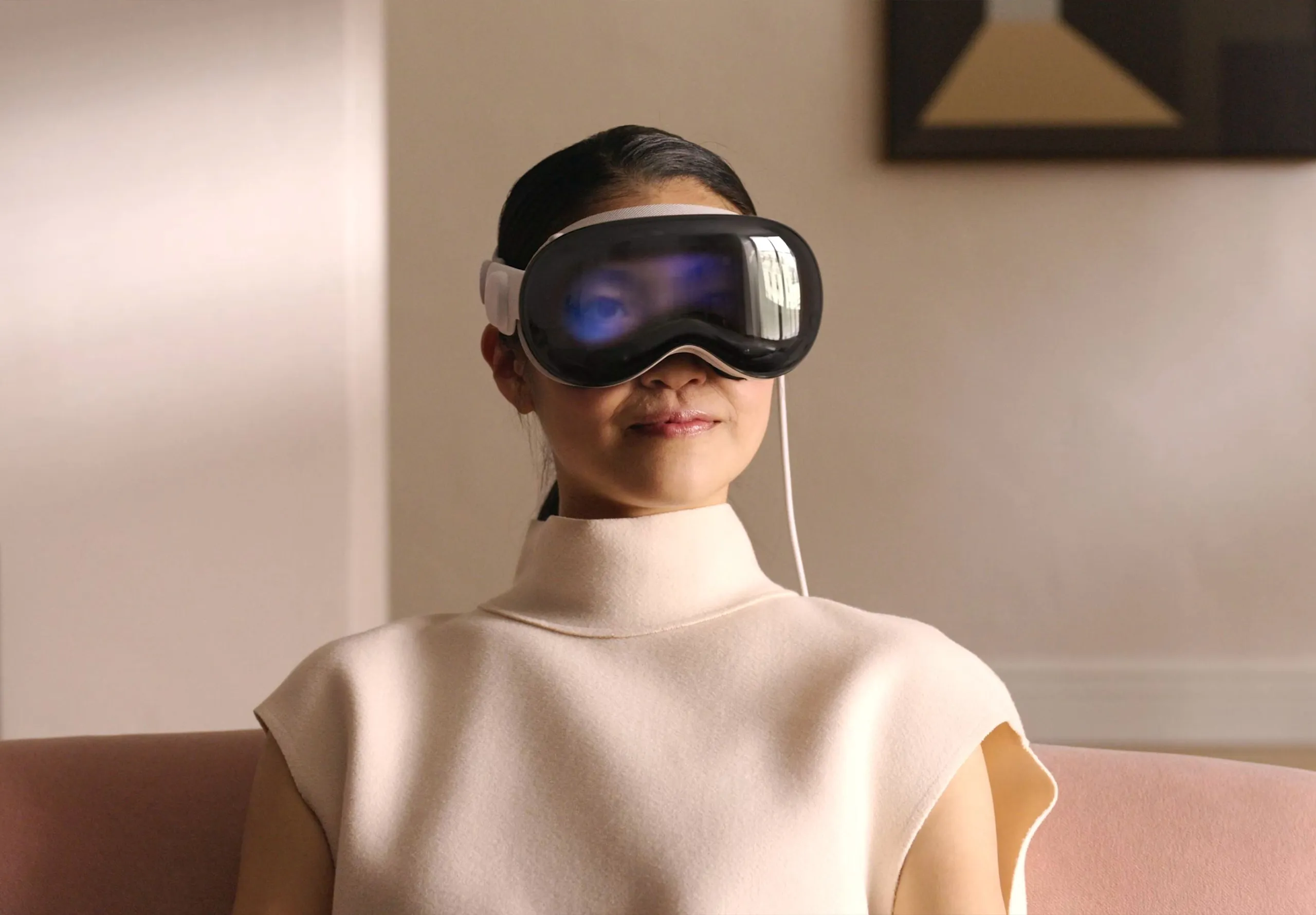
Not every brand has made the shift. Some remain anchored in the rigidity that once defined brand excellence. Apple’s approach exemplifies this older model. Extreme proportion control, round-rect geometry, chamfer discipline, axis purity, silhouette simplicity. These rules remain fixed. Over time, the brand has softened, sharpened, flattened and thickened its products within the same geometric framework.
While products remain recognisable, this rigidity limits how Apple can evolve across rapidly shifting cultural contexts. The CMF evolution feels reactive rather than responsive. As culture demands warmth, playfulness and individual expression, Apple’s geometric constraints struggle to flex far enough.


Elasticity is now a survival mechanism.
The world brands operate in changes faster than the objects they produce. Product cycles running 18–36 months while cultural cycles move in weeks and materials shift with regulation.
Rigid brands fracture under this pressure. They either fragment into inconsistency or ossify into irrelevance. Elastic brands bend without breaking.
This is the competitive advantage: brands who master controlled adaptation can enter new categories authentically, respond to cultural shifts without losing themselves, and maintain recognition across fragmenting platforms. They stay emotionally coherent while remaining commercially agile.
The brands who lead this era will be those who understand that identity is not what stays the same, but what remains recognisable as everything changes.