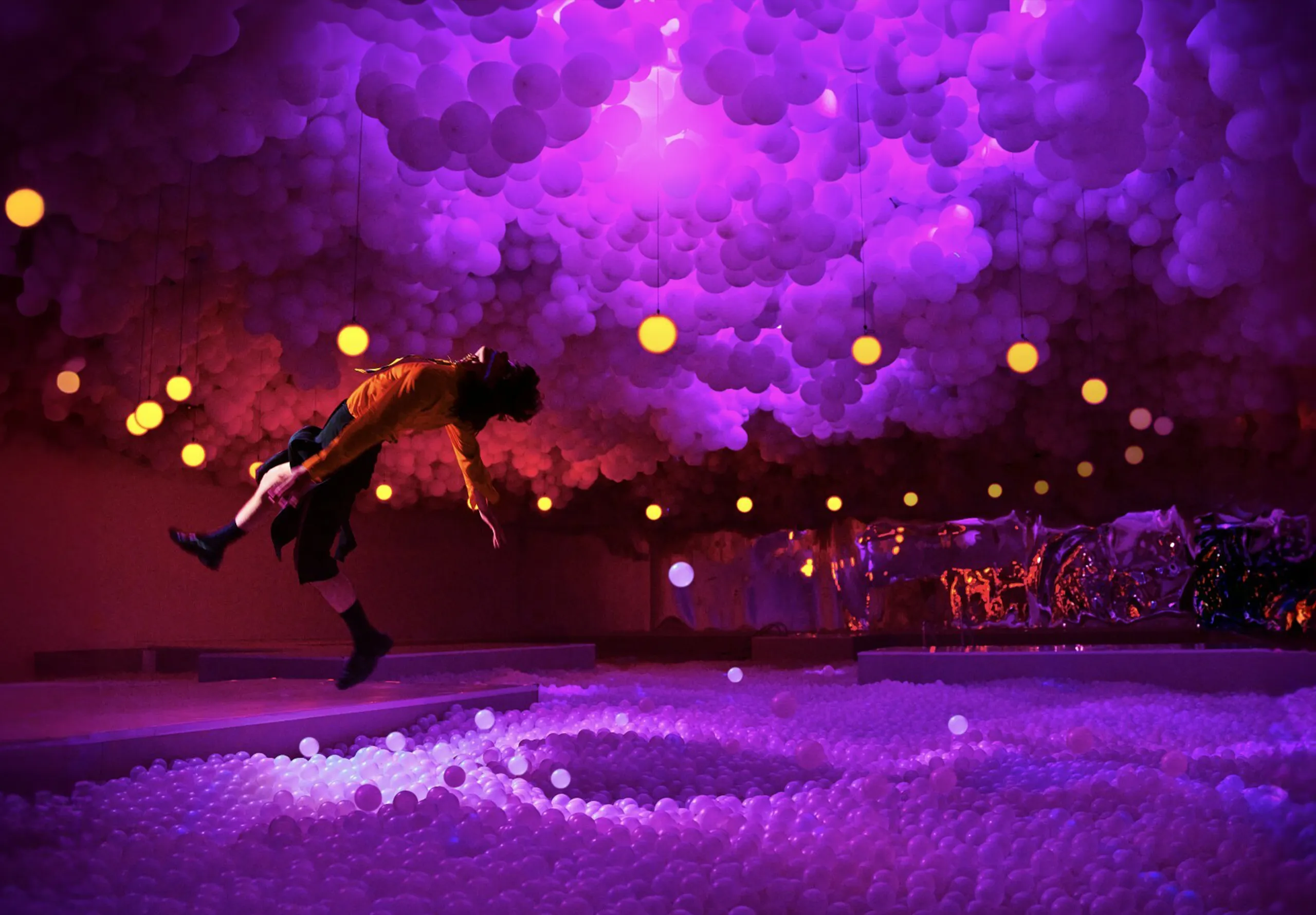
Where empathy meets aesthetic.
Author Béatrice Lorans
A few projects this month caught my eye for bringing fresh thinking and real care to design.
From simplifying crucial healthcare to sparking conversation through fashion or refreshing a beloved brand’s identity, these examples prove design with purpose still packs a punch.
Here’s what stood out…

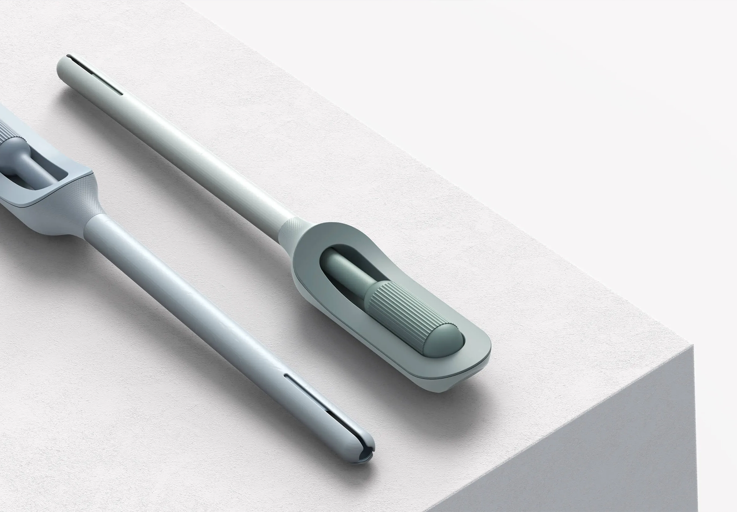
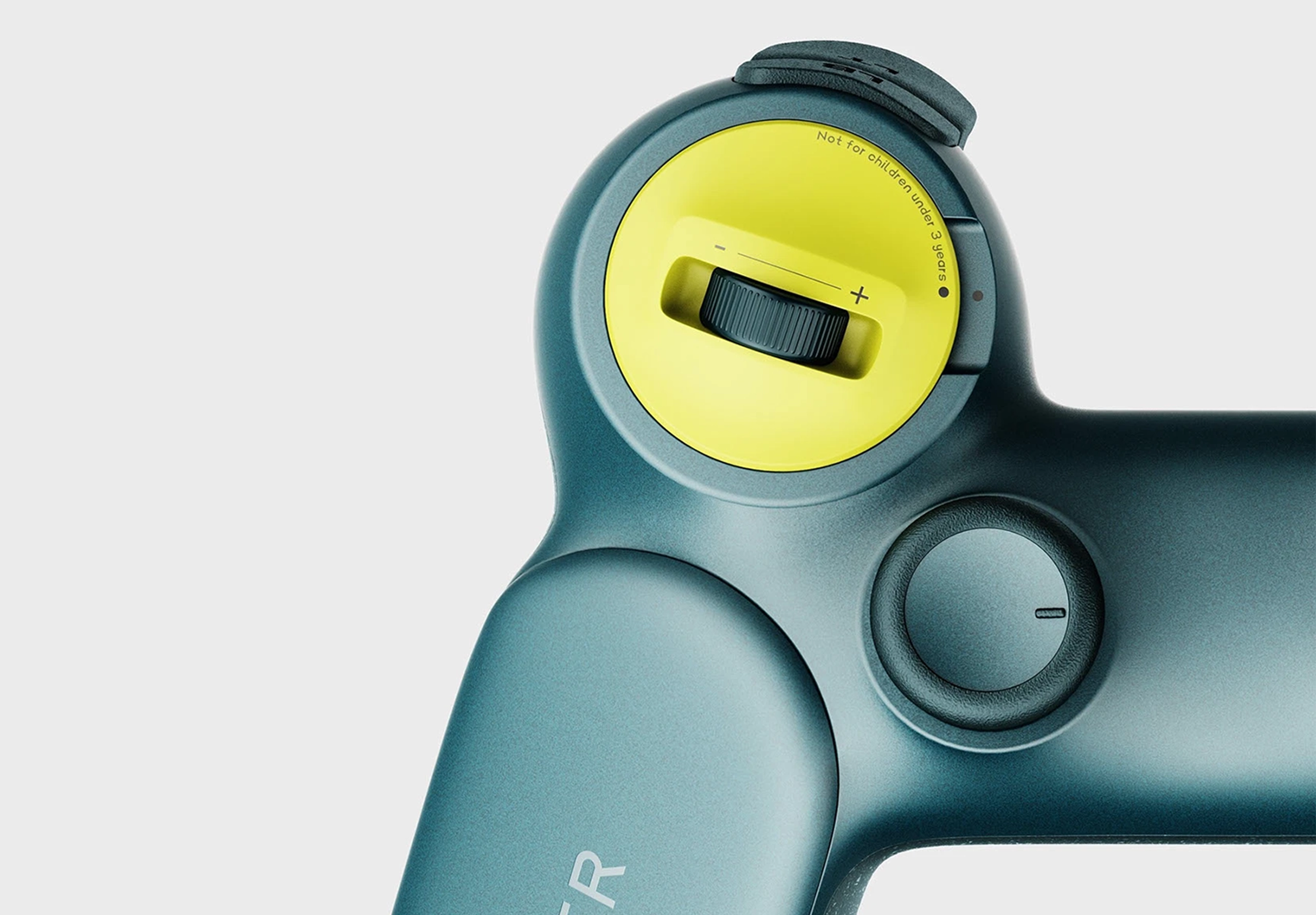
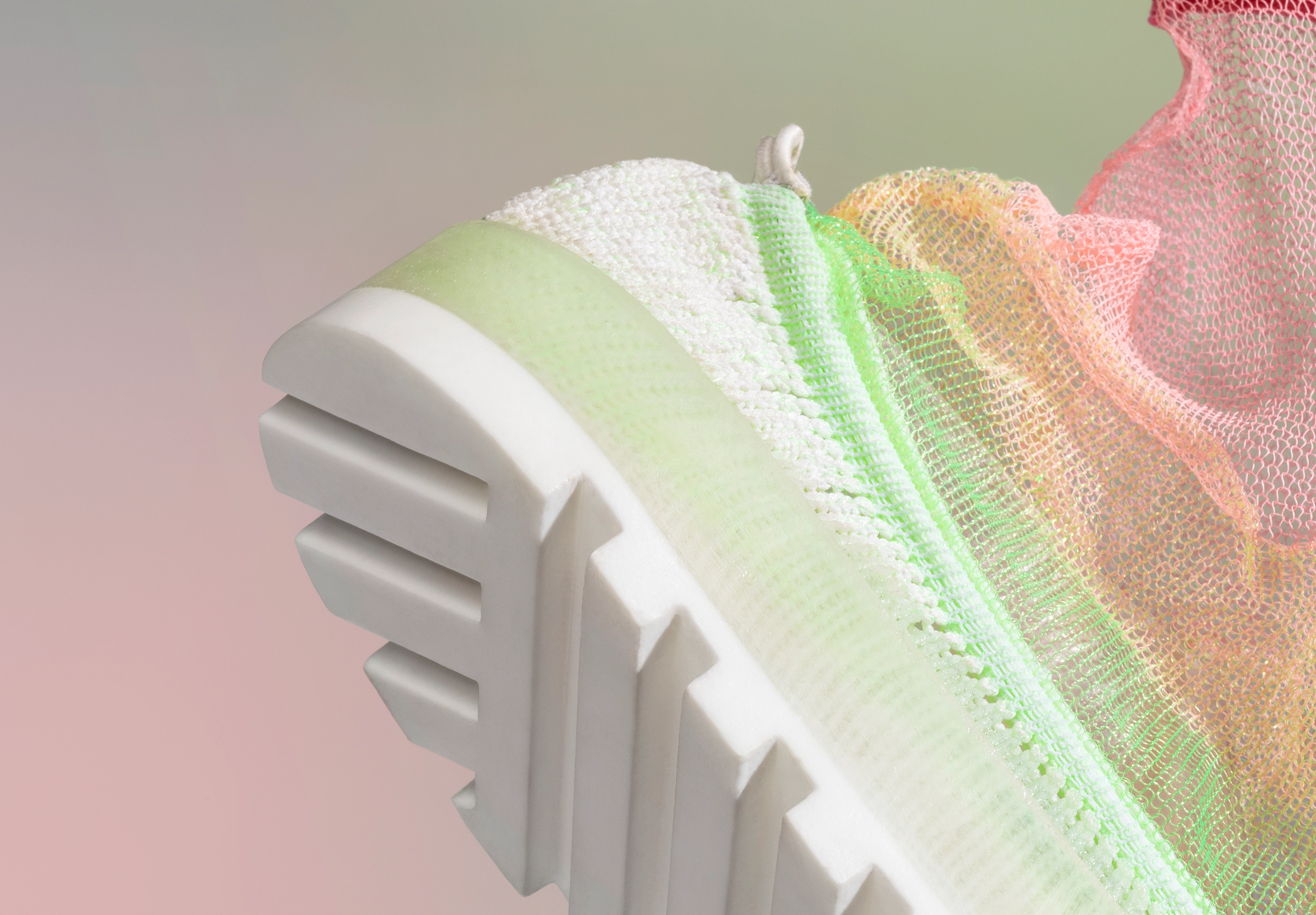
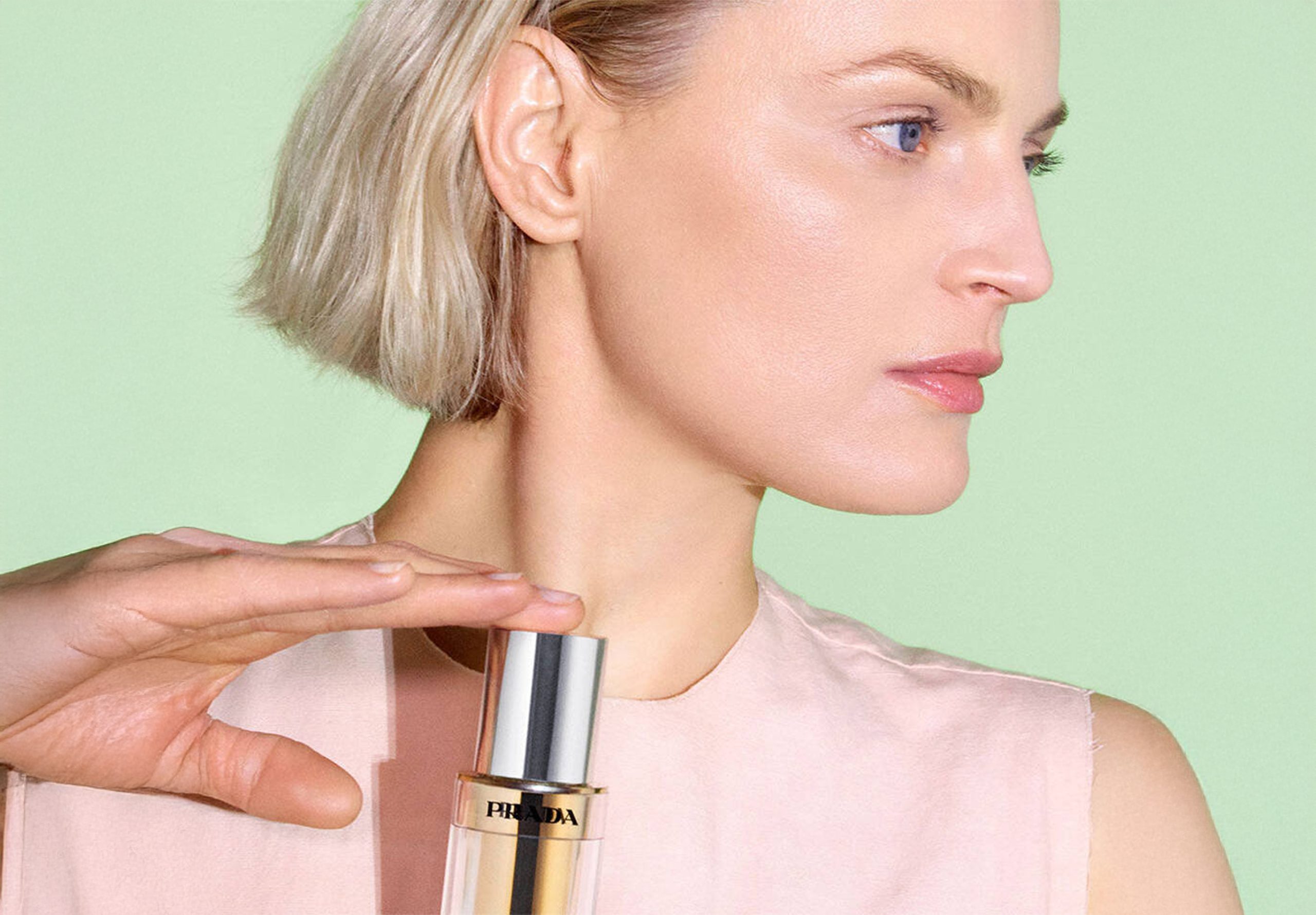
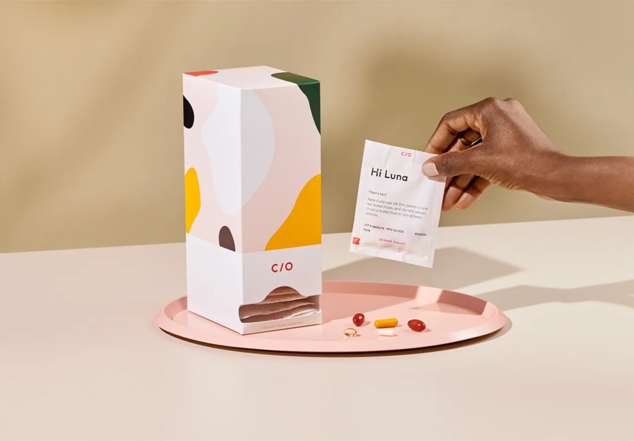
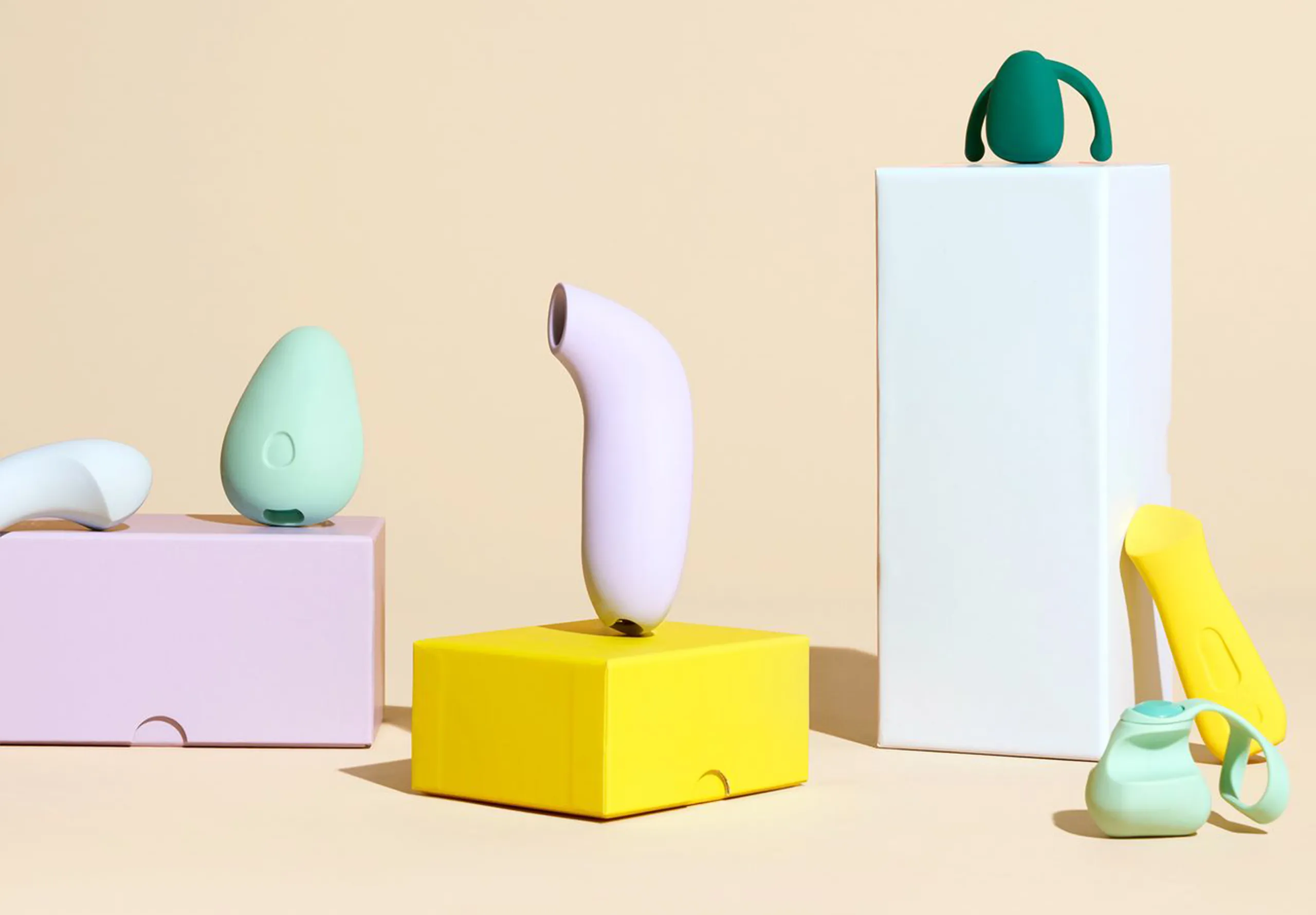
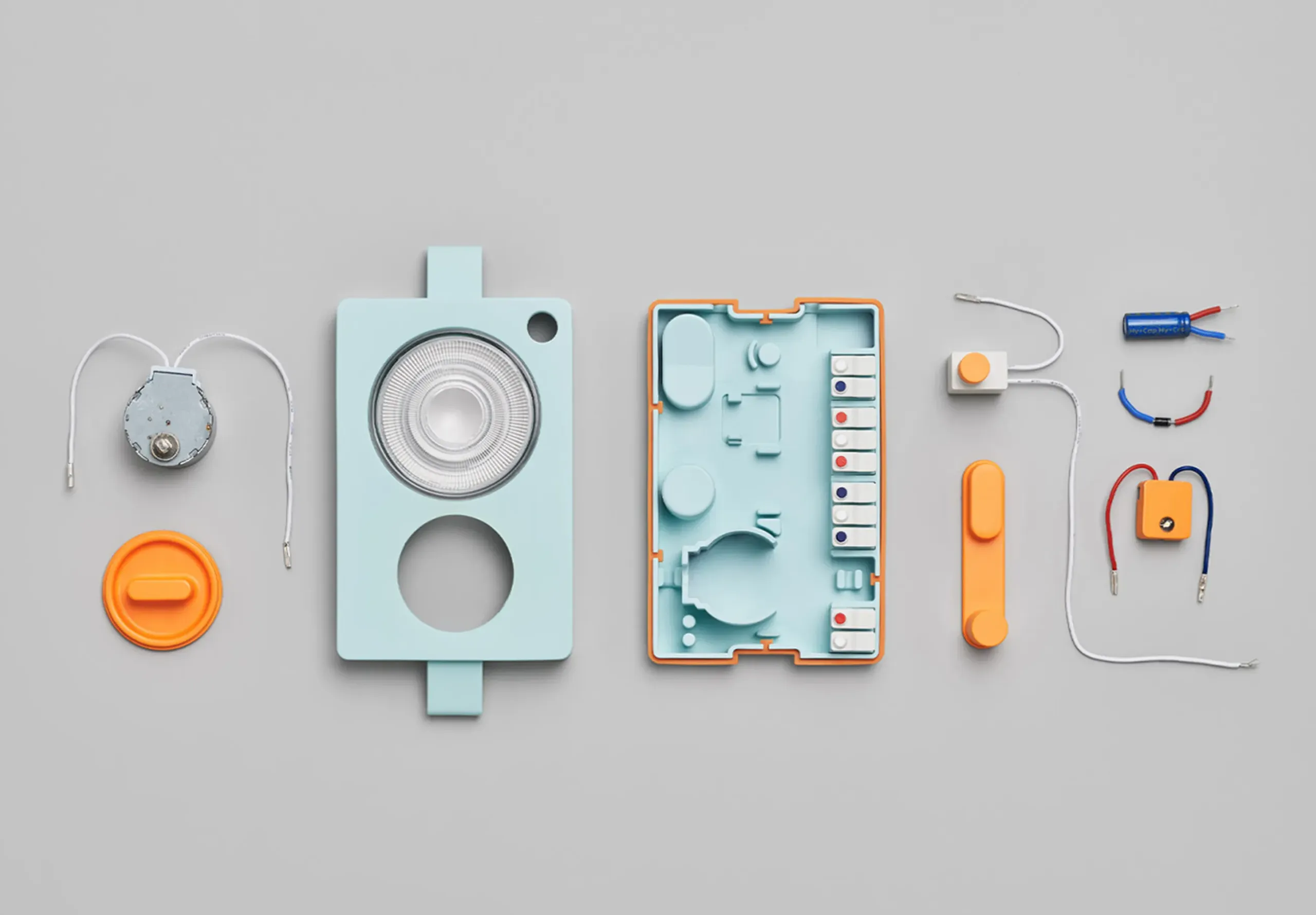
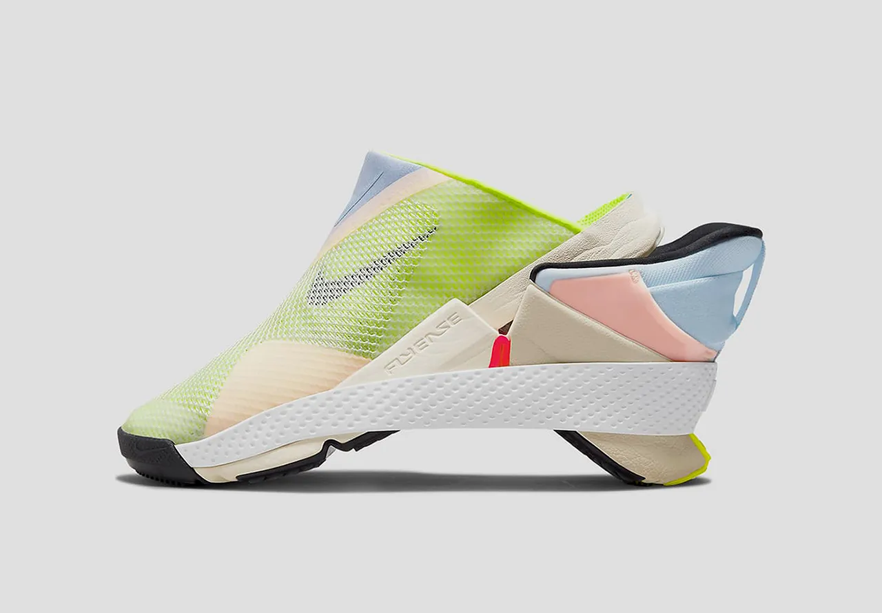
Teal wand by Teal health
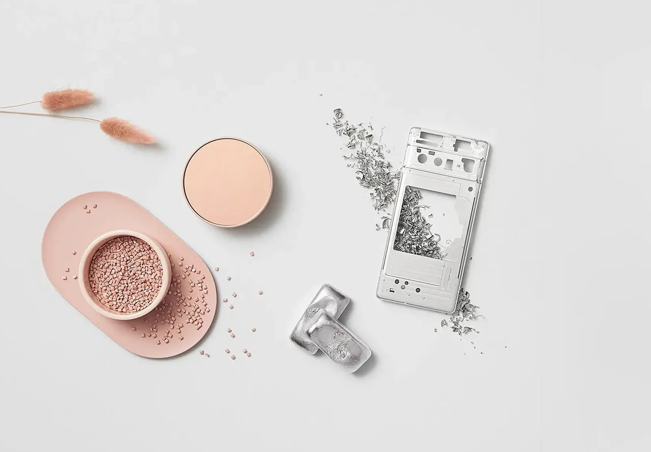
Smear tests have long been uncomfortable and clinical affairs, but Teal Health’s Teal Wand changes that with thoughtful design: a sleek, tampon-shaped device that fits comfortably in one hand. Its soft sponge deploys with a simple dial to collect samples discreetly and safely, all while standing in your own bathroom.
The form feels familiar, the function is intuitive and the whole experience strips away clinical coldness. Its design made personal, making cervical screening easier, faster, and far less daunting.

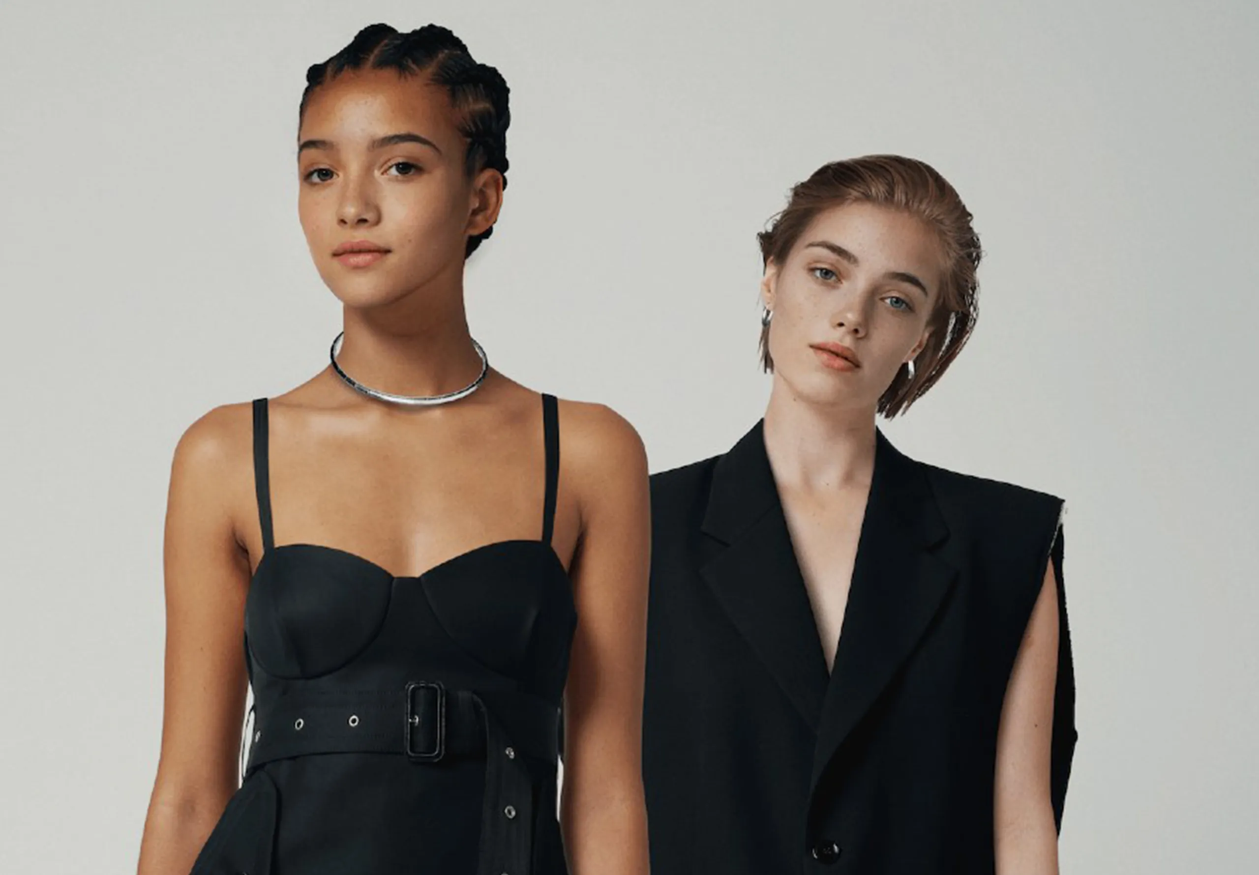
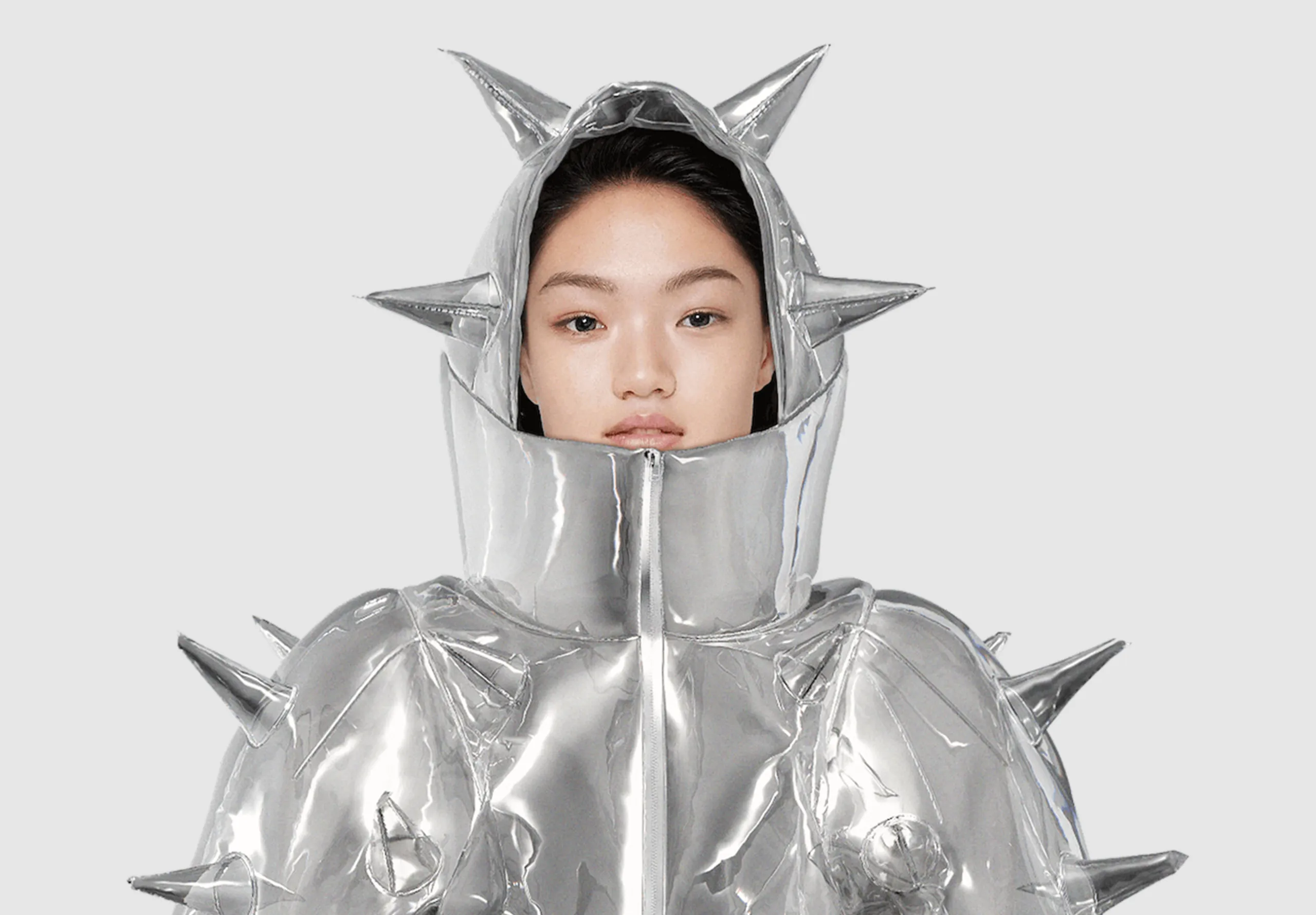
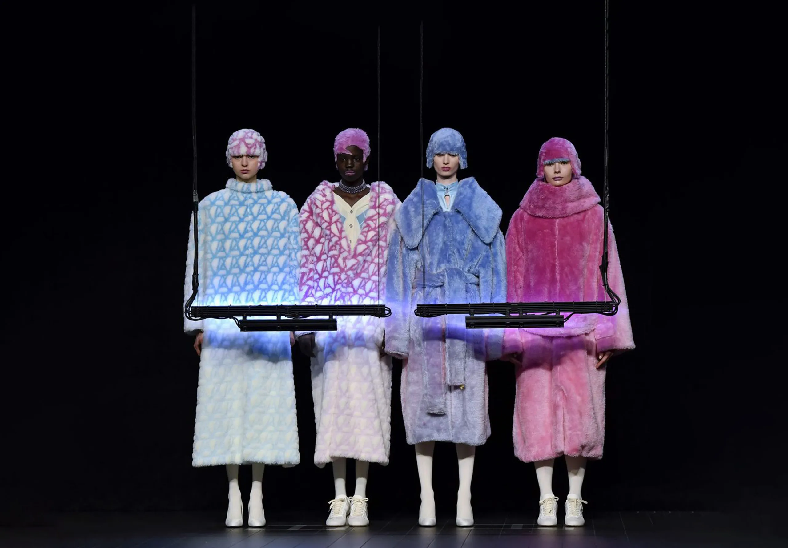
Armedangels x Wikipedia
At a time when misinformation spreads fast and truth feels scarce, German fashion brand Armedangels have teamed up with Wikipedia to celebrate free, open knowledge. Their ‘For Fact’s Sake‘ collection transforms everyday clothing into powerful statements, using 100% recycled cotton and Wikipedia’s iconic logos to highlight the importance of verified facts.
With proceeds supporting Wikipedia’s vital mission, each piece helps keep reliable information accessible to millions worldwide. And let’s be honest, they just look great.

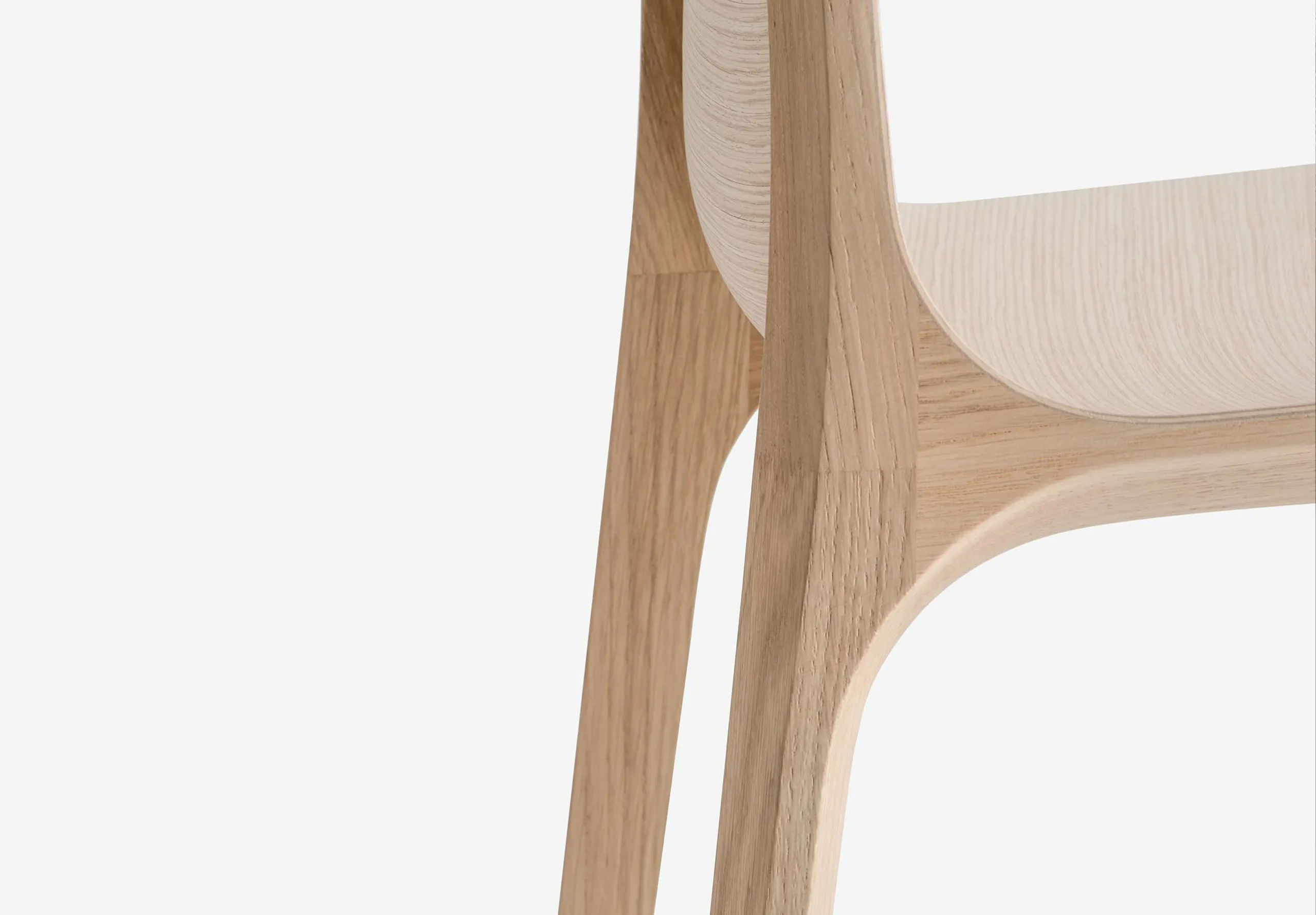
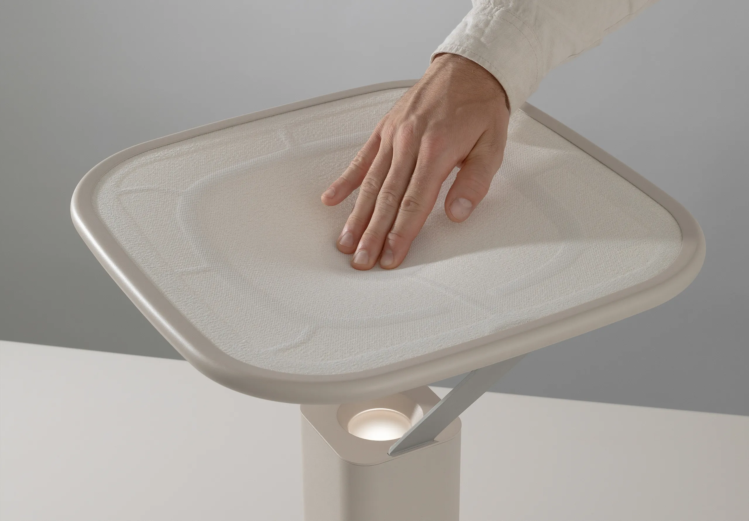
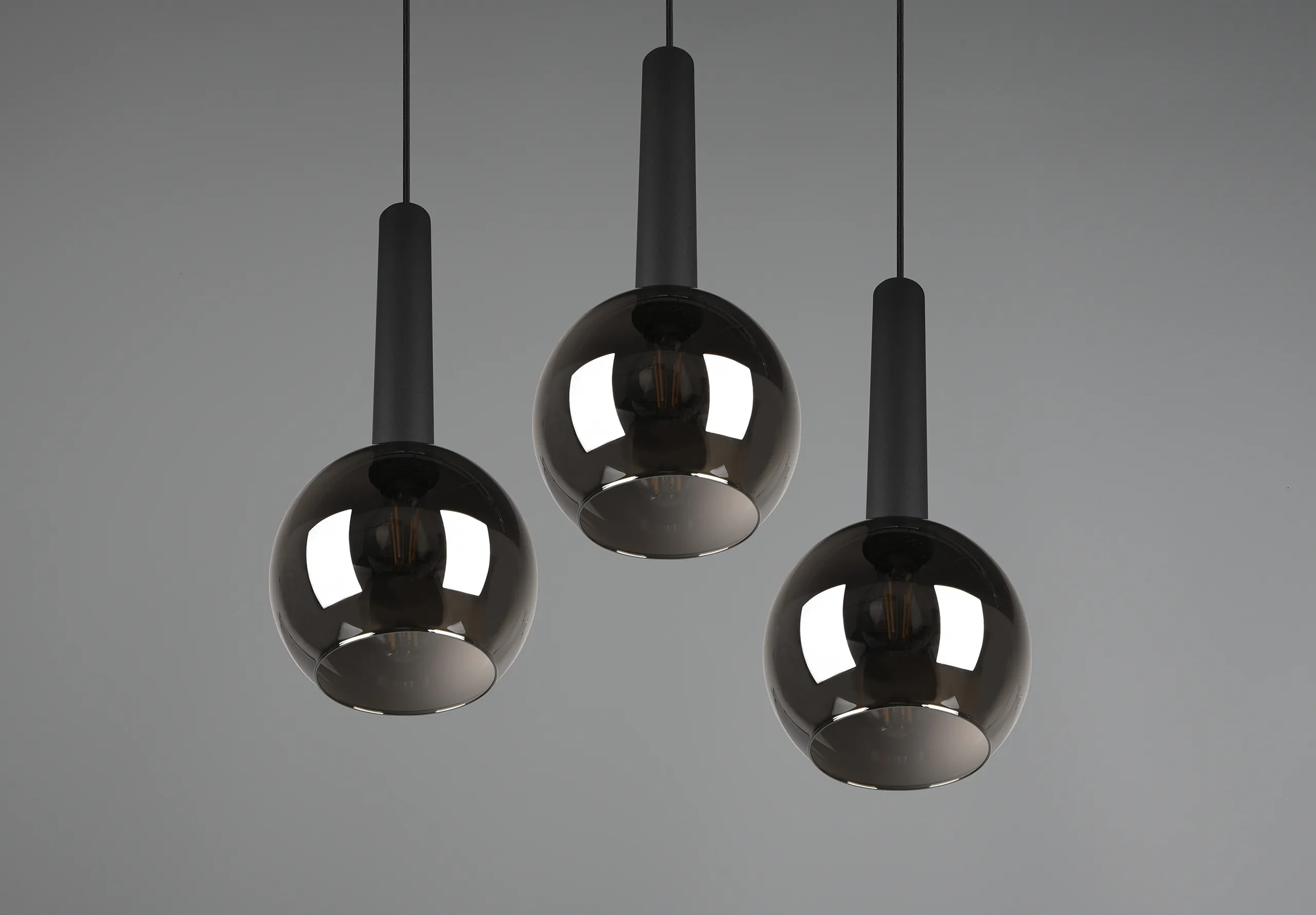
Butter yellow
Butter yellow is having a moment, casting a warm, sunny glow across fashion and interiors alike. This pastel shade brings clarity and brightness, pairing effortlessly with both bold colours and gentle tones. At Naked Copenhagen’s Paris boutique, the shade brightens a low-light space, balanced by sleek aluminium shelving and soft blue highlights.
This thoughtful use of colour and form creates a seamless, inviting user experience that proves how subtle hues can transform space and mood with timeless elegance.

William Stout Architectural Books x LoveFrom
William Stout Architectural Books has been a beacon for architects and design lovers since 1974, yet it never had a formal logo – until now! As it approached its 50th anniversary under new ownership by the Eames Institute, LoveFrom stepped in to create a timeless identity that honours the bookstore’s cultural legacy while ensuring it thrives for decades to come.
The new branding refines the store’s architectural spirit with a clean, scalable design that bridges heritage and modernity, proving how a well-crafted brand identity can future-proof its story.